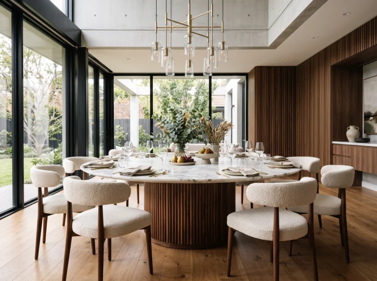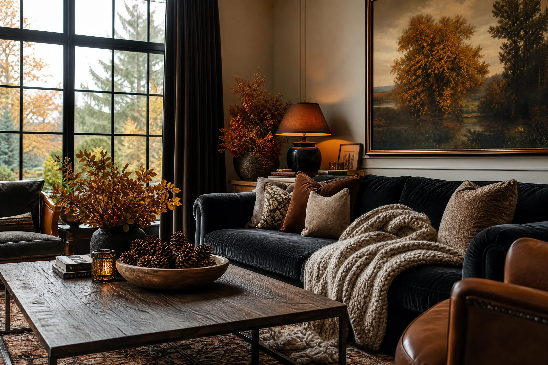
Autumn Decor Ideas for Living Rooms That Actually Look Sophisticated
When the weather turns cold, the urge to completely overhaul your living room with autumn decor can be overwhelming. Unfortunately, many people fall into the trap of turning their home into a temporary seasonal aisle at a craft store, stuffing every available corner with plastic pumpkins and bright orange faux leaves. True seasonal decorating should never feel like a gimmick or a chaotic theme party. Instead, updating your living room for autumn is about making highly intentional swaps that prioritize warmth, deep saturated colors, and organic textures. I have noticed that the most successful, high-end seasonal transitions rely on a less is more philosophy, focusing heavily on engaging the senses through tactile fabrics and warm, ambient lighting rather than generic seasonal signs.
The secret to sophisticated autumn decor is understanding which classic approaches still work and which outdated methods actually make your living room look cluttered. You must evaluate how different textures interact with your existing furniture and decide where to place your seasonal focal points so they feel fully integrated into the room’s architecture. To help you navigate this transition, the twenty-five ideas below are presented as direct comparisons between two common decorating strategies. By weighing the pros and cons of different approaches, you can clearly see why one method usually creates a more elevated, cohesive aesthetic in a real-world living space. Whether you are choosing between different types of cozy throw blankets or deciding how to style your coffee table, these practical insights will help you build a cozy sanctuary that feels both seasonal and incredibly chic.
Deep Plum Accents vs. Bright Orange Accents
When deciding how to introduce autumn colors into a neutral living room, opting for deep plum or aubergine accents is far more sophisticated than relying on traditional bright orange. Bright orange pillows and throws can immediately look overly thematic and slightly juvenile, whereas rich plum introduces a massive amount of historical depth and moody elegance. I find that pairing aubergine velvet pillows with a warm taupe or cream sofa creates a deeply saturated, luxurious contrast that feels highly relevant for the fall season. You can easily balance these dark accents by incorporating natural wood tones and warm brass lighting to keep the room from feeling entirely dark. This mid-range budget swap completely elevates the aesthetic of the room, providing a mature, subtle nod to autumn without screaming Halloween.
Pro Move: Mix deep plum with muted mustard yellow accents to create a highly complex, vintage-inspired autumn color palette that feels incredibly custom.

Chunky Wool Knit Throws vs. Thin Fleece Blankets
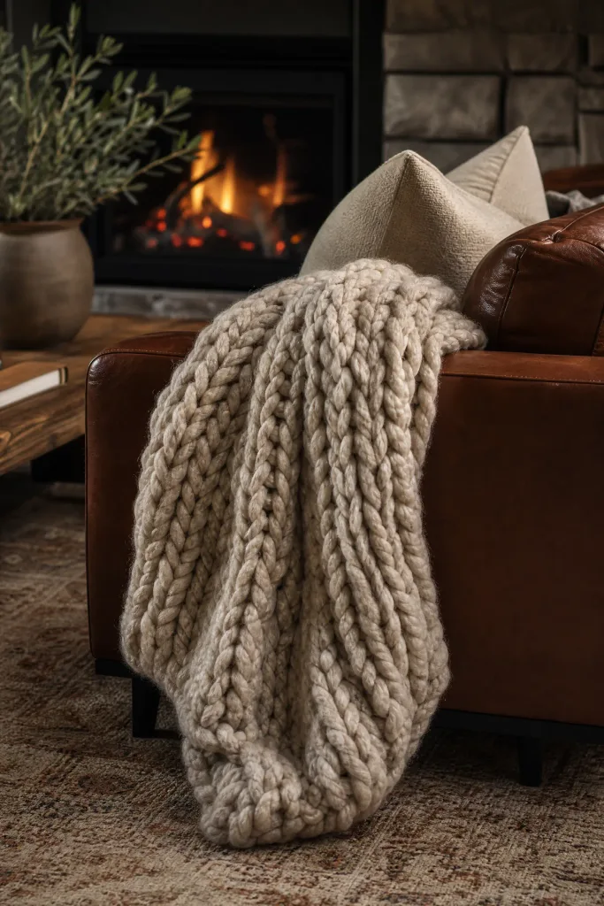
For adding cozy texture to your sofa, investing in a heavy, chunky wool knit throw is vastly superior to tossing a thin fleece blanket over the armrest. Fleece blankets generate massive amounts of static electricity and typically look like cheap college dorm accessories after just one wash in the machine. A thick wool knit, however, introduces essential, high-quality organic texture that visually warms up the entire living room even when nobody is sitting under it. You should pair this heavy, tactile blanket with a sleek leather sofa or a smooth velvet chair to create a highly satisfying contrast between the rough wool and the smooth upholstery. While pure wool is an investment, the structural weight it adds to the room’s decor is absolutely unmatched.
Designer Advice: Always buy a wool throw that is at least fifty inches wide so it looks substantial when draped casually across the back of the sofa.
Foraged Dried Branches vs. Faux Plastic Leaves
When styling a large vase on a console table, utilizing real, foraged dried branches is a much smarter design choice than buying brightly colored faux plastic autumn leaves. Faux leaves often have visible plastic seams and unnaturally shiny surfaces that instantly cheapen the look of your entire entryway or living room. Gathering tall, sculptural dead branches from your own yard introduces authentic, wabi-sabi organic architecture that feels incredibly modern and grounded. I always recommend placing these tall branches in a heavily textured, matte ceramic vase to complete the earthy, highly stylized aesthetic. This is a completely free styling upgrade that looks infinitely more expensive and sophisticated than any synthetic seasonal decor you could purchase.
Quick Tip: Bake your foraged branches in the oven at a very low temperature for thirty minutes to ensure you do not bring any outdoor bugs inside.

Warm 2700K Bulbs vs. Standard Daylight Bulbs
If you want to instantly change the mood of the living room, swapping your lighting to warm 2700K bulbs is vastly more effective than keeping bright white daylight bulbs. Daylight bulbs cast a sterile, blue-toned light that aggressively fights against the cozy, intimate atmosphere you are trying to create during the autumn months. Warm 2700K LED bulbs perfectly mimic the soft, golden glow of a traditional incandescent light or a crackling fire, instantly making the room feel like a comfortable sanctuary. You should pair this warm lighting with dark, moody wall colors or heavy drapes to maximize the highly immersive, fireside retreat vibe. This is an incredibly affordable swap that fundamentally changes how your furniture and seasonal textiles look after the sun goes down.
Reality Check: Never mix warm bulbs and cool daylight bulbs in the same room, as the clashing color temperatures will make the space feel highly disjointed.

Velvet Cushion Covers vs. Standard Cotton Covers
When updating your throw pillows for the season, switching to plush velvet covers is a much stronger styling move than sticking with lightweight summer cotton. Cotton feels crisp and airy, which is perfect for July, but autumn design requires materials that actually absorb light and provide a heavy, tactile richness. I love using velvet because the fabric naturally shifts in color depending on how the ambient light hits the crushed fibers, creating massive visual depth on a simple sofa. You can easily pair these heavy velvet pillows with a chunky knit throw to establish a highly layered, professional look. Buying just the velvet covers and stuffing them with your existing down inserts keeps this project firmly in the budget-friendly category.
Heads Up: Always purchase pillow covers that are two inches smaller than your actual down inserts to achieve a highly plump, overstuffed appearance.

Heirloom White Pumpkins vs. Orange Carving Pumpkins
When deciding how to incorporate pumpkins into your living room decor, choosing heirloom white or muted green varieties is far more elegant than displaying bright orange carving pumpkins. The standard bright orange gourds heavily dominate the visual space and immediately pull the room’s aesthetic toward a literal Halloween theme rather than a general autumn vibe. Heirloom varieties like the ghostly white Lumina or the muted grey-green Jarrahdale provide beautiful, muted tones that blend seamlessly into a sophisticated, neutral color palette. You should group three different sizes of these subtle pumpkins on a hearth or a wooden tray to create a highly organic, natural focal point. This approach feels intentional, modern, and mature.
Pro Move: Wipe down the exterior of your real heirloom pumpkins with a mild bleach solution to significantly extend their shelf life indoors.

Heavy Linen Curtains vs. Sheer Summer Panels
Replacing sheer, breezy summer window panels with heavy, lined linen curtains is vastly superior when trying to make a living room feel ready for autumn. Sheer curtains provide absolutely zero visual weight and allow drafts to enter the room, making the space feel chilly and ungrounded as the weather turns. Heavy linen or velvet drapes physically insulate the room while adding a massive, framing block of cozy texture around your windows. In my experience, pairing dark moss green or taupe curtains with a light-colored sofa perfectly anchors the room and draws the eye upward to the ceiling. While custom heavy drapes are an investment, they dramatically improve both the temperature control and the acoustic dampening of the living room.
Designer Advice: Ensure your heavy autumn curtains lightly pool on the floor by about one inch to create a highly relaxed, luxurious custom appearance.

Dried Hydrangeas vs. Artificial Sunflowers
Displaying a large arrangement of dried, faded hydrangeas is a much more sophisticated way to bring autumn florals indoors compared to using bright, artificial sunflowers. Faux sunflowers often look incredibly stiff and feature unrealistic, neon-yellow petals that clash violently with moody, muted autumn color palettes. Dried hydrangeas naturally fade into beautiful, complex shades of dusty purple, muted green, and pale brown, providing an authentic, papery texture that looks incredibly high-end. You can pair a massive bundle of these dried blooms in an antique brass or tarnished silver vase to create a stunning, romantic centerpiece on your coffee table. Drying your own summer hydrangeas by hanging them upside down makes this a completely free seasonal upgrade.
Quick Tip: Spray your fully dried hydrangeas lightly with an aerosol hairspray to prevent the delicate, papery petals from shattering and dropping onto your table.

Wooden Bowls of Acorns vs. Glass Jars of Candy
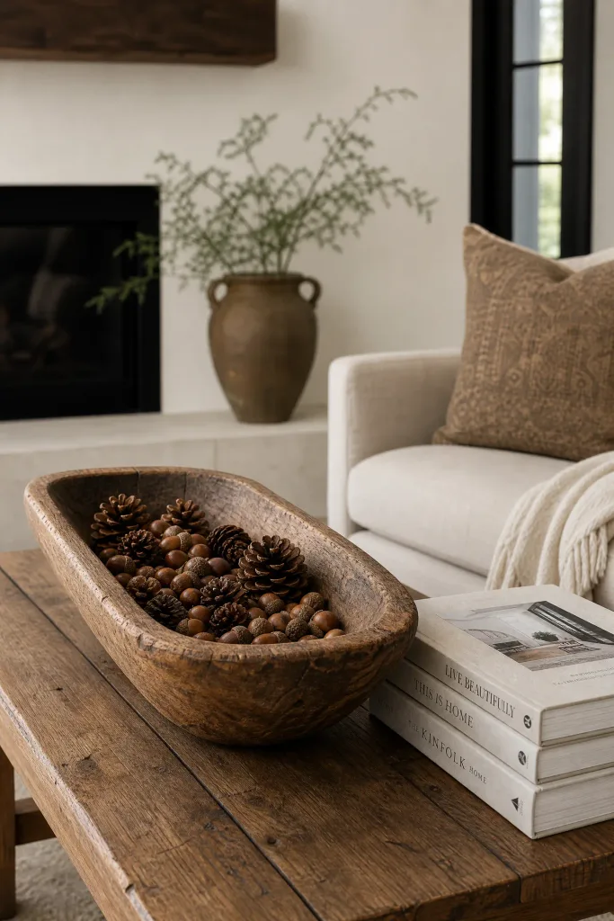
For a subtle coffee table accent, filling a hand-carved wooden bowl with natural acorns or pinecones is far more stylish than leaving out a glass jar full of bright Halloween candy. A candy jar introduces chaotic, branded colors that completely ruin a carefully curated aesthetic, while making the space feel like a doctor’s waiting room. A rustic wooden dough bowl filled with natural, foraged elements introduces essential organic texture and deep, earthy brown tones that perfectly complement a cozy autumn room. I always recommend pairing this rustic centerpiece with a stack of large, linen-bound coffee table books to balance the rough textures with clean, architectural lines. This is a highly functional, subtle nod to the season that requires almost zero budget.
Reality Check: Bake any foraged acorns or pinecones before displaying them to eliminate sap and ensure you do not bring any dormant insects into your home.
Layered Persian Rugs vs. Single Thin Rug
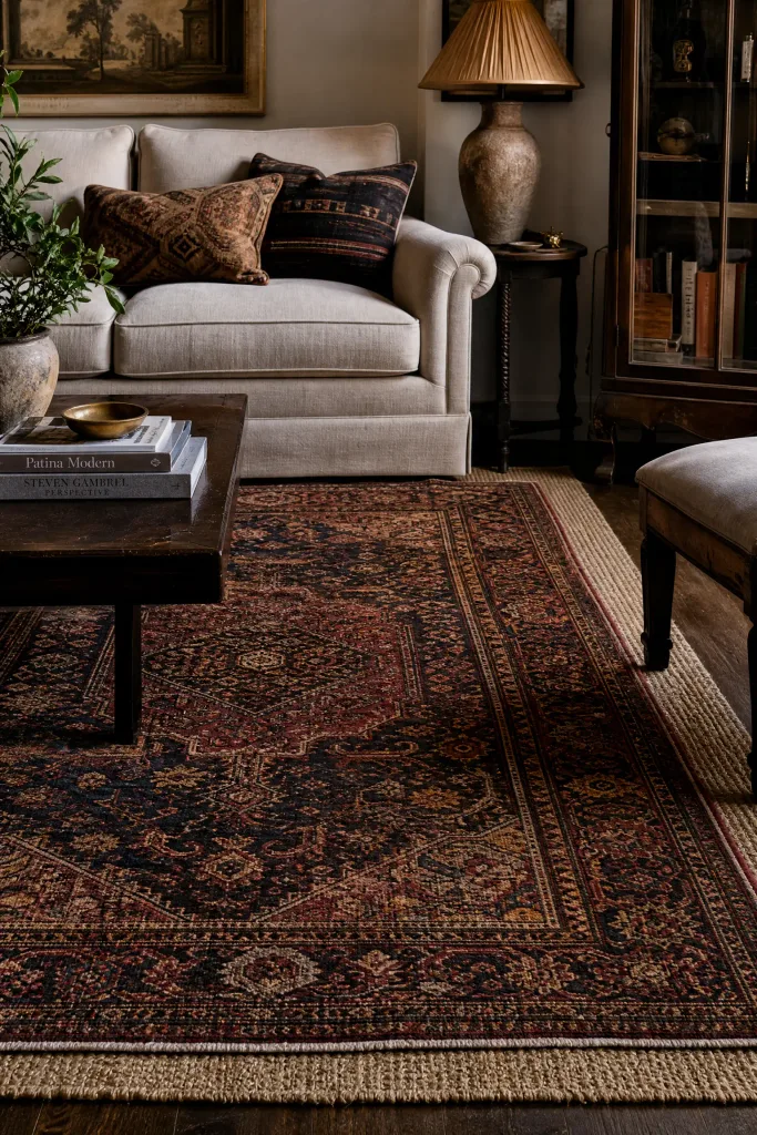
If you have a thin, flat-weave summer rug, layering a thicker, richly colored vintage Persian rug directly on top of it is a much better autumn strategy than leaving the single thin rug alone. A single thin rug often feels physically cold underfoot and lacks the visual weight required to anchor a room during the cozy winter months. Layering rugs provides a highly eclectic, collected-over-time aesthetic that adds massive warmth, deep saturated colors, and a highly satisfying plush texture to the seating area. You should pair the dark, intricate patterns of the vintage rug with a solid, neutral sofa to prevent the room from feeling overly chaotic. This mid-range upgrade completely transforms the acoustic and physical warmth of a hardwood floor.
Heads Up: Always use a high-quality, double-sided rug tape to secure the corners of the top rug so it does not become a dangerous tripping hazard.
Scented Wood Smoke Candles vs. Sweet Pumpkin Candles
When engaging the senses for autumn, choosing candles with complex notes of wood smoke, cedar, or tobacco is vastly superior to burning overly sweet, artificial pumpkin spice candles. Cloyingly sweet, artificial vanilla or pumpkin scents can quickly become overpowering, causing headaches and making the room feel like a bakery rather than a sophisticated lounge. Complex, woody scents mimic the natural, comforting smell of a real fireplace, adding an invisible layer of ambiance that makes the room feel incredibly warm and grounded. I find that pairing a high-end, smoky candle with a dark, moody room perfectly completes the intimate, sanctuary vibe. Investing in one large, high-quality, multi-wick candle provides a much better scent throw than several cheap, small votives.
Pro Move: Always trim your candle wicks to precisely one-quarter inch before every single lighting to prevent ugly black soot from staining the glass jar.

Amber Glass Bottles vs. Clear Glass Vases
Swapping out your clear glass vases for a collection of vintage amber or tortoiseshell glass bottles is a much more effective way to warm up a console table for autumn. Clear glass practically disappears and offers zero visual warmth, whereas amber glass actively filters the incoming sunlight, casting a beautiful, warm, honey-colored glow across the room. You can group three different sizes of amber glass bottles tightly together and fill just one of them with a single dried fern frond for a highly minimalist, stylized display. This is a very budget-friendly decor swap, as you can easily source beautiful amber bottles from local thrift stores or antique malls. The rich color perfectly complements brass accents and natural wood finishes.
Designer Advice: Place your amber glass display directly in front of a window or a table lamp so the light can actively pass through and illuminate the rich color.

Brass Taper Candlesticks vs. Block Pillar Candles
For elevating a fireplace mantel, grouping tall, slender brass taper candlesticks is far more elegant than lining up bulky, thick pillar candles. Pillar candles often look heavy and unrefined, taking up massive amounts of physical space without adding any delicate architectural interest to the woodwork. A collection of mismatched vintage brass candlesticks provides varying heights, drawing the eye upward while introducing a warm, metallic texture that catches the light beautifully. I always recommend pairing these brass holders with dark, moody taper candles in shades of olive green or charcoal grey to create a highly sophisticated, high-contrast focal point. This sits in the mid-range budget category but delivers a massive amount of historical, romantic charm to the living room.
Quick Tip: Use a small bead of sticky candle adhesive wax inside the brass holders to ensure the tall tapers stand perfectly straight and secure.

Dark Matte Books vs. Bright Glossy Magazines
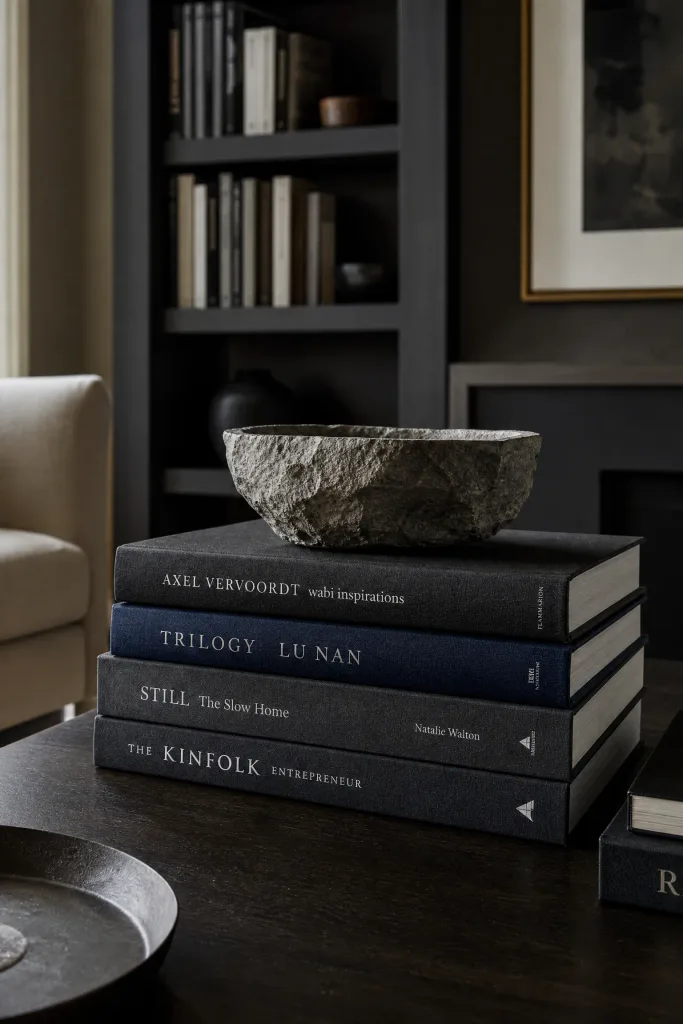
When styling your coffee table for the season, stacking thick, dark matte hardcover books is a much better choice than leaving out a pile of bright, glossy summer magazines. Glossy magazines create visual clutter, reflect harsh overhead lighting, and completely ruin the cozy, subdued atmosphere you want in an autumn living room. Large design books with matte linen covers in shades of charcoal, navy, or deep brown provide a highly structured, intellectual base for displaying small decorative objects. You should pair these dark book stacks with a raw, unpolished stone bowl or a heavy brass magnifying glass to complete the curated, library-like aesthetic. This approach completely hides visual noise while making the room feel highly intentional.
Reality Check: Remove the brightly colored, glossy paper dust jackets from your hardcover books to expose the beautiful, highly textured fabric bindings underneath.
Woven Seagrass Baskets vs. Plastic Storage Bins
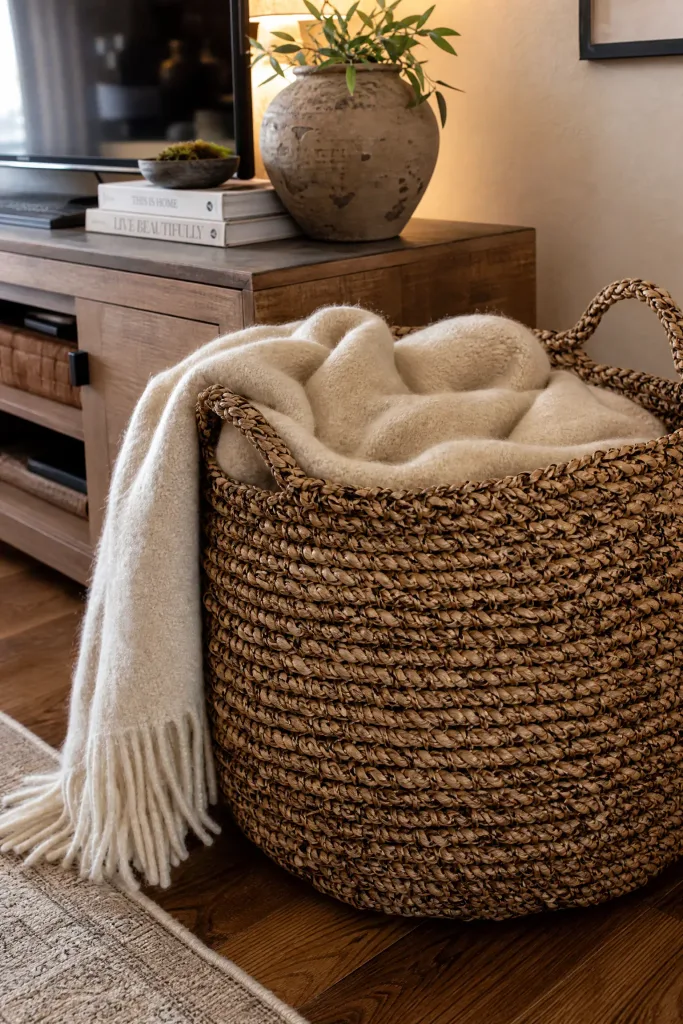
For storing the extra throw blankets you need during autumn, utilizing massive, woven seagrass baskets is vastly superior to using colored plastic or canvas storage bins. Canvas and plastic bins look highly utilitarian and belong strictly inside a closet, as they bring zero aesthetic value to a carefully designed living room. A large, natural seagrass or jute basket introduces essential, earthy organic texture that softens the hard edges of your media console or sofa frame. I find that leaving a plush wool blanket casually spilling out over the edge of the woven basket makes the room feel incredibly inviting and ready for relaxation. This is a highly affordable, functional addition that actively contributes to the cozy, seasonal decor.
Heads Up: Ensure the woven basket you select has tightly braided handles so it does not snap when you attempt to move a heavy load of wool blankets.
Leather Accent Pillows vs. Graphic Quote Pillows
When adding a third texture to your sofa styling, a soft, caramel-colored leather accent pillow is infinitely more sophisticated than a pillow printed with a cheesy autumn quote. Quote pillows quickly feel dated, read as highly gimmicky, and completely break the immersive, relaxing atmosphere of a mature living room. A high-quality leather lumbar pillow introduces a rich, warm, equestrian vibe that bridges the gap between cool summer fabrics and heavy winter wools flawlessly. You can pair a warm tan leather pillow with dark navy or charcoal grey velvet cushions to create a striking, masculine contrast that feels very high-end. While genuine leather is an investment, the patina it develops over the years makes it entirely worthwhile.
Pro Move: Condition your leather pillows twice a year with a natural leather cream to keep the material supple and prevent ugly, dry cracking over time.

Single Focal Vignette vs. Scattered Small Decor
When deploying your seasonal decor, creating one massive, highly detailed focal vignette on a console table is a much smarter strategy than scattering tiny pumpkins on every single flat surface. Scattering small items across the room creates massive visual clutter, making the apartment feel messy and entirely disorganized. Dedicating a single, specific area to an intense, layered display of branches, candles, and natural gourds creates a stunning, highly intentional focal point that commands attention. I always suggest pairing this intense focal zone with completely bare coffee tables and side tables, allowing the eye to rest and preventing the room from feeling like a retail store. This approach actually requires less decor overall while delivering a significantly higher visual impact.
Designer Advice: Build your single vignette using the rule of three, utilizing items of varying heights, textures, and widths to create a perfectly balanced composition.

Muted Sage Green Walls vs. Bright Red Accent Walls
If you are considering painting for the season, choosing a muted, earthy sage green is a vastly superior choice compared to painting a bright, aggressive red or orange accent wall. Bright red walls demand constant attention, aggressively shrink the perceived size of the room, and become incredibly exhausting to look at once the autumn season passes. A muted, soft sage green provides a highly calming, historic backdrop that pairs beautifully with autumnal warm woods and brass, but it remains perfectly relevant and fresh during the spring. You should pair these green walls with crisp white trim and a warm leather sofa for a timeless, sophisticated aesthetic. This mid-range project provides massive seasonal warmth without locking you into a strict holiday color palette.
Quick Tip: Always test the sage green paint swatch on multiple walls, as green hues shift dramatically from warm to cool depending on the natural lighting.

Vintage Brass Trays vs. Mirrored Trays
When organizing your coffee table, placing your decor on an oxidized, vintage brass tray is a much better choice for autumn than using a glitzy, mirrored glass tray. Mirrored trays reflect harsh ceiling lights and feel overly formal, cold, and starkly modern, which completely fights against the cozy, grounded atmosphere you want. An aged brass tray introduces a warm, golden metallic tone and a slightly dull, historic patina that heavily complements dried botanicals and dark, moody candles. I find that pairing the heavy brass tray with a stack of matte books and a single amber glass vase creates a perfectly balanced, textural centerpiece. This is an incredibly affordable swap if you source the brass piece from a local antique market.
Reality Check: Do not aggressively polish an antique brass tray with harsh chemicals; the dark, tarnished patina is exactly what gives the piece its incredible character.

Faux Sheepskin Throws vs. Cotton Slipcovers
For making a rigid accent chair feel ready for colder weather, draping a faux sheepskin throw over the back is far more effective than putting a tight cotton slipcover over the furniture. Cotton slipcovers are notoriously difficult to keep perfectly smooth, and the lightweight fabric does absolutely nothing to visually warm up the room. A thick, plush faux sheepskin instantly softens the hard architectural lines of a wood or metal chair, providing massive tactile warmth and a highly inviting, Nordic-inspired aesthetic. You can easily pair a white sheepskin with a dark leather chair to create a stunning, high-contrast moment that feels incredibly luxurious. This sits in the affordable budget category but completely changes the perceived comfort level of the room.
Heads Up: Use a specialized metal pet brush to gently comb out the fibers of your faux sheepskin throw when it inevitably begins to look matted.

Potted Olive Trees vs. Tropical Palms
When selecting large floor plants for an autumn living room, choosing a potted olive tree is a much stronger design move than keeping a bright, tropical palm tree in the corner. Tropical palms scream summer vacation and completely disrupt the moody, cozy, fireside aesthetic you are trying to establish. An olive tree features muted, silvery-green leaves and a delicate, woody trunk that perfectly complements the earthy, subdued color palettes of the autumn season. I always recommend placing the olive tree inside a heavily textured terracotta pot or a dark woven basket to firmly anchor it to the floor. While large, real olive trees are an investment and require massive amounts of sunlight, high-quality faux versions are an excellent alternative.
Pro Move: Cover the top soil of your potted olive tree with a thick layer of preserved green moss to hide the plastic nursery pot seamlessly.

Tortoiseshell Glass vs. Clear Crystal
Swapping out your clear crystal drinking glasses and decanters on a bar cart for tortoiseshell or smoked glass is a highly effective way to warm up a living room corner. Clear crystal reads as incredibly icy and formal, whereas tortoiseshell glass introduces a fantastic, mottled amber and brown pattern that feels inherently warm, vintage, and slightly masculine. You should pair these moody glass pieces with a dark walnut bar cart and a small brass table lamp to create a highly curated, moody speakeasy vibe in the corner of the room. This affordable glassware update ensures that even the highly functional elements of your living room actively contribute to the overall cozy autumn aesthetic. The rich, varied patterns in the glass look stunning when back-lit.
Designer Advice: Hand-wash tortoiseshell or smoked glass items strictly with mild soap, as the harsh heat of a dishwasher will quickly degrade the beautiful finish.

Matte Black Hardware vs. Polished Chrome
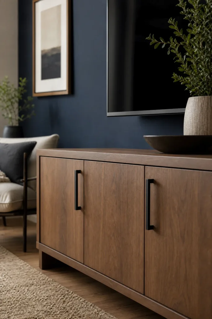
If you are looking for a semi-permanent living room update, swapping out polished chrome cabinet pulls on your media console for matte black hardware is vastly superior. Polished chrome is highly reflective and reads as very cold and sterile, which is the exact opposite of what an autumn sanctuary requires. Matte black hardware acts as a strong, grounding neutral that instantly modernizes the furniture piece while absorbing light and providing a subtle, tactile finish. I find this pairs exceptionally well with warm wood tones and muted sage green or navy paint, pulling the entire room together with a cohesive, tailored edge. This is a highly affordable DIY project that takes only a screwdriver and thirty minutes to complete.
Quick Tip: Measure the exact distance between the existing drill holes on your furniture before ordering new pulls to ensure a perfect, headache-free installation.
Dried Pampas Grass vs. Fresh Cut Flowers
Utilizing tall, fluffy stalks of dried pampas grass in a floor vase is a much better long-term decor strategy for autumn than constantly buying fresh cut flowers. Fresh flowers die quickly, require constant water changes, and often feature bright spring colors that clash with a moody autumn palette. Dried pampas grass introduces massive vertical height, an incredible feather-like texture, and a beautiful warm beige color that perfectly bridges the gap between summer and winter. You can pair a massive bundle of pampas grass in a large, unglazed ceramic floor vase to fill an empty, awkward corner with soft, organic movement. This is a one-time, low-budget purchase that will last for years if properly cared for.
Reality Check: Pampas grass sheds incredibly heavily when first unpacked, so you must shake the stalks out vigorously outside before bringing them into the living room.

Dark Wood Accents vs. Painted White Furniture
When introducing a new side table or accent chair into the room, choosing a piece made of rich, dark walnut or mahogany is far more effective for autumn than buying painted white furniture. White painted furniture often feels incredibly stark and belongs in a bright, breezy summer beach house rather than a cozy, fireside retreat. Dark wood tones naturally ground the living room, introducing a historic, library-like warmth that pairs perfectly with heavy velvet drapes and chunky wool blankets. I always suggest pairing a dark wood accent table with a sleek, modern sofa to ensure the heavy timber does not make the room feel like a dated antique store. This creates a beautifully balanced, transitional aesthetic.
Heads Up: Dark wood surfaces highlight dust instantly, so you must keep a microfiber cloth nearby to quickly wipe the table down before guests arrive.

Conclusion
Transitioning your living room for autumn does not require massive renovations or purchasing boxes of literal, themed holiday decor. As these comparisons highlight, the most elegant seasonal updates rely entirely on introducing rich, saturated colors, highly tactile fabrics, and warm, ambient lighting. By making smart, deliberate choices, like swapping out a thin summer blanket for a chunky wool knit or replacing bright white bulbs with a warm 2700K glow, you instantly change the physical comfort and visual temperature of the room. Always remember to edit your choices carefully, focusing on one or two strong focal points rather than scattering decor randomly across every surface. By prioritizing high-quality, organic textures and moody, sophisticated palettes, you can create a beautiful, restful sanctuary that perfectly captures the magic of the autumn season.
Frequently Asked Questions
How can I decorate for autumn without using orange?
You can easily bypass orange entirely by focusing on a sophisticated, moody palette of deep plum, aubergine, olive green, and warm taupe. These colors naturally evoke the feeling of fall without relying on the literal, expected shades of a pumpkin patch.
What is the best way to make a living room feel cozier?
The fastest way to increase coziness is to completely eliminate harsh overhead lighting. Rely instead on a layered approach using warm-toned table lamps, floor lamps, and candles. Combine this warm lighting with heavy, tactile textures like velvet pillows and wool blankets.
Are faux autumn leaves tacky?
Faux autumn leaves can often look cheap and plastic, especially when brightly colored. A much more sophisticated, high-end alternative is to forage for real, dried sculptural branches from your yard, or to use dried, faded botanicals like hydrangeas and pampas grass.
How do you transition decor from autumn to winter?
If you build your autumn decor around neutral, cozy textures like chunky knits, amber glass, and dark wood accents, the transition is seamless. You simply remove any literal gourds or dried leaves and introduce winter greens, pine, and heavier faux fur throws.
Can I mix different wood tones in my living room?
Yes, mixing wood tones creates a highly curated, collected look. To do it successfully, ensure the woods share a similar undertone (like pairing warm oak with warm walnut) and use a large, neutral rug to break up the wooden legs of the furniture.
What should I put on my coffee table for fall?
Keep it incredibly simple and tactile. Stack a few dark, matte hardcover books and top them with a hand-carved wooden dough bowl filled with natural, baked pinecones or a few muted, heirloom white pumpkins. Avoid glossy magazines and chaotic candy dishes.