Acrylic Kitchen Cabinet Looks That Actually Feel Expensive
Walk into any high-end kitchen showroom right now and you’ll notice the same thing over and over: acrylic fronts catching the light in a way laminate or painted wood just can’t match. I’ve walked clients through dozens of these showrooms, and the reaction is almost always the same, they run a hand across the surface and ask why it feels so smooth. That glass-like finish is exactly why acrylic has become a go-to choice for anyone who wants a kitchen that photographs well and still holds up to daily cooking and spills.
What follows isn’t just a list of pretty colors. I’ve grouped these ideas into six real categories, from glossy showstoppers to quiet matte finishes to the small details that pull a kitchen together, so you can find the direction that actually fits your space and your budget.
Sleek and Reflective: The Classic High-Gloss Look
Mirror White Gloss Uppers
Pure white gloss uppers over a warm oak or walnut lower cabinet still reads as the safest bet, bouncing daylight around a room and making low ceilings feel taller. Pair it with brushed nickel pulls and a softly veined quartz counter. Affordable to mid-range.
Quick Tip: keep a microfiber cloth handy, gloss white shows water spots fastest of any color.

Charcoal Gloss Base Cabinets
Charcoal gloss on lower cabinets with a lighter upper section grounds a room without closing it in, especially in open-plan layouts. Add gold or brass hardware for warm contrast. Mid-range, but it reads far pricier than it is.
Designer Advice: keep charcoal to base units only in small kitchens, full charcoal gloss can overwhelm a tight footprint.

Glossy Navy Island
A navy gloss island against white or pale wood perimeter cabinets gives you one bold focal point without committing the whole room to a dark palette. A warm-toned pendant above keeps the navy from reading cold. Mid-range to investment, since islands often need custom sizing.
Quick Tip: test the navy sample under your own kitchen lighting first, it shifts a lot between daylight and warm bulbs.

Pearl Gloss with Chrome Pulls
Pearl or oyster gloss carries a subtle shimmer that’s softer than pure white but still bounces light well, especially paired with chrome hardware for a cooler palette. It suits kitchens with large windows since it softens harsh light rather than reflecting it sharply. A step above standard white gloss in price. Designer Advice: keep walls neutral, pearl gloss can pick up strong wall colors as a faint tint.

Soft and Subtle: Matte Acrylic for a Calmer Feel
Sage Green Matte Slab Doors
Matte finishes have become a favorite among many professional designers lately, and sage green slab doors are a big part of it. The non-reflective surface hides fingerprints far better than gloss. Pair with unlacquered brass hardware and open wood shelving. Affordable to mid-range.
Quick Tip: matte can show scuffs from metal pans, so line lower drawers with a soft liner.

Warm Greige Matte Cabinetry
Greige, that in-between grey and beige, avoids the coldness grey gloss sometimes has, creating a calm backdrop that lets your countertop do more visual work. A honed marble-look quartz counter completes it well. Mid-range depending on the cabinet maker.
Designer Advice: greige is the safest long-term bet if you change your mind about trends often.

Charcoal Matte for an Industrial Edge
Charcoal matte gives an industrial, loft-like feel without the coldness of concrete or steel, reading well against black window frames and unfinished brass that patinas over time. Better suited to larger kitchens than tight galleys. Mid-range to investment.
Quick Tip: balance charcoal matte with at least one warm wood element so the room doesn’t feel one-note.

Soft Blush Matte in a Small Kitchen
Blush sounds bold on paper, but in a small kitchen with white oak floors and brushed brass hardware it reads as gentle rather than loud. Keep the countertop a plain white quartz so blush stays the star. Affordable to mid-range.
Designer Advice: test this shade in natural north-facing light first, it can shift slightly grey in cooler light.

Bold Color Statements
Cobalt Blue Island Centerpiece
A cobalt island against neutral perimeter cabinetry adds real personality without a full color commitment, especially with a butcher block top set against quartz counters elsewhere. Investment-level for a custom island.
Quick Tip: repeat the cobalt in one small accessory, like bar stool fabric, so it doesn’t feel isolated.

Deep Emerald Green Walls of Cabinets
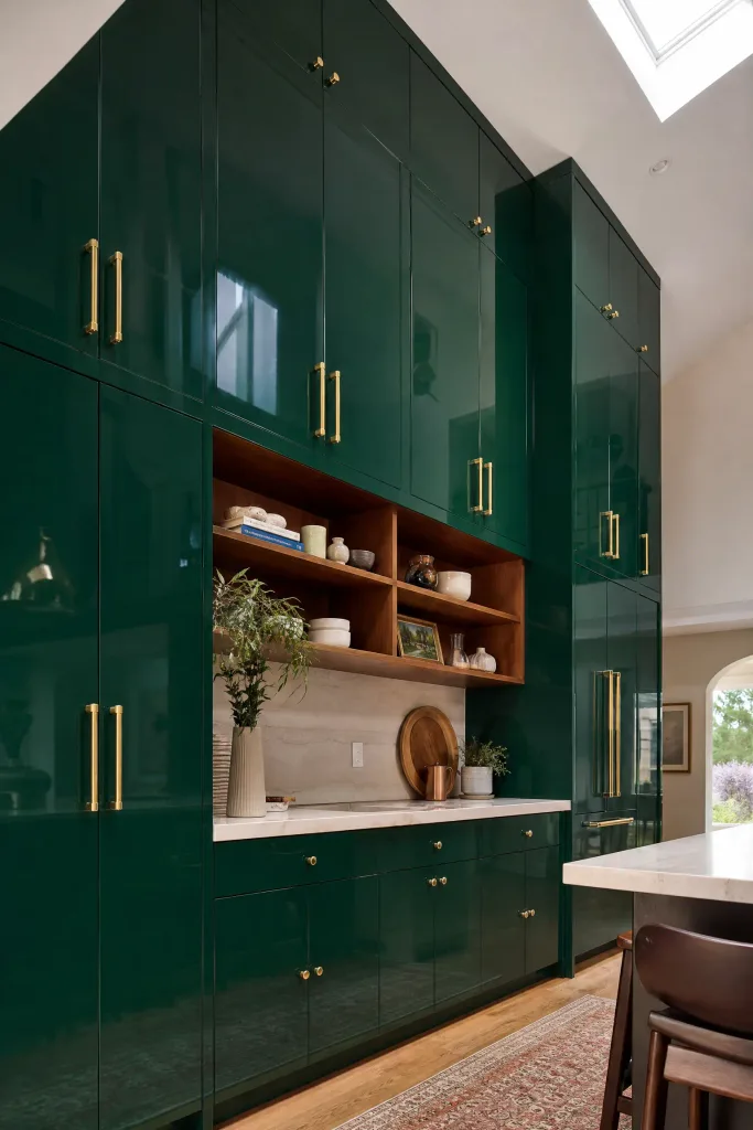
Full-height emerald cabinetry works well in kitchens with tall ceilings and good light, creating a jewel-box feel neutral tones can’t match. Brass hardware and a wood open shelf help break up the green. Mid-range to investment.
Designer Advice: avoid this shade in a kitchen with limited windows, dark green needs daylight to read rich rather than dim.
Burgundy Red Accent Wall Units
Burgundy on upper wall units only, with white or cream lower cabinets, adds drama at eye level while keeping the workspace below light and functional. Warm brass sconces finish the look well. Mid-range. Quick Tip: sample burgundy against your actual backsplash tile first, undertones can clash more than expected.

Mustard Yellow Lower Cabinets
Mustard lower cabinets with white uppers and natural wood open shelving bring retro warmth that suits a mid-century modern kitchen especially well. Keep hardware simple so the color stays the focal point. Affordable to mid-range.
Designer Advice: this shade needs plenty of natural light, in a dim north-facing room it can read muddy.

Two-Tone and Contrast Combinations
Black Gloss Uppers with Wood-Look Lowers
Flipping the usual formula, black gloss on top with warm wood-look acrylic below, adds visual weight that suits open-concept homes needing a defined kitchen edge, and hides grease near the stove better than an all-light palette. Mid-range to investment.
Quick Tip: keep black gloss away from the cooktop, grease marks show fast at eye level.

White Gloss Top, Matte Grey Bottom
A crisp white gloss upper section with a forgiving matte grey lower section gives you brightness where it matters and fingerprint resistance where hands touch most, a practical combination for family kitchens. Affordable to mid-range.
Designer Advice: match the grey undertone to your flooring so the transition feels intentional.

Glossy Island, Matte Perimeter
Making the island the one glossy element draws the eye to the center of the room and limits higher-maintenance gloss to a single piece. A waterfall edge reinforces the focal point further. Investment-level due to custom island work.
Quick Tip: keep the island color slightly bolder than the perimeter so the contrast reads as deliberate.

Metallic Edge Banding Contrast
Rather than mixing two colors, a single acrylic tone with a contrasting brushed stainless or aluminum edge banding adds shine without a full two-tone commitment, especially on handleless slab doors. Mid-range as an upgrade.
Designer Advice: match the metallic to your faucet finish so small details don’t compete.

Small Kitchen Solutions
All-White Gloss to Maximize Light
An all-white gloss scheme is still one of the most reliable ways to make a small kitchen feel bigger, bouncing both natural and artificial light. Keep countertops light too, a pale quartz or marble-look surface. One of the more budget-friendly directions here.
Quick Tip: add one small pop of color through a runner or a bowl of fruit, all-white alone can feel sterile.

Handleless Slab Doors for Clean Lines
Handleless acrylic slab doors, opened with a push mechanism or a routed finger pull, remove visual clutter where every extra line matters, making a cramped galley kitchen feel calmer. Mid-range to investment depending on the mechanism.
Designer Advice: push-to-open needs occasional maintenance, a finger pull is the more forgiving long-term option.

Glass-Front Acrylic Wall Units
Swapping a few solid uppers for glass-front frames adds negative space, a visual break that keeps a small kitchen from feeling like a solid wall of storage. Interior LED lighting turns glassware into display. Mid-range.
Quick Tip: limit glass fronts to two or three doors, too many and the kitchen loses its sense of storage security.

Vertical Grain Acrylic Panels
A wood-look acrylic with vertical rather than horizontal grain draws the eye upward and can make a low-ceilinged kitchen feel taller, while keeping true acrylic’s easy cleaning. Pairs well with brushed brass or matte black hardware. Mid-range.
Designer Advice: run the vertical grain continuously up tall pantry units for the strongest height illusion.

Finishing Touches That Complete the Look
Under-Cabinet LED Strip Lighting
Layered lighting is what makes an acrylic kitchen look finished, and under-cabinet LED strips make the biggest visual difference for the smallest cost, eliminating shadows and making gloss finishes glow rather than just reflect. Choose a warm 3000K temperature. One of the most affordable upgrades here. Quick Tip: hardwire the strips rather than using battery versions, which dim unevenly within a year.

Waterfall Countertop Pairing
A waterfall edge, where the countertop wraps down the island’s side to the floor, pairs especially well with gloss acrylic since both share that same seamless, high-shine quality. Investment-level due to extra slab material and precise cuts.
Designer Advice: waterfall edges show seams if the installer isn’t experienced, ask to see a completed project first.

Brushed Aluminum Hardware
Brushed aluminum pulls read as more industrial and modern than chrome or brass, holding up against gloss finishes without showing fingerprints the way polished chrome does. Suits charcoal, navy, or black cabinetry especially well. Affordable.
Quick Tip: buy one extra pull when you order, matching a discontinued finish years later is nearly impossible.

Open Shelving Break-Up
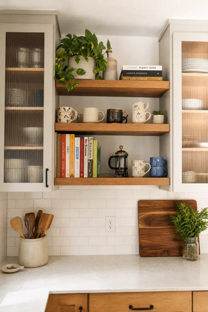
Replacing one or two upper runs with open wood shelving softens an all-acrylic kitchen and adds visual texture, a mix of materials that keeps the eye interested. Also genuinely useful for displaying everyday mugs or cookbooks. Affordable, since it often means removing cabinets rather than adding them.
Designer Advice: style open shelves loosely, overfilled shelving reads as clutter instead of decor.
Final Thoughts
Acrylic cabinets aren’t a passing trend, they’ve stuck around because they solve problems wood and laminate finishes struggle with, resisting moisture and holding color well over years of use, all while giving a kitchen a polished look without much upkeep beyond a soft cloth and mild cleaner. What I’d tell anyone starting this process is to pick a finish based on how you actually live in your kitchen, not just how a showroom sample looks under perfect lighting. If you cook daily with kids running through, matte will save you a lot of wiping. If you want maximum brightness in a small space, gloss is still hard to beat.
The ideas above aren’t meant to all appear in one kitchen. Pick one category, maybe two, and build from there. A glossy white upper section with a matte charcoal island, brushed brass hardware, and a warm LED strip underneath can look just as considered as a kitchen that cost twice as much. The details, lighting, hardware, and how finishes get paired, do more of the work than people expect.
Frequently Asked Questions
Are acrylic kitchen cabinets worth the extra cost compared to laminate?
For most homeowners staying put more than five years, yes. Acrylic resists fading and moisture damage better than laminate, without the edge peeling laminate is prone to over time.
Do acrylic cabinets scratch easily?
High-gloss acrylic can show fine scratches from abrasive pads or metal utensils dragged across it, but it resists dents and impacts better than painted wood. Matte hides small scratches better than gloss.
Is matte or gloss acrylic easier to maintain?
Matte hides fingerprints and smudges far better day to day, while gloss needs more frequent wiping but reflects light in a way matte can’t replicate.
Can I mix acrylic cabinets with wood cabinets in the same kitchen?
Yes, and it’s one of the more popular approaches right now. Pairing acrylic uppers with a warm wood island or lower cabinets adds texture and keeps an all-acrylic kitchen from feeling too cold.
What colors of acrylic cabinets are trending right now?
Sage green and warm greige lead the matte category, while navy and charcoal remain the most requested gloss colors for islands and accent pieces among several cabinet makers.
Do acrylic cabinets work in a small kitchen?
Yes, especially lighter colors and gloss finishes, since the reflective surface bounces light around a tight space. Handleless slab styles also help a small kitchen feel less visually cluttered.