Aqua Bedroom Looks That Are Worth Stealing Right Now
There’s a reason aqua keeps showing up in bedroom mood boards year after year. It sits right in that sweet spot between blue and green, which means it reads as both calming and fresh at the same time. Unlike pure navy or forest green, aqua doesn’t demand too much of a room. It can be the star, or it can play a supporting role, and either way it tends to make a bedroom feel more alive without feeling loud. If you’ve been circling the idea of adding it somewhere in your bedroom but aren’t sure where to start, this guide is for you.
What follows are 22 genuinely different ways to bring aqua into a bedroom, from full wall paint to tiny decorative accents, from coastal breezy to sleek and modern. Each idea covers what colors to pair it with, what kind of furniture works, how to handle lighting, and what textures to bring in. Some ideas are affordable and easy to pull off on a weekend, and others are more of a full-room commitment. The goal is to give you something specific and useful, not just pretty pictures to scroll past.
1. Aqua Walls with Warm Wood and Linen
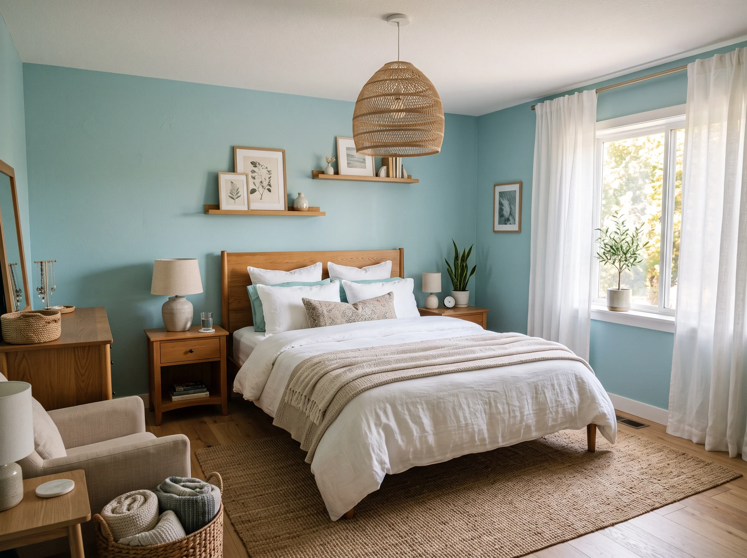
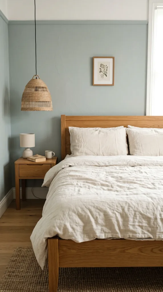
If you’ve ever walked into a room where the walls felt like they were doing all the heavy lifting in the best way possible, this is probably what it looked like. Painting all four walls in a soft aqua, something in the blue-green family rather than a neon or turquoise, and then grounding it with warm wood furniture is one of those combinations that works better in real life than it does in theory. The cool tone of the aqua balances the golden warmth of natural oak or walnut, and the result is a room that feels balanced rather than cold. Choose a bed frame in a medium-toned oak finish, add a linen duvet in off-white or warm sand, and bring in a rattan pendant light above a simple wooden nightstand. The linen adds softness and keeps the room from feeling too sharp or contemporary. In practice, the key is choosing an aqua with a slight grey undertone rather than a bright, saturated one, because grey-toned aquas read as sophisticated and work in lower light conditions without going dingy. This idea works best in medium to large rooms where the wall color has space to breathe. Budget-wise, a gallon of quality paint and a swap of soft furnishings can pull this off without a full renovation.
Quick Tip: Test your aqua paint sample next to your wood furniture in both natural and artificial light before committing, because the undertones shift noticeably depending on the time of day.
2. White and Aqua Coastal Bedroom
Coastal doesn’t have to mean shells glued to a mirror and a quote about the sea on the wall. Done well, a coastal bedroom feels like a room with good light, an easy color palette, and just enough texture to keep things interesting. The base here is white, specifically a warm white or soft cream rather than a stark, cool white, and aqua comes in through bedding, cushions, and maybe one or two painted furniture pieces. A white upholstered bed with aqua blue linen throw pillows gives you the color hit without committing to a wall color. Layer in woven jute or sisal accents, a soft cotton rug in natural tones, and window treatments in white or cream linen that let in as much light as possible. Driftwood-style picture frames, a simple ceramic lamp in an organic shape, and open shelving in white-painted wood all reinforce the look without making it feel themed or kitschy. Lighting matters a lot here. Natural light is the backbone of this style, but if you’re working with limited windows, warm-toned bulbs in simple white or rattan shades do the job. This approach is genuinely budget-friendly since most of the aqua comes through bedding and accessories that you can swap out without commitment.
Designer Advice: Avoid buying an entire “coastal themed” bundle set. Mix individual pieces from different sources so the room looks collected rather than coordinated out of a catalogue.

3. Aqua Accent Wall Behind the Bed
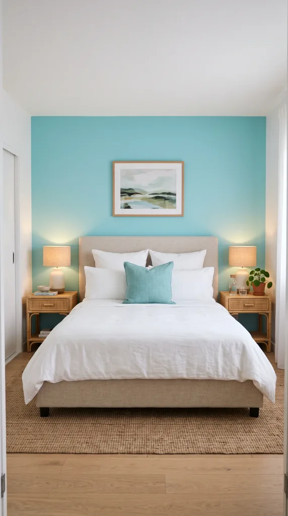
One of the most common mistakes people make with accent walls is choosing the wrong one. In a bedroom, the wall behind the bed is the one that actually matters because your eye goes straight to it the moment you walk in the door, and it frames the bed like a built-in headboard at room scale. An aqua accent wall in this position has an outsized visual impact even if the rest of the room stays completely neutral. Keep the other three walls in a soft white or warm greige, and let the aqua wall do its job. A linen or velvet bed frame in a neutral like oatmeal, charcoal, or even a soft blush works beautifully here because it doesn’t compete with the wall color. Add bedside tables in a natural material like rattan, cane, or light wood, and use table lamps with warm bulbs to soften the contrast between the cool wall and the neutral furnishings. This idea works in small rooms because you get the color without wrapping the whole space in it, which keeps things from feeling heavy. Mid-range effort and cost, since it’s just one wall of paint, but the result looks intentional and well-thought-out.
Pro Move: If your bedroom already has a built-in or panelled wall behind the bed, painting just that section in aqua makes it look like a custom architectural feature rather than a paint decision.
4. Aqua and Gold for a Glam Edge
Aqua and gold is one of those color pairings that designers have leaned on for years, and it continues to show up in editorial spreads because it genuinely delivers. The cool clarity of aqua against the warmth of gold creates a contrast that feels luxurious without being heavy-handed. The approach here is to use aqua as a background, either on the walls or in the bedding, and bring in gold through hardware, lighting, and decorative accessories rather than through furniture upholstery. A brushed gold pendant light or pair of sconces above the bedside tables is one of the highest-impact swaps you can make in a bedroom. Add a gilded mirror above the dresser, gold drawer pulls on a white or painted furniture piece, and a few gold-framed art prints to carry the metal tone through the room. The bed itself can be a simple linen headboard in aqua or a darker teal, and the bedding can mix aqua, white, and warm sand to keep it from looking monochromatic. This is a mid-range to investment-level idea depending on how far you take the lighting and furniture choices, but even small gold accents like decorative objects and frames make a real difference.
Heads Up: Stick to brushed or matte gold rather than shiny polished gold, which can tip into glitzy rather than glamorous and doesn’t age as gracefully in a bedroom setting.
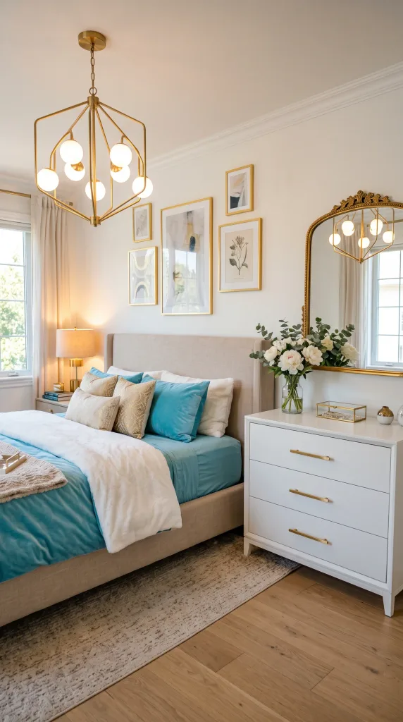
5. Aqua and Coral for a Retro Pop of Energy
Aqua and coral is a combination rooted in mid-century modern and 1950s resort design, and when done well it feels cheerful and energetic without being overwhelming. The key is balance: too much of either color and the room starts to feel like a themed motel room. The approach that works best is to use aqua as the dominant tone, through walls or a large area rug, and bring in coral as an accent through cushions, a throw blanket, a bedside lamp shade, or a piece of artwork. A white platform bed or a simple upholstered headboard in a neutral provides a visual rest between the two colors. Warm wood furniture in a lighter finish like pine or maple reinforces the vintage feel. For lighting, an exposed Edison bulb fixture or a simple rattan shade with a warm-toned bulb suits the retro personality of this palette. In terms of decor style, this reads most naturally in a mid-century modern room or a boho space with some vintage furniture mixed in. It’s worth being honest that this palette has a strong personality and it won’t suit someone who prefers a quiet, neutral bedroom, but for those who love color, it’s one of the most fun combinations to work with.
Reality Check: This palette works best when the coral stays as an accent rather than an equal partner. If coral and aqua appear in roughly equal proportions, the room gets visually loud very quickly.

6. Soft Seafoam Aqua for a Quiet, Minimal Look
Seafoam sits at the lightest, most muted end of the aqua spectrum, and it’s genuinely one of the easier colors to work with in a bedroom because it reads almost like a sophisticated neutral. The tone is delicate enough that it doesn’t need much help. A seafoam wall, or seafoam bedding on a white or cream background, creates a bedroom that feels soft and restful without being boring. The furniture that works here is simple and somewhat understated, things like a white-painted wooden bed frame, clean-lined nightstands, and a low dresser in white or natural wood. Avoid ornate or heavily decorative pieces because they compete with the quietness of the seafoam tone. Lighting should be warm and diffused. Think of a paper globe pendant, a simple linen drum shade, or a ceramic base lamp rather than anything with strong metal or industrial detailing. A soft grey or white cotton rug underfoot keeps the palette cohesive. Woven basket storage, a few green plants, and light cotton curtains complete the look without adding clutter. This is a genuinely calming combination that interior designers often describe in terms of negative space and visual quiet, and it’s particularly well-suited to smaller bedrooms because the light tone keeps things from feeling compressed.
Quick Tip: Seafoam reads very differently on different paint finishes. Use an eggshell finish on the walls rather than matte, because eggshell gives the color a subtle luminosity that flat paint doesn’t.
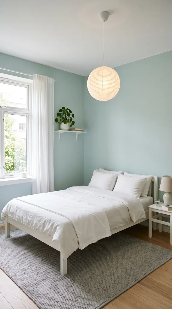
7. Aqua, Navy, and White for a Crisp Nautical Feel
If coastal feels too casual for your taste and you want something with a bit more structure and sharpness, the nautical approach using aqua alongside deep navy and white is worth considering. This isn’t about anchors and rope decor; it’s about the graphic quality of pairing a light aqua with a deep navy in a way that feels clean and pulled together. The structure usually works like this: white walls as the base, a navy bed frame or upholstered headboard as the anchor piece, and aqua coming through bedding, cushions, and textiles to lighten things up. Striped cotton bedding in navy and white with aqua cushions is a classic of this palette done right. Lighting can lean into a slightly industrial or simple style: a black metal sconce or a simple ceramic lamp in navy or white. Flooring matters here. A natural wood floor with a navy or white rug grounds the room without adding another busy element. The wall art that suits this palette includes geometric prints, abstract coastal pieces, or simple framed photographs rather than anything overly decorative. This is a versatile approach that works in both master bedrooms and guest rooms, and it reads as polished rather than casual, which is its main advantage over the lighter coastal version.
Designer Advice: Balance the visual weight carefully. Navy is a heavy color, so make sure your aqua and white elements are present in enough proportion to keep the room feeling light rather than dark.
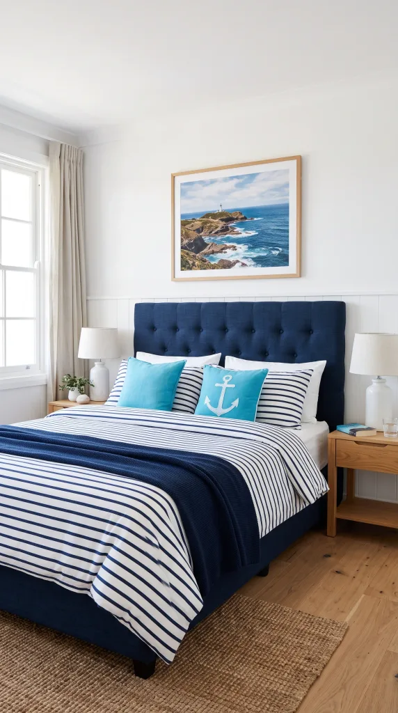
8. Aqua Bedding as the Only Color in a Neutral Room
Sometimes the most effective design decision is also the most restrained one. If you have a bedroom that’s already neutral, with white or greige walls, natural wood furniture, and simple textiles, a set of aqua bedding can be the single color move that makes the whole room feel intentional and finished. The reason this works so well is that the eye has nowhere else to go. All that neutral background directs attention straight to the bed, and the aqua becomes a deliberate focal point rather than a throwaway detail. Choose a high-quality cotton or linen duvet cover in a clear aqua or teal-leaning aqua, and pair it with white or cream pillowcases to keep things from going too flat. Add one or two cushions in a slightly different shade of aqua or in a complementary tone like sand or soft terracotta to add dimension. The rest of the room stays entirely neutral. This approach is genuinely affordable and completely non-committal since bedding is the easiest thing to swap out in any room. It’s also a useful strategy if you’re renting and can’t paint, or if you’re decorating a guest room that needs to feel welcoming without being over-designed.
Pro Move: Buy a duvet cover that’s slightly lighter on the inside and shows just a hint of that when folded back at the top. That layered look adds a sense of depth and craftsmanship that a solid-front cover doesn’t.
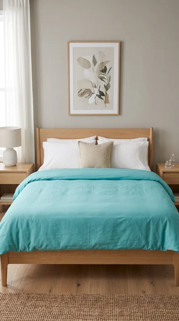
9. Aqua and Blush Pink for a Soft, Romantic Feel
Aqua and blush is one of those combinations that surprises people the first time they see it because on paper the pairing sounds a little unexpected, but in practice it creates a bedroom that feels soft, warm, and genuinely romantic without being saccharine. The reason it works is that blush has a warmth that offsets the cool clarity of aqua, so the two tones meet somewhere in the middle and the room ends up feeling balanced rather than cold or overly sweet. The approach that tends to look best is aqua on the walls or in major textiles, and blush as a secondary through cushions, a throw, a bedside lamp, or a decorative object. A white upholstered bed with mixed aqua and blush cushions is a great starting point. Curtains in a sheer white or very soft blush let natural light in without interrupting the palette. Lighting should be warm, which means a soft-white bulb rather than daylight, to enhance the romantic quality of the room. Floral or botanical prints in soft aqua, blush, and white work well as wall art in this style. This palette is popular in interior design circles right now and reads as current and considered rather than trendy or overdone, but it’s worth noting that it has a distinctly feminine quality that won’t suit every taste or household.
Heads Up: Keep the blush subtle. If the blush starts appearing in furniture upholstery, wall paint, and major textiles all at once, it risks overwhelming the aqua and the room can tip into a candy-coloured feel.

10. Aqua Painted Furniture in an Otherwise White Room
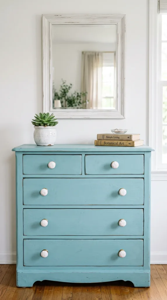
Painting furniture is one of the most underrated ways to introduce color into a bedroom because it’s specific, contained, and reversible with effort. A dresser, bedside table, or wardrobe painted in a bold aqua becomes a statement piece in a room that otherwise stays white or very light. This works particularly well in rooms where the bones are simple and the architecture isn’t doing much, because the painted piece suddenly gives the room a personality and a focal point. Chalk paint in aqua tones is a popular choice among people who do this at home because it adheres well, has a velvety matte finish, and doesn’t require heavy prep work. A wax or matte sealer on top protects the finish without adding shine. In terms of which piece to paint, the dresser tends to have the most visual impact because of its size, but a pair of matching aqua bedside tables on either side of a white bed creates a very intentional, designer-looking result. The rest of the room, walls, bedding, curtains, should stay light and simple so the painted piece has room to be the star. This is a genuinely budget-conscious idea since a tin of chalk paint costs a fraction of new furniture.
Reality Check: Painted furniture does require some maintenance over time. High-traffic surfaces like drawer fronts will show wear, so use a good quality topcoat and be realistic about touch-ups if you go this route.
11. Aqua and Grey for a Cool, Contemporary Look
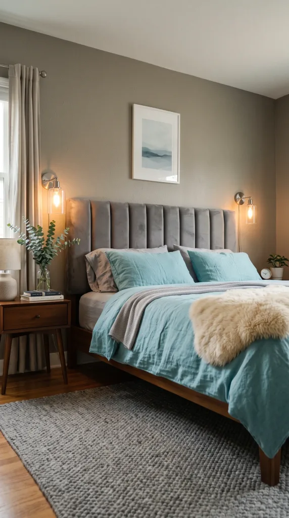
Aqua and grey is a combination that has appeared in contemporary interior design publications and showrooms for years, and it continues to work because the two tones share a cool undertone that makes them feel like they belong together. The pairing tends to feel polished and current without leaning on any single style trend too hard. The structure of this combination usually puts grey in the larger elements, walls in a warm-to-cool grey, a grey upholstered bed frame, or a grey area rug, and brings aqua in through bedding, cushions, artwork, and small decorative pieces. A velvet headboard in a mid-tone grey paired with crisp aqua blue linen bedding is one of those combinations that reads as quiet luxury without requiring an unrealistic budget. Brushed silver or chrome hardware reinforces the cool palette without adding a clashing metal tone. Lighting in this room should be layered: a simple pendant for overhead light, wall sconces for reading, and a small table lamp on the dresser for ambient warmth. One thing to be careful of is that this palette can read a little cold in rooms with north-facing windows or limited natural light, so warming it up with a sheepskin rug, a knitted throw, or some wooden decorative objects is worth considering.
Designer Advice: Introduce at least one warm-toned natural material, like a wood tray, a rattan basket, or a linen cushion in sand, to stop the aqua-grey palette from feeling clinical in low light.
12. Aqua Curtains as the Colour Anchor
Window treatments are one of the most underused tools in bedroom design, which is a shame because curtains cover a significant surface area and have a real effect on how a room feels. Floor-to-ceiling aqua curtains in a bedroom with otherwise neutral walls and furniture create a dramatic, layered look that’s completely different from painting a wall or changing the bedding. The curtains become the color anchor and the room is built around them. Choose a linen or cotton blend in aqua for a look that’s soft and natural rather than formal, and hang the rod as high and as wide as possible so the curtains frame the window generously and make the ceiling feel higher. The furniture and bedding should stay light, white, cream, or natural linen, so the curtains read as deliberate and intentional rather than heavy or mismatched. A wooden or rattan curtain rod rather than a metal one keeps the look relaxed and warm. This is a great option for rental spaces where you can’t paint because the impact is significant and entirely reversible. It’s worth noting that aqua curtains work better in rooms with reasonable natural light; in very dark rooms, the color can look muddy rather than fresh.
Quick Tip: Line your aqua curtains with a white or cream lining. It makes them hang better, protects the fabric from fading, and keeps the color looking fresh and clean from outside.

13. Japandi-Style Aqua Bedroom
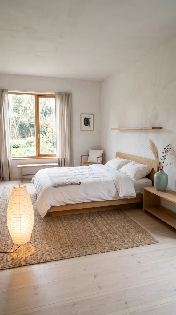
Japandi is the blending of Japanese and Scandinavian design principles, and the result is a style built on restraint, natural materials, craftsmanship, and calm. Bringing aqua into a Japandi bedroom requires a delicate touch because the style is not naturally a colour-forward one. The aqua that works best here is a desaturated, grey-leaning version, something closer to celadon or a very muted teal, rather than a bright or saturated aqua. It appears in small, considered doses: a ceramic vase on a low wooden shelf, a folded linen throw at the foot of the bed in a soft aqua tone, or a single piece of abstract wall art in a blue-green palette. The furniture is low to the ground, minimal, and made from natural materials like light oak, bamboo, or pale ash. The bed frame is simple, without a headboard or with a very low, clean-lined one. Bedding is white, cream, or very pale grey, and the textures carry the warmth: a brushed cotton duvet, a linen cushion, a wool throw. Lighting comes from paper or fabric-shaded floor lamps and simple ceramic-base table lamps with warm bulbs. This is an idea for someone who loves calm, considered spaces and wants to add a breath of color without disturbing the quiet.
Pro Move: In a Japandi room, the aqua should feel like it arrived naturally rather than being placed there on purpose. One beautifully chosen ceramic in the right tone does more than ten accessories in a similar color.
14. Aqua and Terracotta for an Earthy, Bohemian Pairing
Aqua and terracotta are complementary in the way that matters most in interior design: they’re warm and cool, earthy and fresh, grounded and airy, all at the same time. This combination has been showing up heavily in the bohemian and eclectic design world, and for good reason. The pairing feels lived-in and globally influenced in the best way. The approach here is to give aqua the walls or a large textile like a rug or duvet, and let terracotta come through in clay pots, a woven cushion, a cotton throw, or even a terracotta-toned bedside lamp. A macramé wall hanging in natural cotton, a jute rug in warm brown-orange tones, and a mix of woven baskets for storage all reinforce the bohemian quality of the palette. The bed frame can be wooden in a dark or medium finish, a rattan frame, or a simple upholstered piece in off-white. Plants, both hanging and tabletop, are essential in this style because they bridge the aqua and terracotta with natural green tones. This palette is genuinely warm and welcoming and reads well in rooms with varied light conditions, which makes it one of the more forgiving combinations on this list.
Heads Up: Balance the proportions carefully. Terracotta is a warm, heavy tone, so keep it in smaller quantities than the aqua to avoid the room feeling too dark or cave-like.

15. Aqua Ceiling for a Surprise Overhead Detail
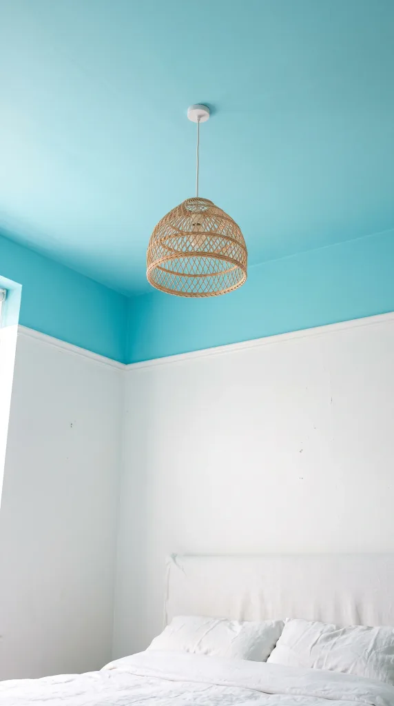
Painting the ceiling is something most people have thought about and then talked themselves out of, but in a bedroom it’s one of the most interesting and relatively low-cost ways to add color in a place that no one else does. An aqua ceiling in a bedroom with white walls creates a canopy effect, as if the room is open to a clear sky, and it adds a depth and intimacy that flat white ceilings simply don’t. The technique works best when the walls are crisp white or very light, because the contrast between the ceiling and the walls is what makes the move feel intentional rather than accidental. The furniture and bedding can be entirely neutral, letting the ceiling carry the design. One thing that makes an aqua ceiling work particularly well is a simple, beautiful light fixture in the center, a rattan pendant, a white paper globe, or a simple brass fitting with exposed bulbs, because the fixture sits against the colored ceiling and becomes part of the composition. This idea genuinely does shift how a room feels when you’re lying down, and that upward-facing view is actually one you spend a lot of time looking at in a bedroom. It’s worth noting that low ceilings benefit most from lighter aqua shades, while higher ceilings can handle a deeper, more saturated tone.
Reality Check: Cutting in a ceiling color neatly against white walls requires patience and a steady hand. Use a good quality angled brush and painter’s tape, and accept that it will probably take two coats to get an even result.
16. Aqua and Black for a Bold, Graphic Bedroom
This is not a combination for the faint-hearted, but for those who love a room with graphic contrast and a modern edge, aqua and black delivers. The combination works because black gives aqua definition and sharpness that it doesn’t get when paired with soft neutrals, and the result is a bedroom that feels confident and contemporary. A black metal bed frame or a matte black upholstered headboard is the anchor piece, and aqua comes through the bedding, cushions, and a key wall. The wall behind the bed might be aqua, or alternatively, the walls could stay white and the aqua lives entirely in the textiles. Black pendant lights or sconces work as both functional and decorative elements. A patterned rug in black, white, and aqua, geometric or abstract, pulls the palette together underfoot. Artwork matters in this style: a large black-framed print or a graphic black-and-white photograph with an aqua mat makes the art feel considered. This approach is better suited to larger rooms because the black elements add visual weight that can feel heavy in a small space. It’s also an honest investment in fixtures and furniture if done properly, though the textiles alone can hint at the palette without a full commitment.
Designer Advice: If you’re nervous about this palette, start with a black bed frame and aqua bedding before committing to a colored wall. That combination alone has a lot of impact and you can build from there.

17. Aqua Wallpaper with a Pattern
Wallpaper has had a genuine comeback in interior design over the last several years, and an aqua-toned pattern on a bedroom wall, specifically the one behind the bed, creates a look that paint simply cannot replicate. The texture, depth, and detail of a well-chosen wallpaper adds a layer of craftsmanship and personality that immediately elevates a room. Botanical prints in aqua and white, geometric patterns in aqua and navy, or abstract painterly designs with aqua as the dominant tone all work well depending on the style of the room. The furniture and bedding should stay simple and relatively neutral, because a patterned wallpaper is already doing a lot of visual work and doesn’t need competition. A white or cream linen bed frame, simple nightstands, and unfussy bedding let the wallpaper be the centerpiece. Wallpaper also tends to be a more significant investment than paint, both in cost and in installation effort, so it’s worth treating it as a considered decision rather than an impulse. Peel-and-stick wallpaper options have improved significantly and offer a lower-commitment alternative that works on smooth walls in good condition.
Quick Tip: Order a sample panel before committing to a full wallpaper purchase. Patterns that look subtle in a small swatch can be overwhelming at scale, and the reverse is also true.

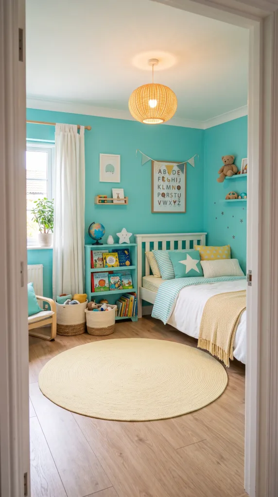
18. Aqua in a Kids’ Bedroom with Playful Layering
Aqua is one of the most versatile colors for a child’s bedroom because it works for any age, reads as cheerful without being garish, and pairs easily with almost any accent color you want to bring in as their tastes change. The key in a kids’ room is layering the aqua across different materials and in different shades so the room feels playful and rich rather than flat. Aqua walls, a white or natural wood bed, and mixed aqua, yellow, and white bedding creates a palette that works for young children but can be refined as they get older by simply swapping the bedding and accessories. Painted furniture in aqua, like a bookcase or a small desk, doubles as both functional storage and a color statement. Woven cotton storage baskets, a soft rug in a complementary color, and a fun pendant light in a simple white or rattan shade keep the room feeling warm and comfortable. In practice, aqua in a kids’ bedroom holds up well because it reads as neither too babyish nor too grown-up, and parents consistently find it easier to redecorate around than primary red or bright yellow.
Pro Move: Keep the large fixed elements like furniture and walls in aqua and save the bolder accent colors for bedding and accessories. When tastes change, you can swap the accent pieces without repainting.
19. Aqua Headboard as a Standalone Statement
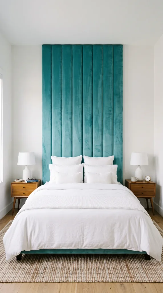
If you’re not ready to commit to a full room redesign but you want one piece that has genuine visual impact, an aqua upholstered headboard is one of the most effective single-piece purchases you can make for a bedroom. An upholstered headboard in a rich aqua velvet or a textured aqua linen becomes the centerpiece of the bed and, by extension, the whole room. The rest of the space can stay almost entirely neutral, white walls, white or cream bedding, wood or white furniture, and the headboard does all the work. The quality of the material matters here more than in most other ideas on this list, because the headboard is both something you see and something you touch. Velvet in aqua has a depth and richness that photographs beautifully and feels luxurious in person, though it does attract pet hair and requires occasional brushing. Linen or a linen-look fabric in aqua is more practical and has a more relaxed, contemporary personality. The headboard should be appropriately proportioned for the bed size: a tall, floor-to-ceiling style panel works beautifully in rooms with high ceilings, while a standard padded headboard suits a more modest space.
Heads Up: Velvet aqua headboards can fade near windows with significant sun exposure. Position the bed away from direct sunlight or add UV-filtering window film if sun is an issue.
20. Art Deco Aqua Bedroom
Art Deco as a design style brings together geometric precision, rich materials, and bold color in a way that feels glamorous and theatrical. Aqua works beautifully in an Art Deco bedroom when it’s paired with the style’s signature materials and motifs: mirrored furniture, geometric patterns, brass hardware, and rich fabrics like velvet and satin. An aqua velvet bed frame in an architectural shape, perhaps with a tufted or geometric panel detail, is the anchor piece. The nightstands should be mirrored or lacquered in a high-gloss finish, and the hardware throughout the room should be brass or gold-toned. Wall art in geometric shapes, framed in gold or brass, reinforces the style. The bedding can be aqua and white in a sateen or high-sheen cotton for a subtle nod to the rich fabrics of the period. Lighting is one of the most important elements in an Art Deco room: a sculptural wall sconce in brass or a multi-arm brass ceiling fixture with globe bulbs carries the era’s aesthetic into a functional light source. This is an investment-level look, both in terms of furniture quality and styling effort, and it works best in rooms with relatively high ceilings and reasonable proportions.
Reality Check: Committing to Art Deco means committing to the details. Half-hearted attempts tend to miss the mark. Focus on one or two investment pieces done properly rather than filling the room with vague references.

21. Wabi-Sabi Aqua Bedroom with Imperfect Textures
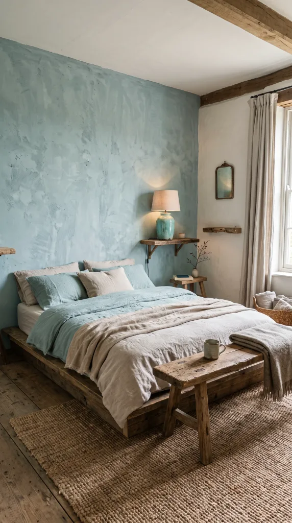
Wabi-sabi is a Japanese aesthetic philosophy that celebrates imperfection, impermanence, and the beauty of natural, worn, and handmade things. It sounds abstract, but in practice it looks like a bedroom with organic shapes, textured plaster walls, handmade ceramics, worn linen, and a color palette drawn from nature. Aqua, in its most muted and complex form, fits this aesthetic perfectly because it recalls aged ceramic glazes, weathered sea glass, and the colour of shallow coastal water. In a wabi-sabi bedroom, the aqua might appear in a hand-thrown ceramic lamp base, a slightly uneven piece of pottery on a shelf, a linen throw in a faded blue-green, or as a limewash paint effect on one wall. The furniture is natural, simple, and often carries some evidence of its age or handmaking, things like a rough-hewn wooden bench, a linen-covered mattress on a low platform bed, a jute rug with an irregular weave. Nothing in this room is perfect, and that’s precisely the point. It’s a genuinely restful aesthetic and one that interior designers note is gaining momentum as people move away from over-styled, Instagram-perfect spaces.
Designer Advice: Limewash paint in an aqua or blue-green tone is one of the most effective ways to bring the wabi-sabi feel to a bedroom wall. The natural variation in the finish is exactly right for this aesthetic.
22. Deep Teal-Aqua for a Moody, Intimate Master Bedroom
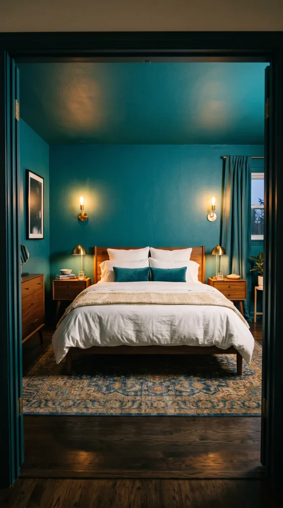
This last idea sits at the deeper, richer end of the aqua spectrum, somewhere between a bright aqua and a dark teal, and it’s the right move when you want a bedroom that feels intimate, cocooning, and genuinely dramatic. Wrapping all four walls, and possibly the ceiling, in a deep teal-aqua creates a room that feels intentionally enclosed in the best way, like a jewel box. This is a look that has been gaining real traction among interior designers who work on master bedrooms because it creates a completely different experience from the bright, airy bedroom most people default to. The furniture works best in warm natural materials, brass, walnut, velvet in ochre or rust, to counterbalance the cool depth of the walls. White bedding is the most common choice here because the contrast between the deep walls and the bright white bed creates a crisp, hotel-quality focal point. Lighting is critical in a room this dark: layer multiple sources including wall sconces, table lamps, and possibly under-bed lighting or strip lighting behind a bedhead panel to keep the room feeling warm rather than shadowy. This is not suitable for small bedrooms or rooms with very limited natural light, but in the right space it’s one of the most impressive bedroom looks you can achieve.
Pro Move: Do a full lighting audit before committing to this palette. A deep teal-aqua room with inadequate lighting will feel oppressive. Plan for at least three separate light sources before you open a single tin of paint.
Final Thoughts
Aqua is one of those colors that rewards thoughtful use. Whether you’re going all-in with a dark teal wrap-around room or just slipping in a set of aqua bedding on a neutral bed, the key is always the same: make a decision and commit to it properly. Half-measures in color design are what make rooms feel unfinished or uncertain, and aqua is a color that reads beautifully when it’s allowed to be what it is.
The ideas in this guide span a wide range of styles, budgets, and commitment levels on purpose, because not everyone is ready to paint a wall and not everyone wants to stop at a cushion. The best bedroom is one that reflects how you actually want to feel in it, and if that means a calm, seafoam-toned sanctuary with a rattan pendant and linen bedding, or a bold Art Deco room with velvet, brass, and a saturated aqua headboard, both are valid and both can be done well. Start with the one that makes you feel something and build from there.
Frequently Asked Questions
What colors go best with aqua in a bedroom?
Aqua pairs well with a wide range of colors depending on the mood you’re after. White and cream create a clean, coastal feel. Warm wood tones add balance and warmth. Gold and brass bring a glamorous edge. Blush pink creates a romantic softness. Navy adds crispness and structure. Terracotta and coral give a warmer, more bohemian result. Grey reads as cool and contemporary. The key is to decide on your overall mood first, then choose the pairing that supports it.
Is aqua a good color for a bedroom?
Yes, aqua is a genuinely good choice for bedrooms. It sits in the blue-green family, and both blue and green have well-documented associations with calm and relaxation. Aqua is also versatile enough to work in multiple design styles, from minimal and Japandi to coastal and glam. The shade you choose matters though: lighter, greyer aquas tend to read as soft and restful, while brighter or deeper aquas have more energy and drama.
How do I use aqua without it looking too trendy or dated?
The best way to keep aqua from feeling like a passing trend is to use it in classic combinations and quality materials rather than overly themed or novelty applications. Aqua walls with warm wood furniture, aqua bedding with white linen, or a single aqua painted piece in a neutral room all tend to age well because they’re grounded in good basic design principles rather than a specific trend moment.
What is the difference between aqua, teal, and turquoise?
These terms are often used interchangeably but they do have distinctions. Aqua sits fairly evenly between blue and green and tends to have a clear, fresh quality. Turquoise leans slightly more blue and is generally brighter. Teal is darker and more saturated, with a richer, deeper quality. In practical bedroom terms, aqua tends to read as light and airy, teal reads as moody and rich, and turquoise reads as bright and vibrant.
Can aqua work in a small bedroom?
Yes, aqua can work very well in a small bedroom, particularly in lighter, more muted shades. A soft seafoam or pale aqua on the walls will make a small room feel fresh and open rather than closed in. If you want to use a deeper aqua in a small room, an accent wall behind the bed is the most effective approach since it adds color impact without wrapping the whole space in a heavier tone.
What kind of lighting works best in an aqua bedroom?
Warm-toned bulbs, around 2700K to 3000K color temperature, generally work best in aqua bedrooms because they soften the cool undertone of the color and prevent the room from feeling clinical or cold. Layered lighting with multiple sources, including a ceiling pendant, bedside lamps, and possibly a floor lamp, gives you control over the mood at different times of day and is a standard recommendation from interior designers for any bedroom with a dominant color.