Brilliant Blue and Yellow Nursery Ideas That Actually Work
Designing a nursery is one of the most exciting parts of preparing for a new baby, but choosing the right color palette can feel overwhelming when you want something that is both soothing and cheerful. A blue and yellow color scheme is a classic, gender-neutral choice that perfectly balances the calming, sleep-inducing qualities of cool tones with the happy, energetic warmth of sunshine shades. I have noticed that many parents struggle to get this specific combination right, often ending up with a room that feels either too chaotic or strongly resembles a primary school classroom. The secret to mastering this palette is understanding contrast, saturation, and exactly where to apply each color so they complement rather than compete with one another. In my experience, relying on a solid neutral base like soft white or warm grey provides the necessary breathing room that allows your blue and yellow accents to truly shine.
When you start buying furniture, rugs, and paint, you will quickly realize that there are countless ways to interpret a blue and yellow theme. You must consider how much natural light the room receives, as dark navy can easily overpower a dim space, while bright lemon yellow can become blindingly intense in a south-facing room. Too often, people buy matching blue and yellow bedding sets that look overly themed and lack the sophisticated, layered texture that makes a room feel professionally designed. The comparison ideas below are structured to help you weigh different design approaches, highlighting why one method usually works better than the other in a real-world nursery setting. Whether you want a moody, sophisticated space or a bright, coastal retreat, these practical insights will help you build a beautiful room that can easily grow with your child.
Navy Walls vs. Mustard Walls
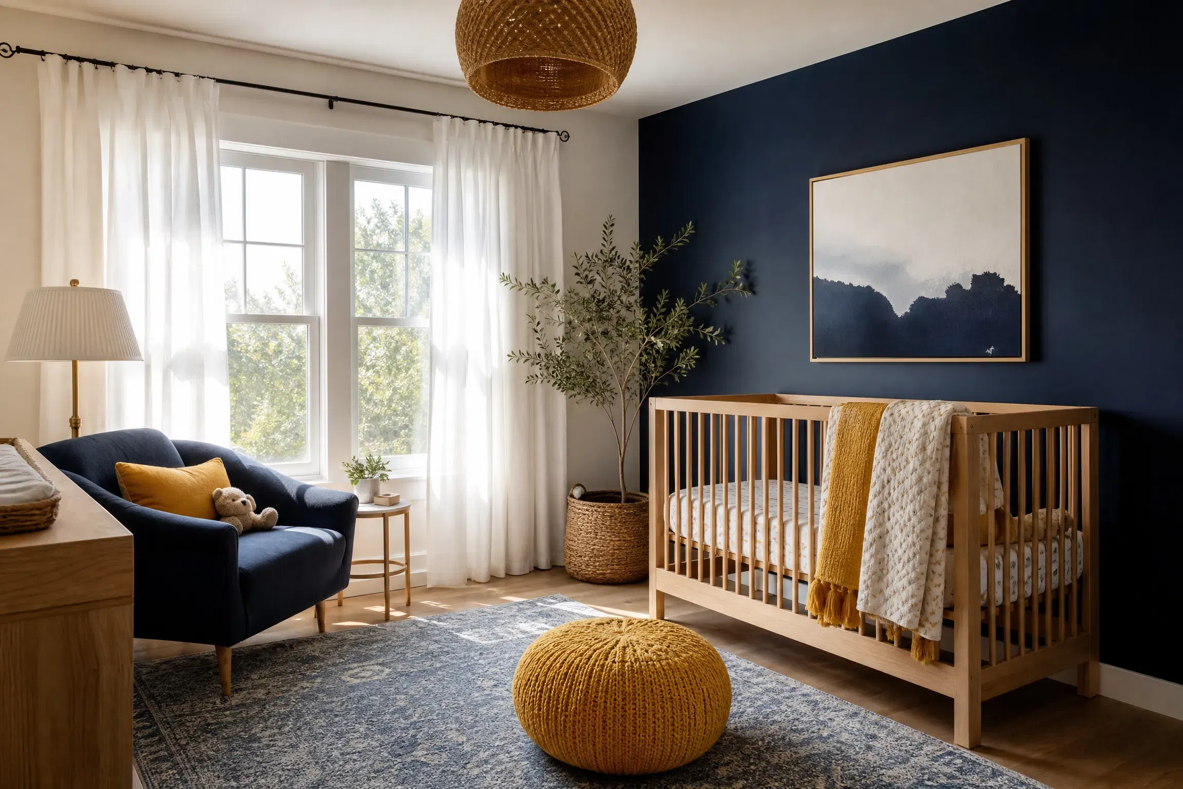
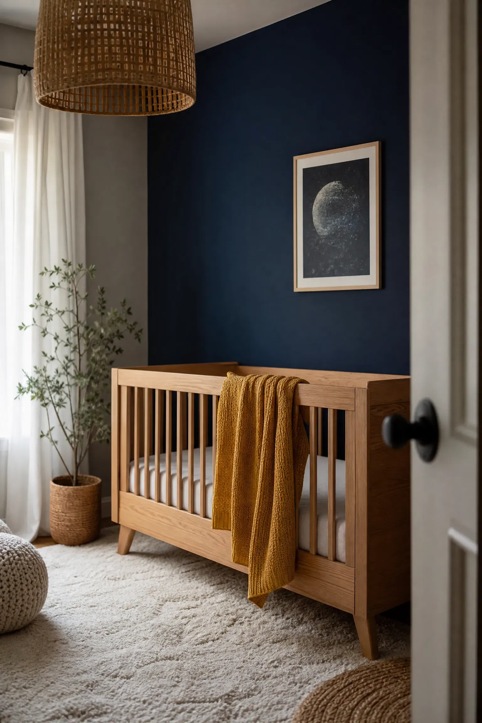
When deciding between painting the nursery walls navy blue or mustard yellow, painting them navy is almost always the better choice for a sleep-focused environment. A dark blue backdrop provides a naturally calming, womb-like atmosphere that encourages healthy sleep patterns, whereas bright yellow walls can overstimulate a baby and make nap time significantly more difficult. You should pair these dark navy walls with a natural oak crib and crisp white linen curtains to prevent the room from feeling like a cave. If you want to introduce yellow, do so through smaller textiles like a golden knitted throw or a patterned changing pad cover, which adds warmth without overwhelming the senses. This approach is highly affordable and allows you to easily swap out the yellow accents for a different color as your child grows.
Pro Move: Use a flat or matte paint finish for navy walls to absorb light and create a soft, velvety texture that hides drywall imperfections.
Painted Ceiling vs. Painted Trim
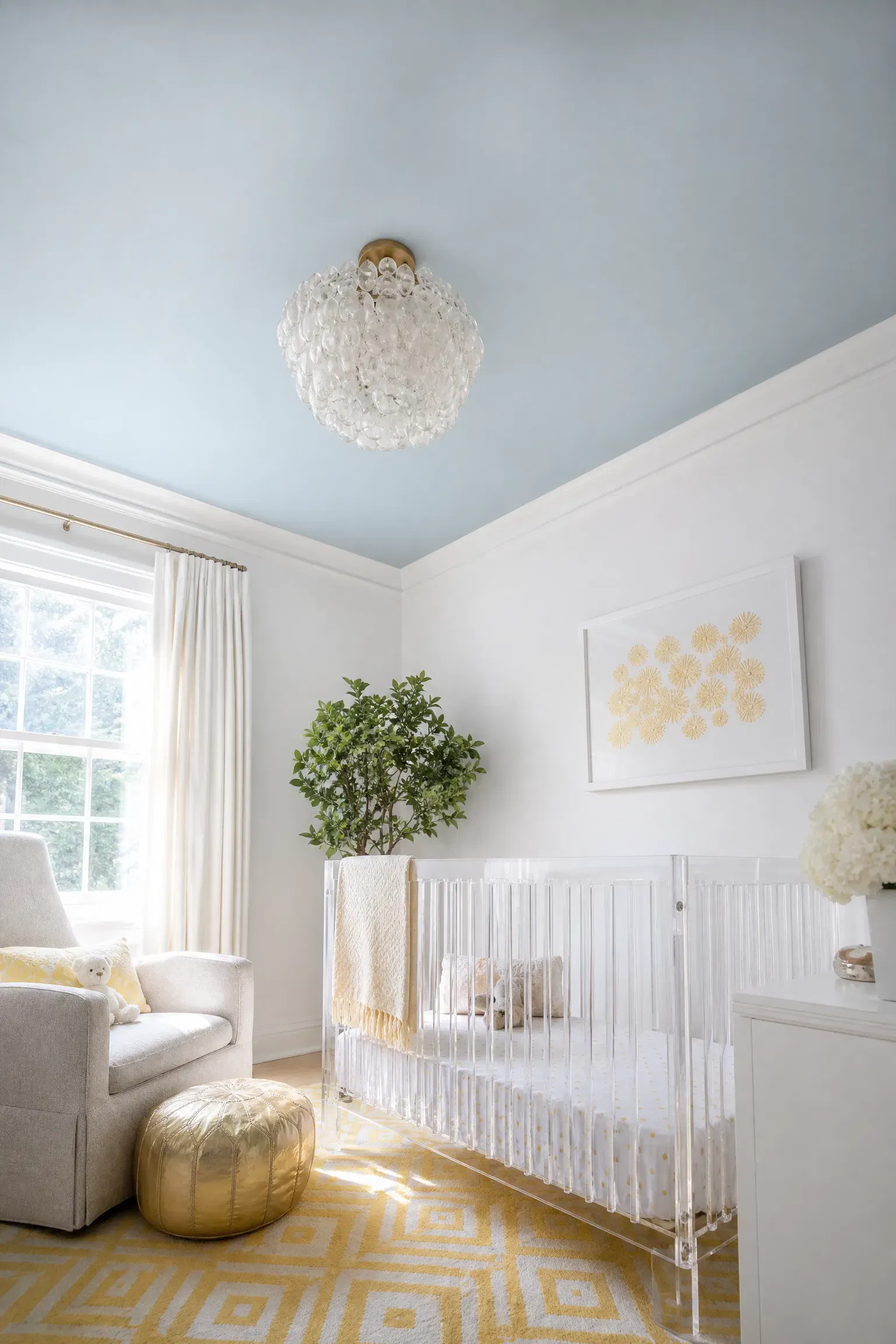
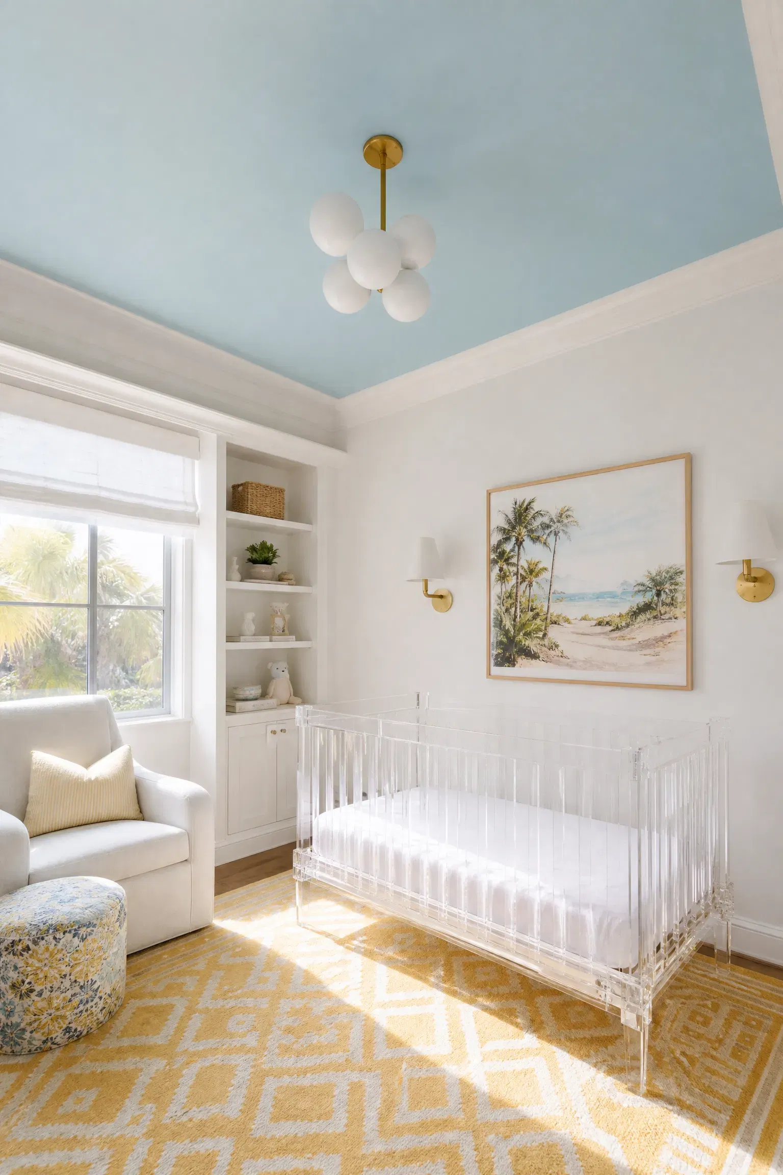
If you want to add a subtle pop of sky blue to a mostly white room, painting the ceiling is generally a much stronger design choice than painting the baseboards and window trim. A pale blue ceiling draws the eye upward, mimicking the natural sky and giving the baby something visually soothing to look at while lying in the crib. Conversely, painting the trim blue often makes a room look choppy and visually shrinks the wall height, especially in smaller nurseries. You can pair the painted ceiling with a soft yellow geometric rug and a modern acrylic crib to keep the entire space feeling light, airy, and contemporary. This is a budget-friendly weekend project that delivers massive architectural impact without requiring you to commit to fully colored walls.
Designer Advice: Carry the ceiling paint down the top two inches of the wall to create a clean, seamless horizon line that feels highly intentional.
Yellow Glider vs. Blue Glider
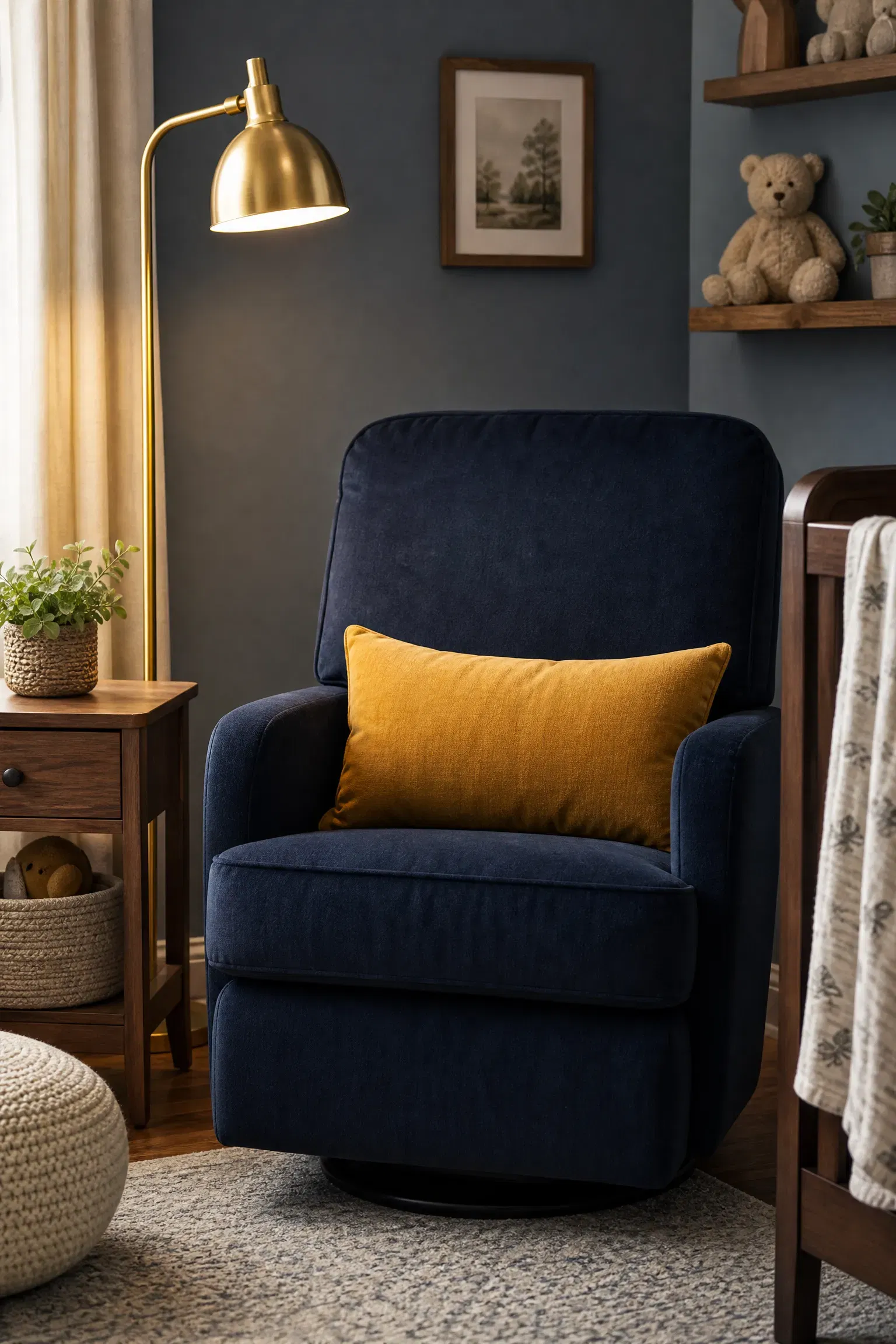
When investing in a comfortable rocking chair or glider, choosing a dark blue upholstered chair is far more practical than buying a bright yellow one. In practice, nursery seating takes a massive beating from spilled milk, spit-up, and daily wear, making a dark navy or denim-colored fabric much better at hiding inevitable stains. While a yellow chair might look incredibly cheerful on a Pinterest board, it will likely require constant professional cleaning to maintain its vibrant appearance. You can easily satisfy the color scheme by tossing a washable yellow lumbar pillow onto the dark blue chair, giving you the best of both worlds. A blue glider pairs beautifully with a warm walnut side table and a brass floor lamp, creating a highly functional and sophisticated feeding corner.
Reality Check: Always choose a high-performance, stain-resistant velvet or microfiber fabric for your glider, regardless of which color you ultimately select.
Blue Painted Crib vs. Natural Wood Crib
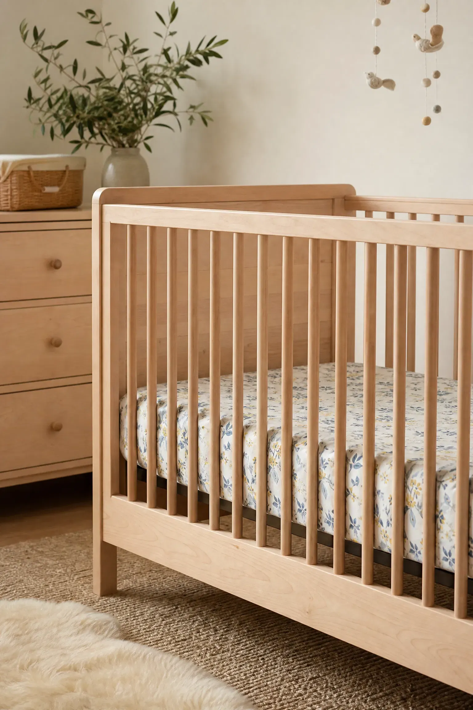
Between choosing a custom blue painted crib or a natural wood crib, the natural wood option provides far more longevity and versatility for the space. A solid maple or birch crib grounds the blue and yellow color scheme with necessary organic texture, preventing the room from looking like a plastic toy box. While a painted blue crib is certainly a fun statement piece, it heavily locks you into a specific color palette that you might want to change when transitioning to a toddler room. You should pair the natural wood crib with a fitted sheet featuring a delicate blue and yellow botanical print to tie the room’s colors together effortlessly. Wood furniture sits in a higher budget bracket, but the durability and timeless appeal make it a much smarter long-term investment.
Quick Tip: Match the wood tone of your crib to your dresser and floating shelves to ensure the room feels cohesive and professionally curated.
Wallpapered Accent Wall vs. Half-Painted Wall
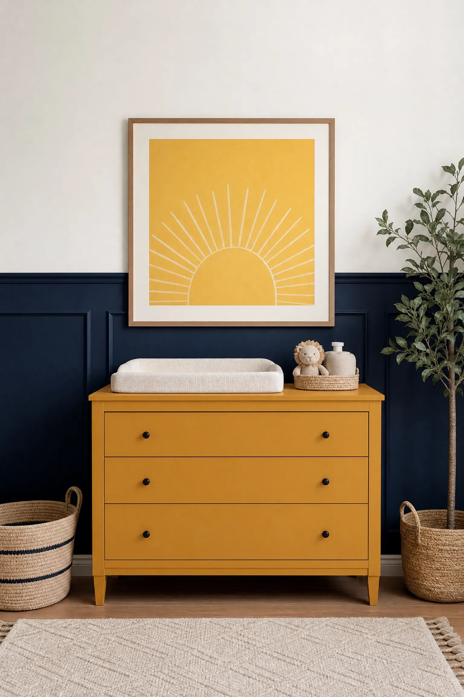
If you are debating between a blue and yellow wallpapered accent wall or a two-tone painted wall, the half-painted wall usually offers a more restful environment for a nursery. A bold wallpaper featuring both colors can quickly become visually exhausting and chaotic, whereas painting the bottom half of the wall navy and the top half white provides a highly structured, tailored backdrop. I find this painted approach works perfectly when you hang a single, oversized piece of framed yellow artwork directly above the dividing line to introduce the secondary color. This painted wainscoting effect costs significantly less than high-end wallpaper and is entirely foolproof for DIY beginners. Pairing this wall treatment with a mustard yellow changing table adds a fantastic punch of color that remains anchored below eye level.
Heads Up: Use a laser level and high-quality painter’s tape to ensure the dividing line between your painted colors is razor-sharp and perfectly straight.
Yellow Curtains vs. White Curtains
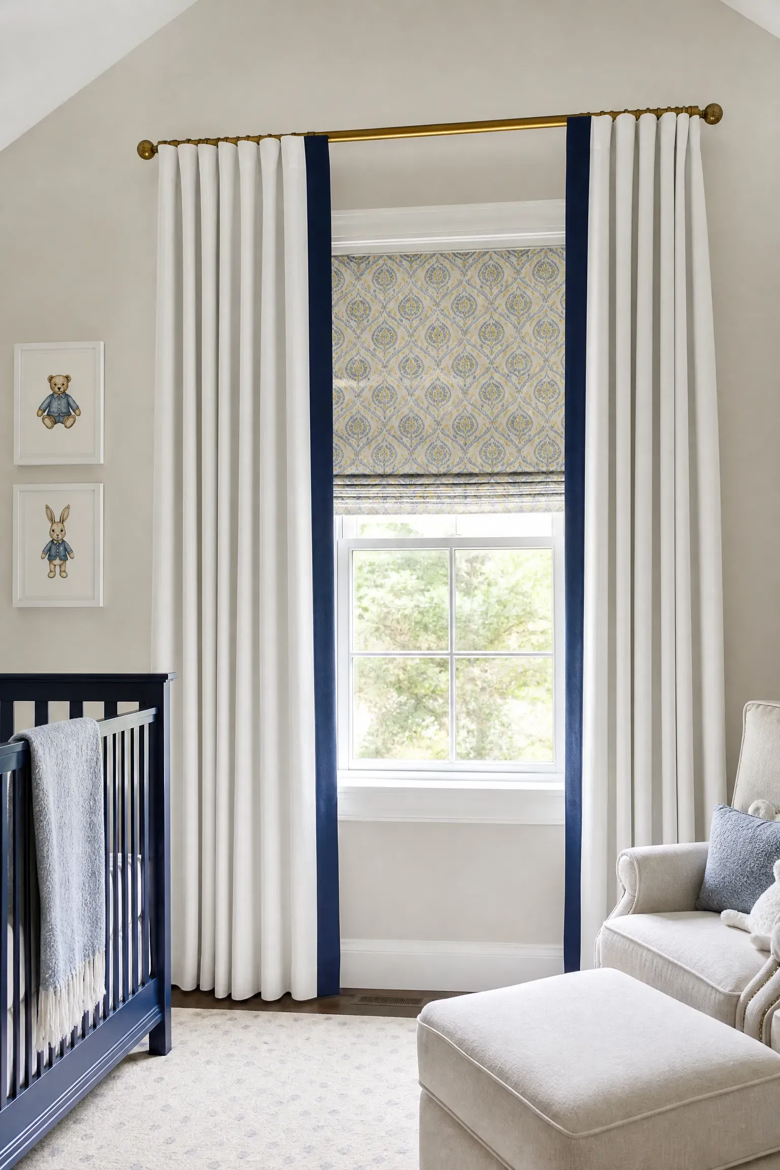
When selecting window treatments to complete the room, sticking with thick white blackout curtains is functionally superior to hanging bright yellow drapes. While yellow curtains glow beautifully in the morning sun, they inadvertently bathe the entire nursery in a stimulating, energizing yellow light that can easily wake a sleeping baby too early. Crisp white blackout curtains provide necessary darkness for daytime naps while keeping the room feeling fresh, neutral, and classic. To incorporate your theme, you can add a thick navy blue border to the leading edge of the white curtains or use decorative yellow tassel tiebacks. You should pair these clean white curtains with a blue and yellow patterned Roman shade mounted underneath for a highly layered, custom-window treatment that looks very expensive.
Pro Move: Hang your curtain rod at least six inches above the window frame to make the nursery ceilings feel significantly taller.
Patterned Area Rug vs. Solid Color Rug
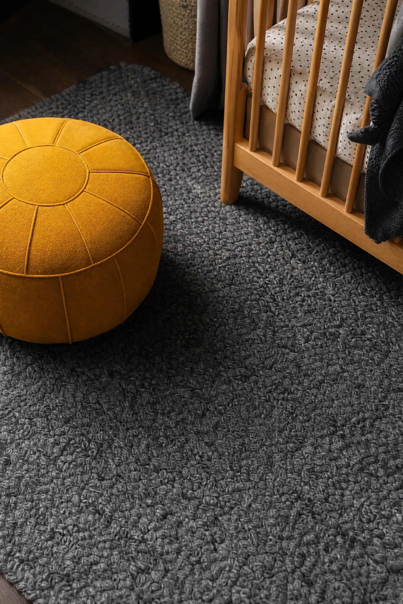
Deciding between a rug that heavily features a blue and yellow pattern versus a solid colored rug leans heavily in favor of the solid option. A rug with a busy, two-tone geometric pattern often fights for attention with the crib bedding and wall decor, making the small room feel overwhelming. I always recommend using a solid, highly textured navy blue or slate grey rug because it hides lint and stains flawlessly while anchoring the brightly colored furniture pieces sitting on top of it. You can pair this dark, solid rug with a vibrant mustard yellow pouf or ottoman to introduce the warm accent color right at floor level. Solid wool rugs sit in a mid-range budget but offer incredible softness and durability for a baby learning to crawl.
Designer Advice: Ensure your area rug is large enough that at least the front two legs of the crib and the glider rest comfortably on top of it.
Yellow Dresser vs. Blue Dresser
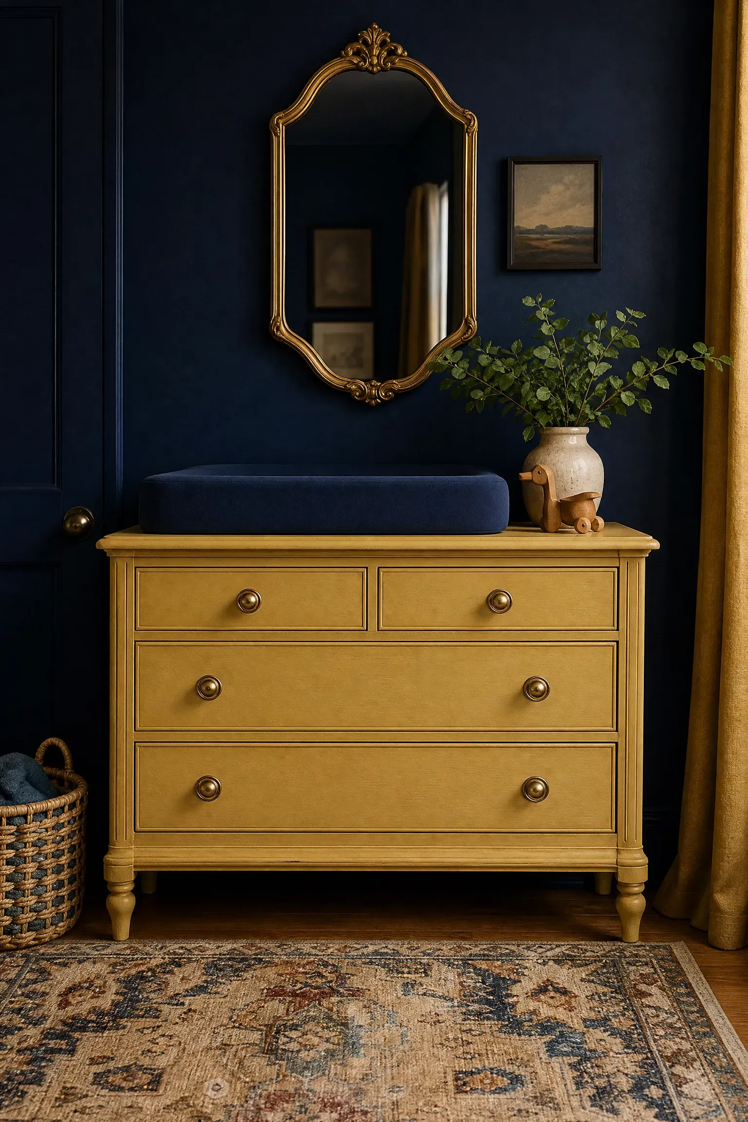
If you want to use a brightly painted dresser as a changing station, a muted mustard yellow dresser brings much more joy to the room than a dark blue one. Because the walls or rugs in a blue and yellow room are typically dark blue, introducing a yellow dresser creates a brilliant, sunny focal point that breaks up the moody tones. In practice, pairing a vintage, freshly painted yellow dresser with modern brass drawer pulls elevates the piece from looking childish to feeling highly chic and intentional. You can easily achieve this look on a tight budget by sanding and painting a thrifted solid wood dresser over a single weekend. Keeping a simple navy blue changing pad on top balances the color blocking perfectly.
Reality Check: Use a durable, self-leveling cabinet enamel rather than standard wall paint to ensure the dresser surface resists scratching from diaper caddies.
Open Shelving vs. Closed Cabinetry
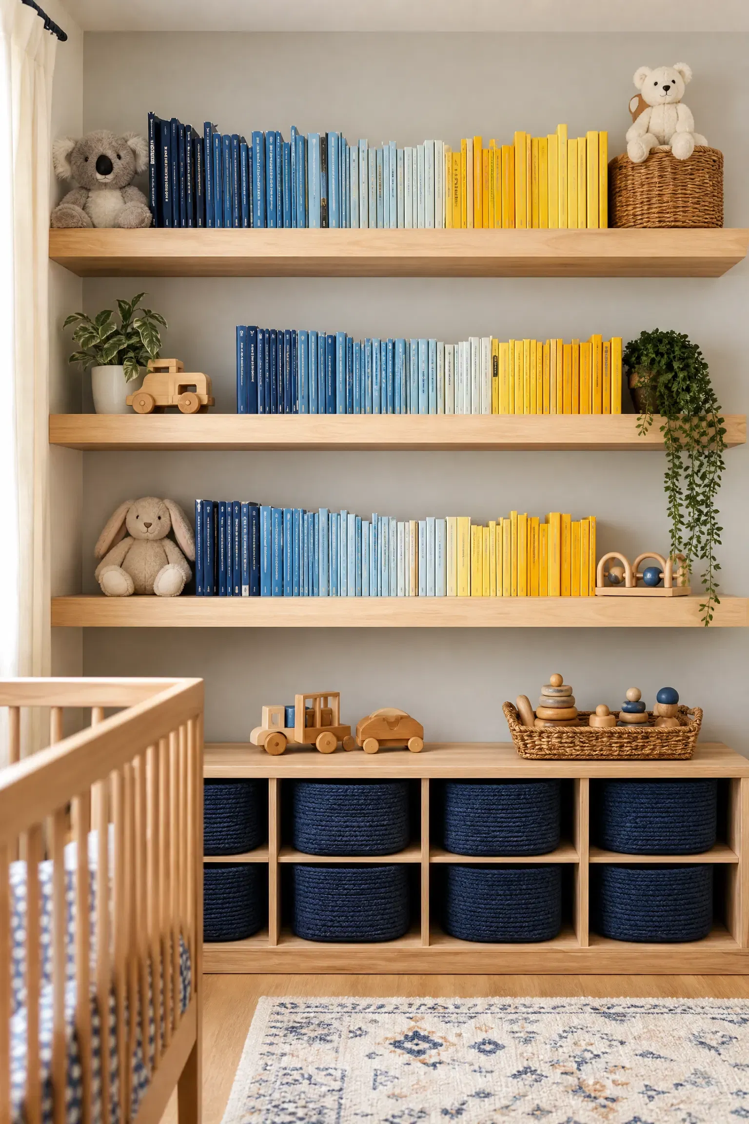
When organizing books and toys, installing open floating shelves is far better for a nursery than using heavy, closed wooden cabinets. Open shelves allow you to display beautifully illustrated children’s books, many of which naturally feature primary blues and yellows, turning your everyday clutter into a thematic art display. Closed cabinetry, while great for hiding ugly plastic toys, tends to make a small bedroom feel boxed-in and visually heavy. You should pair natural ash wood floating shelves with a set of navy blue woven storage baskets placed underneath to catch the less attractive items. This highly affordable approach encourages reading and provides easily accessible stimulation for a growing toddler.
Quick Tip: Group books on the shelves strictly by spine color, creating a rainbow effect that emphasizes your blue and yellow color palette.
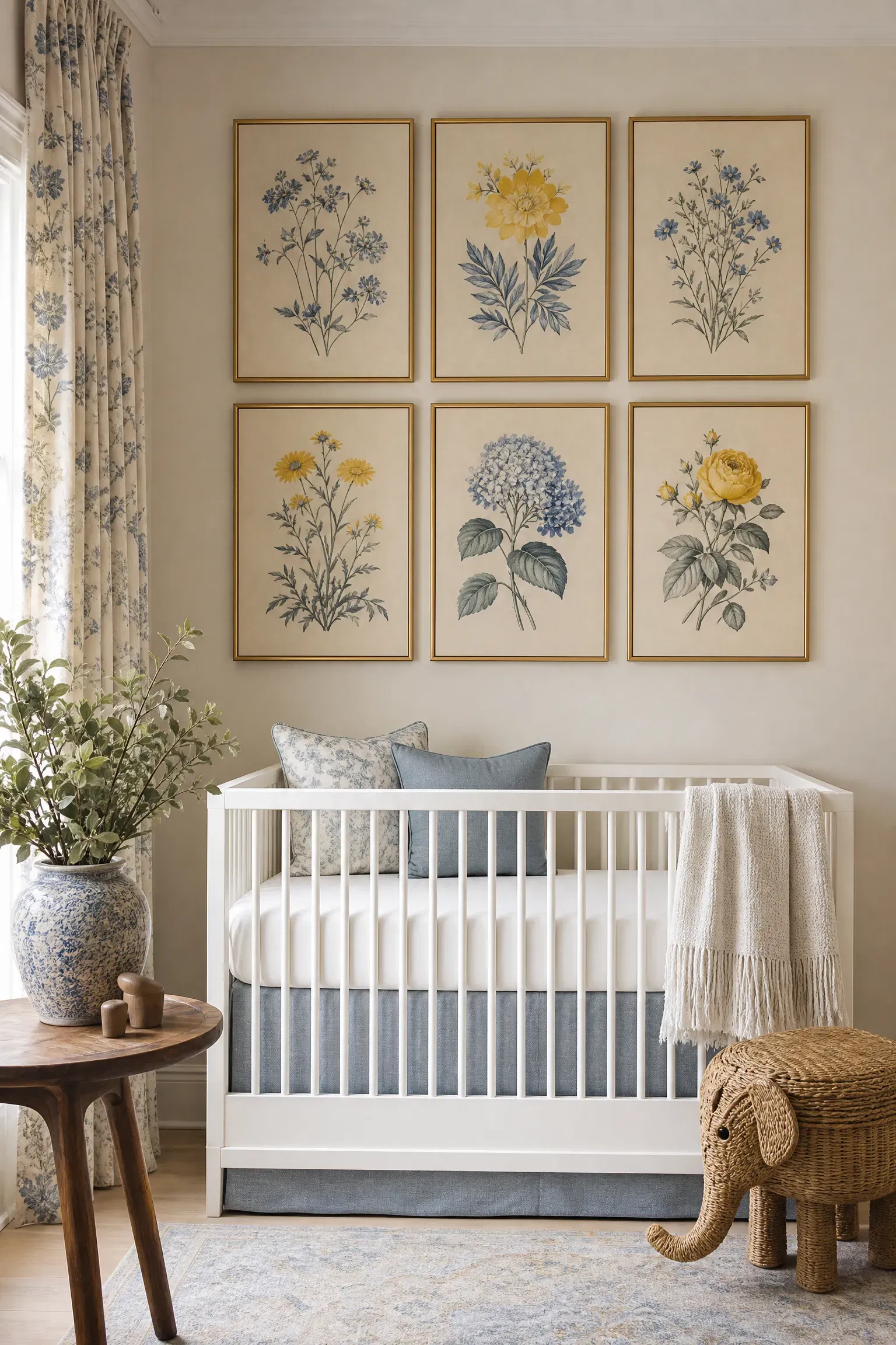
Themed Wall Decals vs. Framed Art
Between covering the wall in blue and yellow nautical decals or hanging a curated gallery of framed art, the framed art is a much smarter design choice. Decals can look cheap if not applied perfectly, and they are notorious for peeling at the edges over time, whereas framed art instantly makes a nursery feel sophisticated and finished. I love sourcing digital downloads of vintage botanical prints in blue and yellow hues and placing them in identical thin gold frames. This mid-range budget project allows you to easily swap the artwork as the child ages without ever needing to patch or scrape the drywall. You can pair the gallery wall with a sleek, minimalist crib to ensure the art remains the undisputed star of the room.
Heads Up: Always use lightweight acrylic instead of real glass in frames hung anywhere near a crib or changing table for obvious safety reasons.
Woven Baskets vs. Plastic Bins
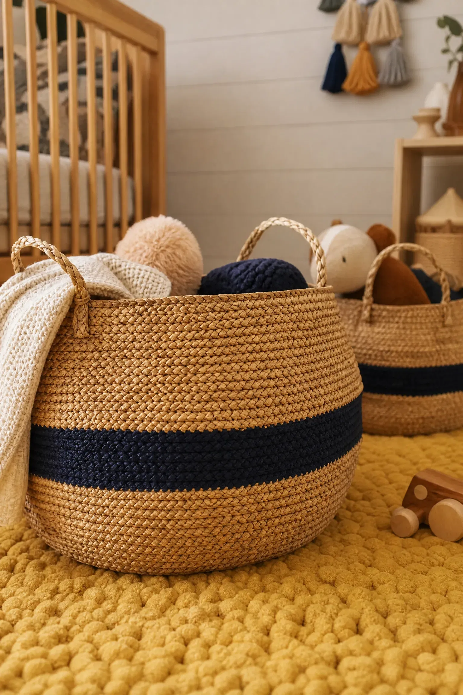
For storing extra blankets and stuffed animals, utilizing natural woven sea-grass baskets is vastly superior to using brightly colored plastic storage bins. Plastic bins instantly make the room feel like a commercial daycare center, while woven baskets introduce essential organic texture that softens the high contrast of a blue and yellow room. When working with clients, I always suggest finding baskets that feature a navy blue dyed stripe woven into the natural grass to subtly reinforce the room’s color scheme. You should pair these earthy baskets with a soft, tufted yellow rug to create a highly tactile, comfortable floor area for playtime. This is a budget-friendly detail that adds a huge amount of sophisticated warmth to the nursery.
Pro Move: Buy baskets that are at least twice as large as you think you need, as baby toys are bulky and accumulate incredibly quickly.
Brass Hardware vs. Black Hardware
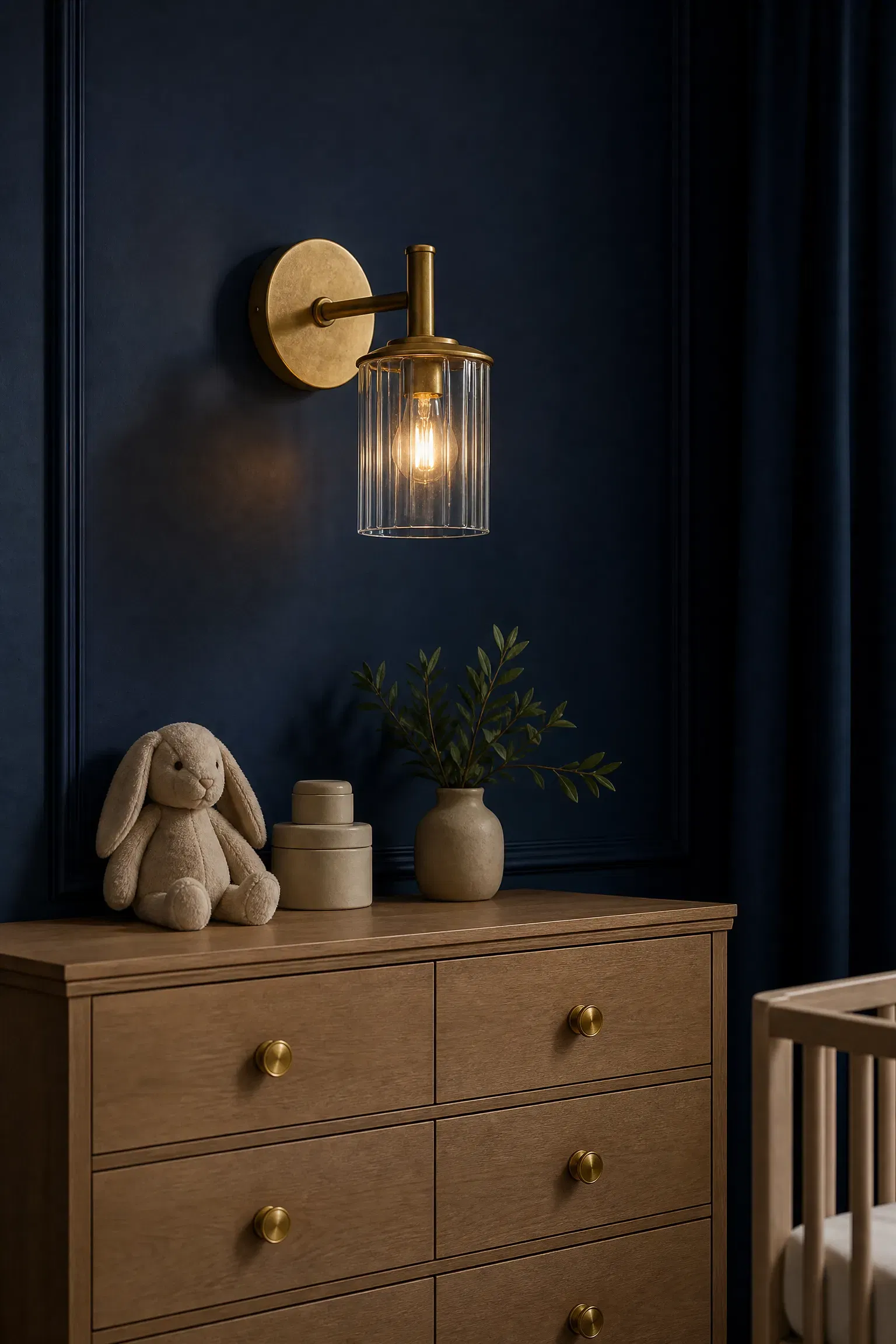
When selecting curtain rods, light fixtures, and drawer pulls, warm unlacquered brass hardware is a much better fit for this palette than matte black. Black hardware can feel overly harsh and industrial against soft baby blues and sunny yellows, whereas brass perfectly complements the yellow tones and adds a touch of necessary elegance. In my experience, pairing brass wall sconces with a dark navy accent wall creates a stunning, jewelry-like contrast that looks incredibly high-end. This sits in the mid-range budget category but completely changes the perceived quality of inexpensive furniture like a basic IKEA dresser. Ensuring all the metals in the room match prevents the decor from feeling chaotic and disjointed.
Designer Advice: Embrace the natural aging process of unlacquered brass; the subtle patina it develops over time adds incredible character and depth.
Yellow Ceiling Pendant vs. Flush Mount
Choosing a large, oversized yellow drum pendant over a standard flush mount ceiling light gives the nursery a much-needed architectural focal point. A generic glass flush mount provides harsh, unappealing overhead light, while a fabric drum shade diffuses the bulb, casting a softer, more flattering glow that is gentle on a baby’s eyes. You should pair this bold yellow fixture with pale sky-blue walls to create a cheerful, sun-in-the-sky aesthetic that feels very conceptual but entirely wearable. While custom fabric pendants can be an investment, the impact they have on the room’s overall mood and lighting quality is unmatched. Adding a dimmer switch to this fixture is absolutely essential for late-night feedings and gentle wake-ups.
Reality Check: Make sure the pendant hangs high enough that a tall adult will not bump their head while leaning over the crib.
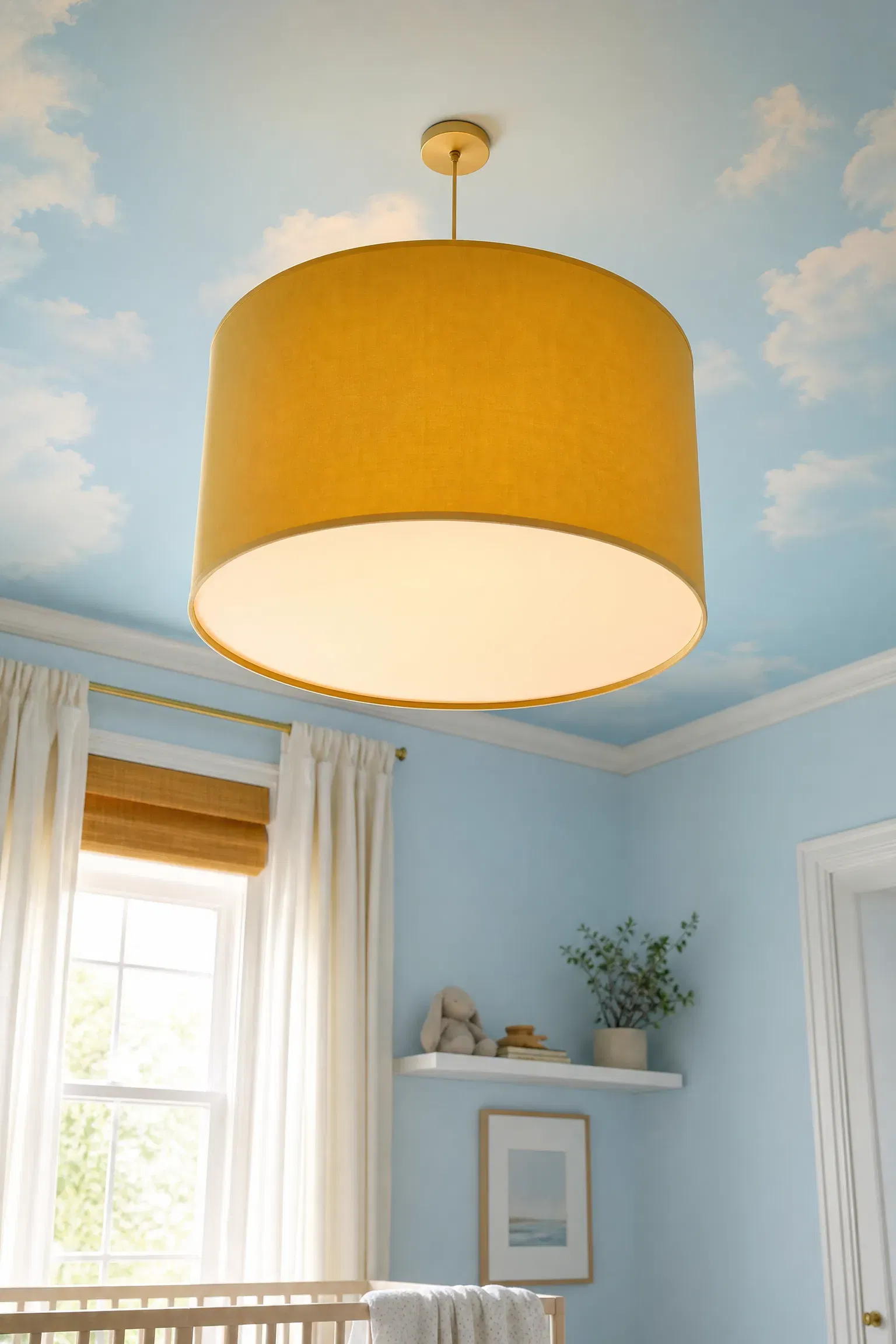
Blue Painted Ceiling vs. Wallpapered Ceiling
If you want to create a highly unique ceiling, simply painting it a soft blue is a much safer and more affordable option than attempting to wallpaper it. Hanging wallpaper on a ceiling is notoriously difficult, expensive, and prone to peeling due to gravity and humidity, whereas paint provides a seamless, risk-free splash of color. I find that a light robin’s egg blue ceiling paired with warm yellow linen curtains creates a beautiful, uplifting environment that feels incredibly spacious. This DIY paint project requires only a roller and an afternoon, making it highly accessible for any budget. Keeping the surrounding walls a crisp, warm white ensures the blue ceiling doesn’t make the room feel entirely enclosed.
Quick Tip: Use a dead-flat ceiling paint to hide the inevitable roller marks and drywall seams that become glaringly obvious when illuminated.
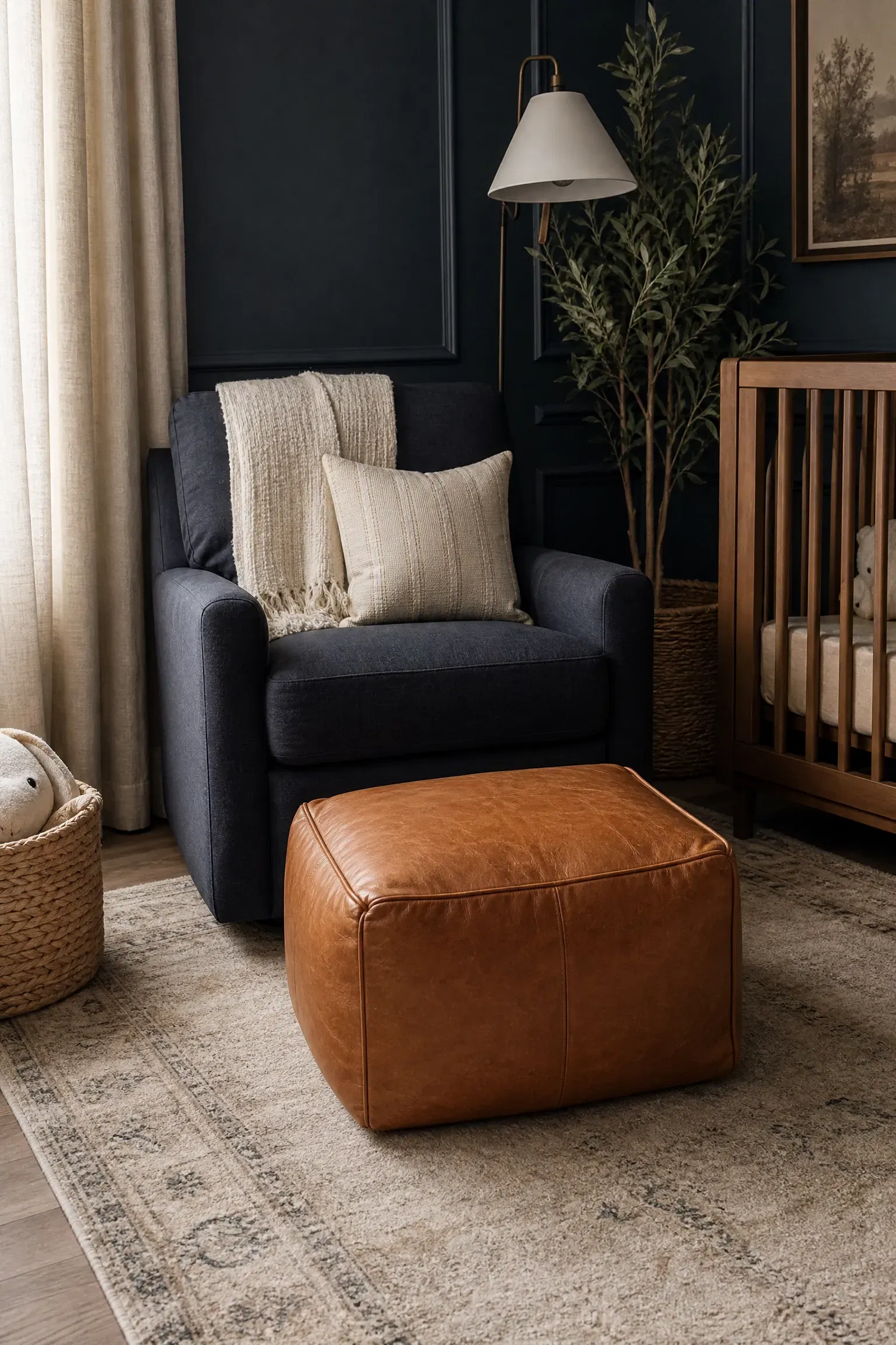
Leather Pouf vs. Fabric Ottoman
When adding a footrest for your glider, choosing a tan leather pouf is far more practical than buying a blue or yellow upholstered fabric ottoman. A leather pouf wipes clean instantly with a damp cloth, making it highly resilient to spills, while also introducing a third, grounding neutral material to the blue and yellow scheme. You can easily pair the warm tan leather with a dark navy blue glider to create a highly sophisticated, slightly masculine corner that doesn’t feel overly babyish. Real leather poufs are an investment, but they wear beautifully over time and can easily be repurposed in a living room later. The rich, earthy tone of the leather perfectly bridges the gap between cool blues and bright yellows.
Heads Up: Unstuffed leather poufs require massive amounts of filling; use old towels or outgrown baby clothes instead of buying expensive poly-fill.
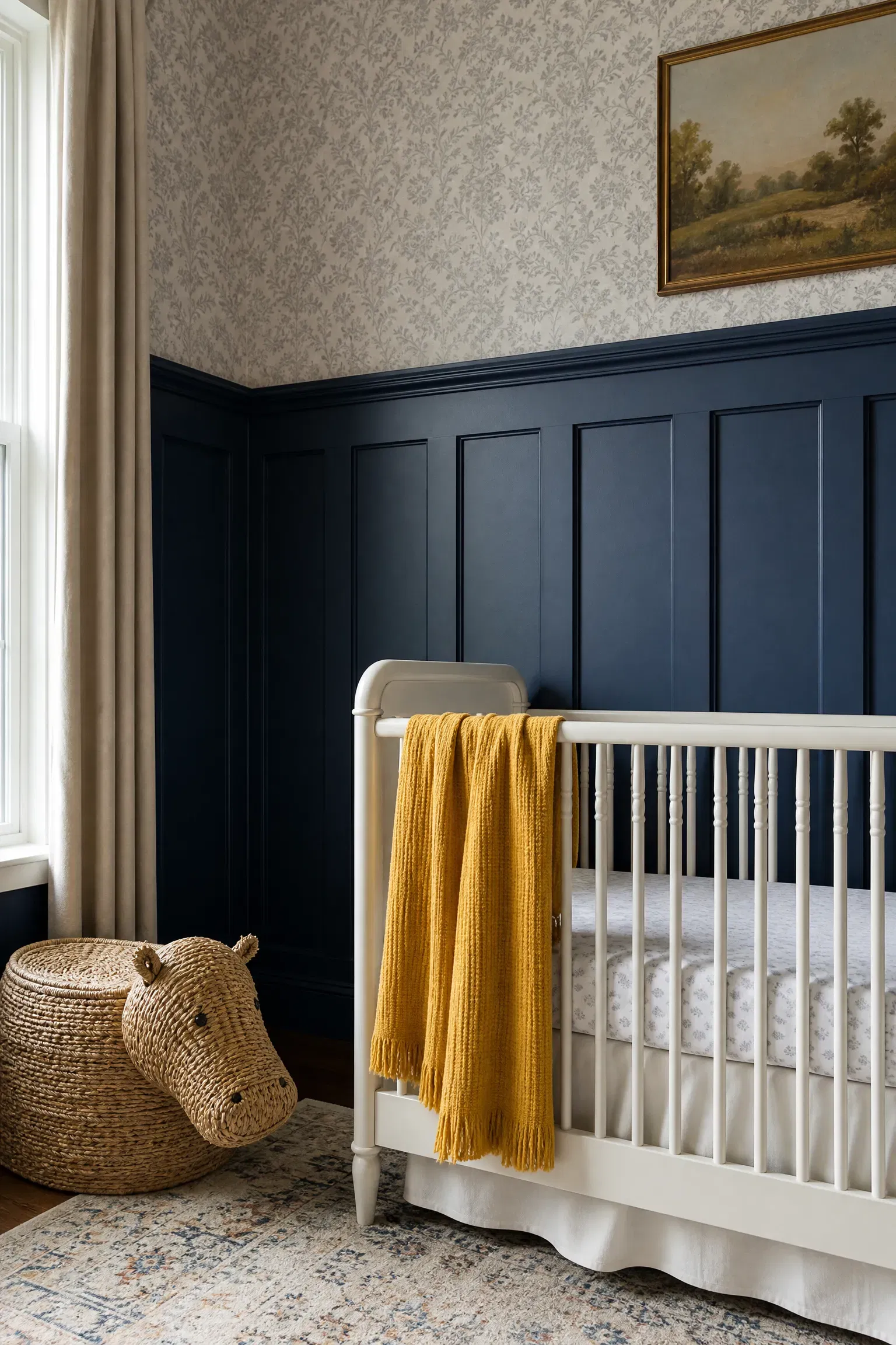
Blue Board and Batten vs. Painted Arch
When deciding how to add architectural interest, installing blue board and batten wainscoting is vastly superior to painting a trendy yellow arch behind the crib. Painted arches are a fleeting trend that can look like a dorm room DIY, while classic board and batten adds permanent structural value and timeless elegance to the home. In practice, painting the detailed woodwork a deep navy blue and pairing it with a simple white crib creates a highly tailored, traditional aesthetic. This is a mid-range project that requires basic carpentry skills but delivers an incredibly professional, high-end finish. You can easily add a bright yellow throw blanket draped over the crib to introduce your secondary color against the dark woodwork.
Pro Move: Cap the board and batten with a slightly protruding trim ledge so you can easily prop up small picture frames or wooden toys.
Patterned Crib Sheets vs. Solid Crib Sheets
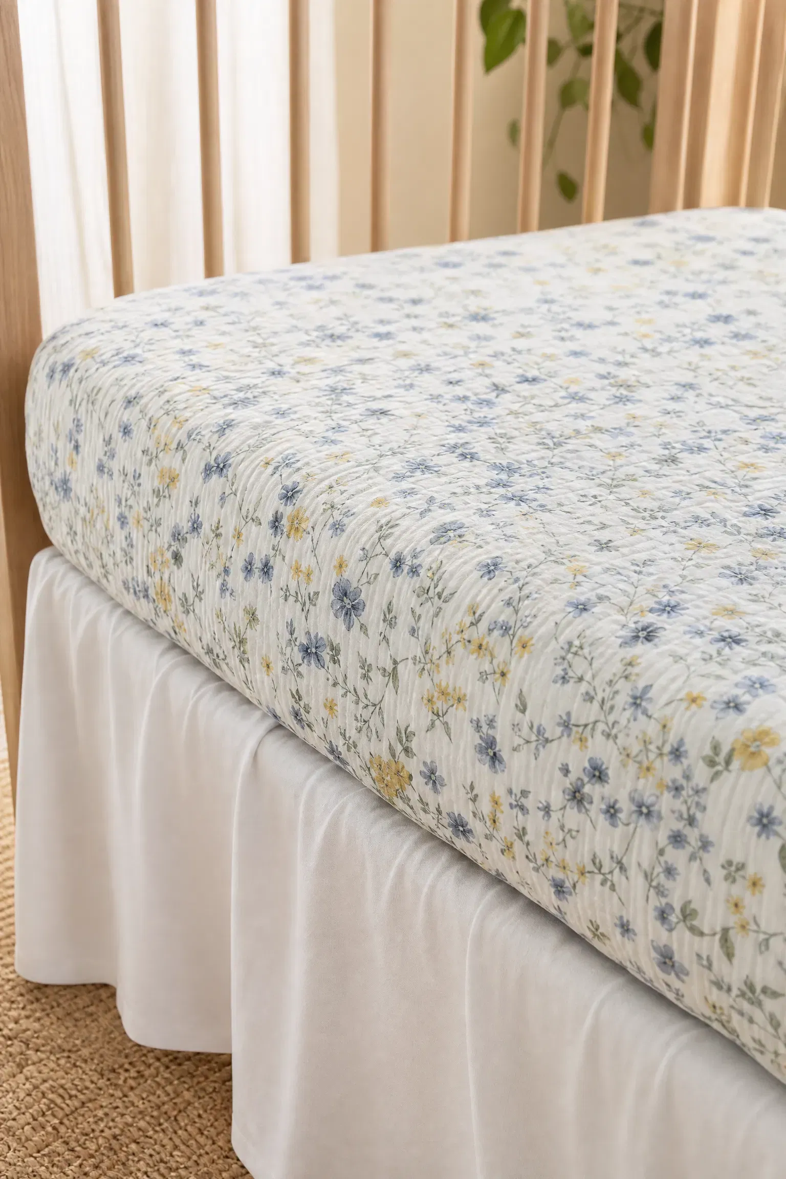
Selecting crib bedding with a subtle blue and yellow pattern is generally better than using solid-colored sheets in a nursery. Solid yellow or blue sheets can quickly make the crib look like a massive block of color, whereas a delicate floral or geometric print breaks up the visual weight and adds necessary detail. You should pair these patterned sheets with a totally solid, neutral crib skirt to prevent the bed from looking overly busy or messy. This is an incredibly affordable way to tie your two theme colors together in a single item without overwhelming the space. Since you need multiple sheets anyway for midnight accidents, collecting a few different patterns keeps the room feeling fresh.
Designer Advice: Always buy crib sheets made of 100 percent organic muslin cotton; the textured, crinkly appearance looks beautiful even when unironed.
Yellow Table Lamp vs. Floor Lamp
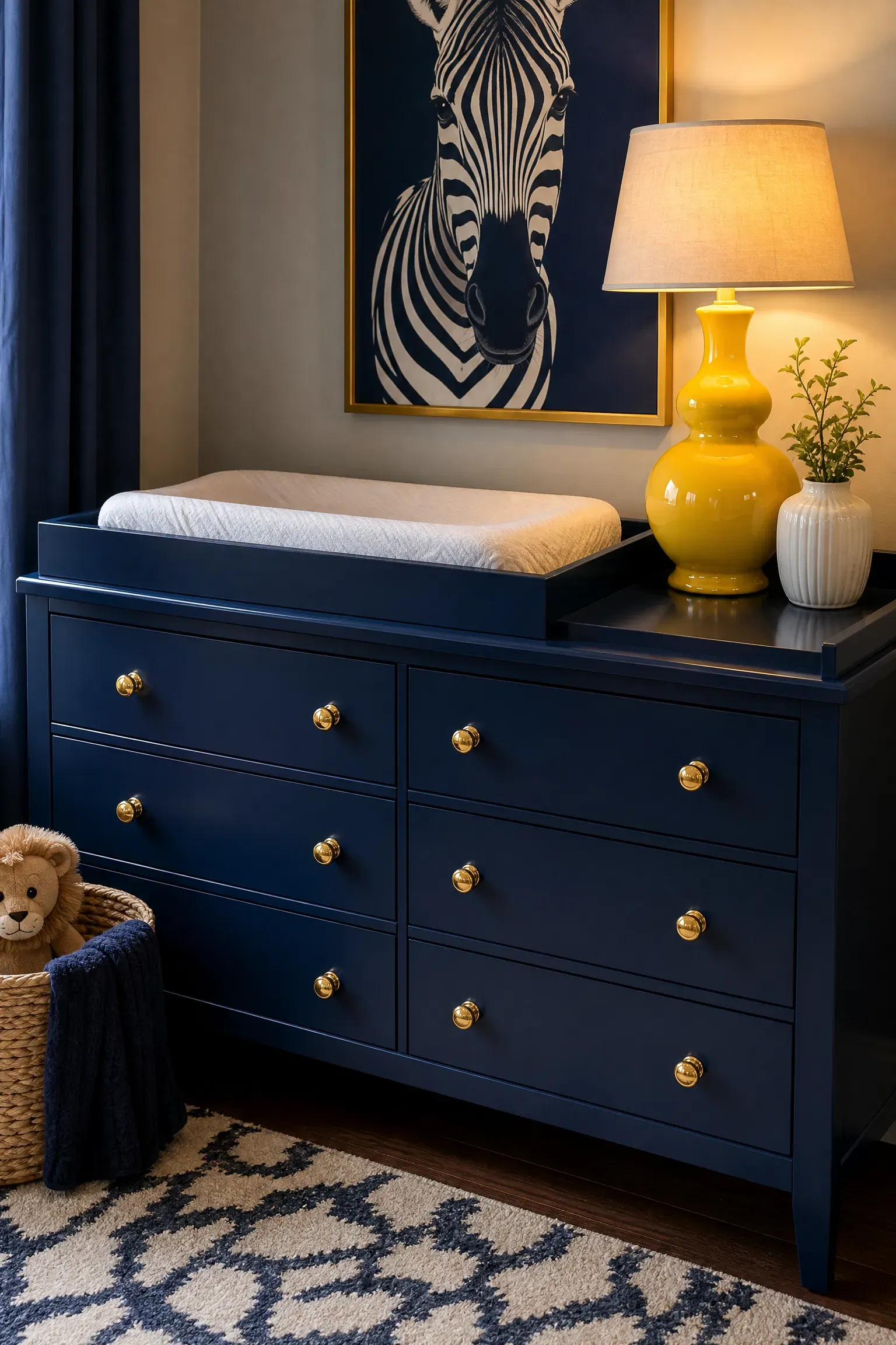
When adding task lighting near the changing table, a small, brightly colored yellow table lamp is a much better choice than a bulky floor lamp. A table lamp takes up zero floor space in a cramped nursery and provides localized, targeted light exactly where you need it during late-night diaper changes. I have seen this work perfectly when the glossy yellow ceramic lamp is paired with a sleek navy blue dresser, creating a striking, high-contrast moment. This is a highly affordable accessory that doubles as a sculptural decor piece during the day. Ensure you use a warm-toned, low-wattage LED bulb so the yellow ceramic glows softly rather than casting a harsh, interrogating light.
Reality Check: Always secure the lamp cord tightly to the back of the dresser using adhesive clips so a reaching toddler cannot pull it down.
Dark Hardwood vs. Light Carpet
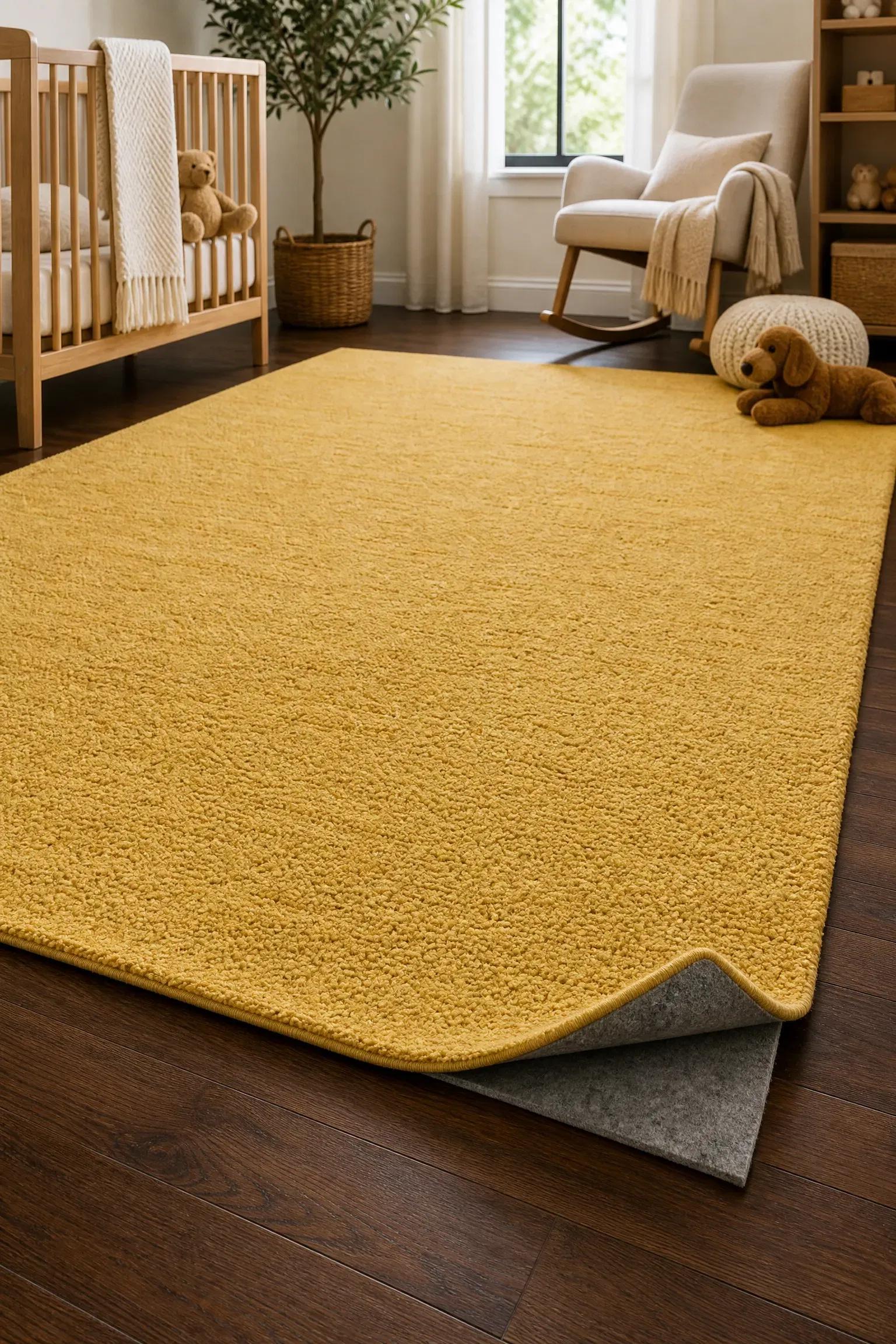
If you are renovating the floors, keeping dark hardwood is vastly superior to installing light-colored wall-to-wall carpeting in a nursery. Hardwood floors are infinitely easier to clean, harbor zero dust mites, and provide a rich, earthy contrast that grounds the bright blue and yellow decor perfectly. You can pair the sleek wooden floors with a massive, washable yellow area rug to provide the necessary softness for tummy time without committing to permanent carpet. While refinishing hardwood is an investment, the long-term hygiene and aesthetic benefits make it entirely worthwhile. The dark wood tone acts as a massive neutral anchor, preventing the colorful walls and furniture from looking like a cartoon.
Quick Tip: Use a thick, quarter-inch felt rug pad underneath your washable area rug to provide the necessary plushness for a crawling baby.
Blue Ceiling Medallion vs. Plain Ceiling
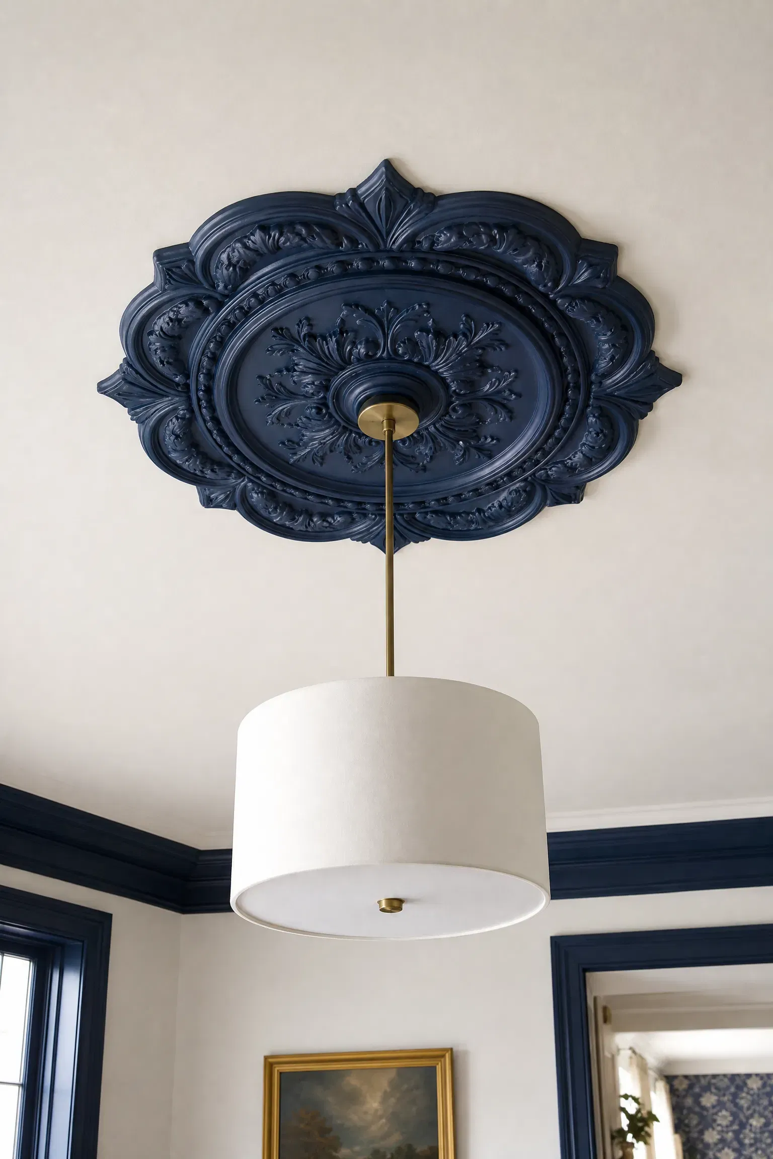
Installing a decorative polyurethane ceiling medallion painted a crisp navy blue is a much more sophisticated choice than leaving the ceiling completely plain. The medallion adds a layer of unexpected historical charm and draws the eye upward, making the lighting fixture feel like a grand, intentional centerpiece. In my experience, pairing a dark blue medallion with a simple white drum pendant creates a fantastic tailored look that fits perfectly in a traditional or transitional home. This is an incredibly affordable DIY project that only requires construction adhesive and a steady ladder. It instantly elevates the perceived value of the room and makes the ceiling feel heavily considered rather than forgotten.
Heads Up: Ensure the diameter of the ceiling medallion is at least the same size as, or slightly larger than, the lighting fixture hanging below it.
Yellow Abstract Art vs. Animal Prints
When choosing artwork, framing a large piece of modern yellow abstract art is a much stronger long-term choice than hanging juvenile animal prints. Abstract art introduces vibrant color and movement without locking the room into a specific babyish theme, allowing the decor to effortlessly transition into a chic toddler room later. You should pair this sophisticated artwork with a classic navy blue crib and highly textured linen curtains for a beautifully balanced, gallery-like aesthetic. Buying a large digital download and having it printed locally is a fantastic, budget-friendly way to fill a massive blank wall. The sweeping yellow brushstrokes will energize the room while maintaining a highly curated, adult-approved style.
Pro Move: Hang the center of the oversized abstract artwork exactly 57 inches from the floor to match standard art gallery viewing heights.
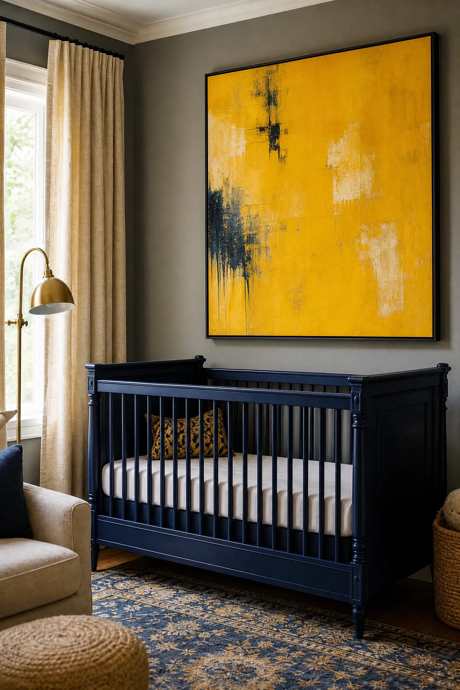
Blue Shiplap vs. Painted Drywall
Installing horizontal blue shiplap halfway up the wall provides significantly more character and durability than simply painting the drywall. The wooden grooves of the shiplap introduce a subtle, coastal texture that is highly resilient to bumps and scrapes from runaway toy cars. I always recommend pairing this nautical, textured wall treatment with warm yellow lighting and natural woven wood shades to complete the seaside aesthetic. This sits in the mid-range budget category but offers incredible return on investment by protecting the underlying drywall from damage. Capping the shiplap with a thick piece of oak trim creates a beautiful, natural transition between the blue wood and the white wall above.
Designer Advice: Paint the shiplap before you install it on the wall to ensure the deep grooves between the boards are fully coated in color.
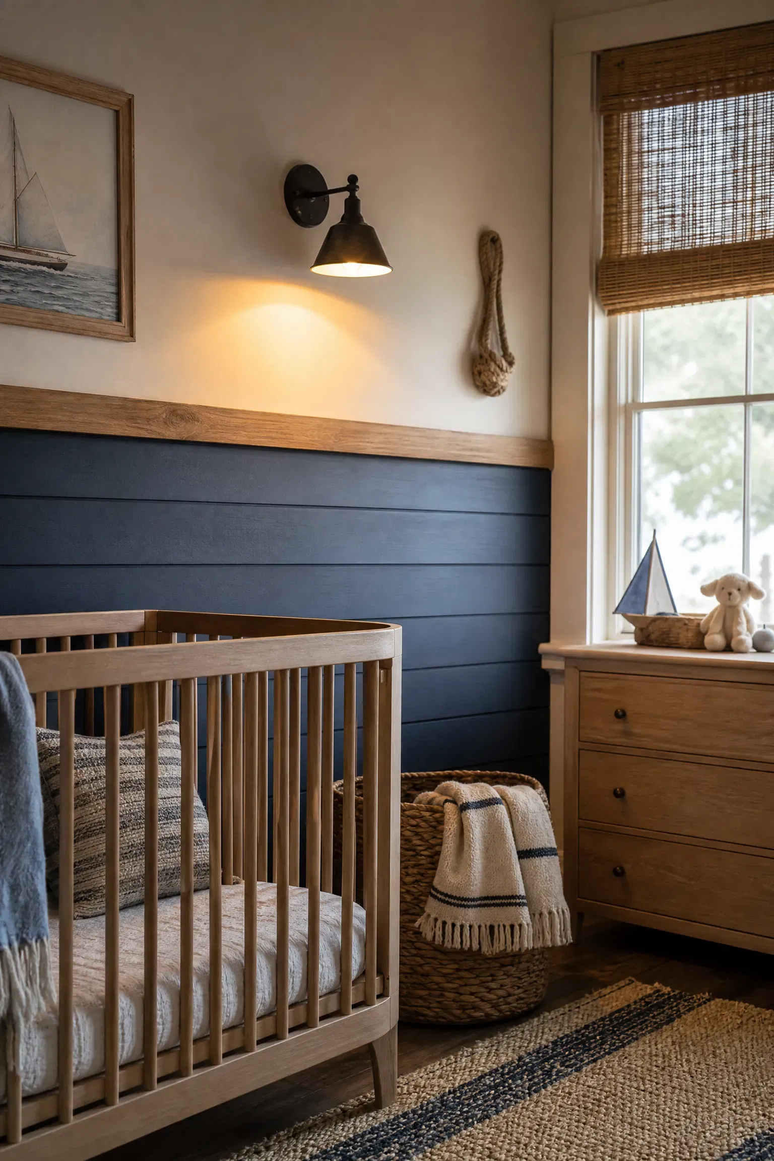
Yellow Painted Door vs. White Door
Painting the interior side of the nursery door a cheerful mustard yellow is a far more creative and joyful design choice than leaving it standard builder-grade white. Because the door is usually open during the day, the pop of yellow remains hidden from the hallway but acts as a massive, sunny piece of art when you are sitting inside the room. You can pair this brightly colored door with cool, slate-blue walls and classic white trim for a highly stylized, contrasting look. This is one of the most affordable projects possible, requiring only a quart of high-gloss enamel paint and a foam roller. Changing out the standard door knob for a vintage brass handle will make the painted door feel even more special.
Reality Check: Painting a door requires removing all the hardware and hinges first; trying to tape around a doorknob always results in a sloppy finish.
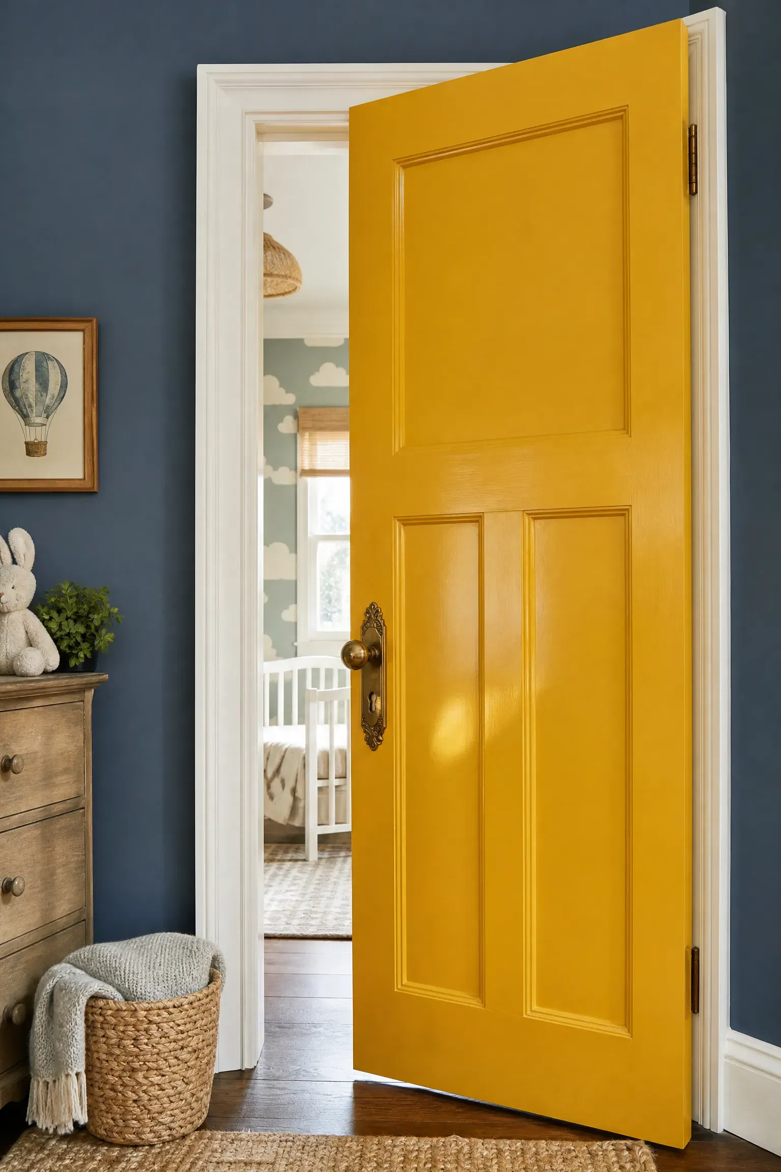
Blue Velvet Curtains vs. Cotton Drapes
When selecting blue window treatments, investing in heavy navy blue velvet curtains is vastly superior to using thin, unlined cotton drapes. Velvet inherently looks incredibly luxurious and has the added functional benefit of naturally blocking out light and dampening street noise for a sleeping baby. When testing materials, I found that pairing heavy velvet drapes with a delicate, pale yellow sheer curtain underneath provides ultimate control over privacy and sunlight. While custom velvet curtains are an investment-level purchase, their extreme durability and light-blocking capabilities are unmatched by cheaper fabrics. The rich, plush texture of the velvet heavily contrasts the hard lines of the crib and dresser, softening the entire room.
Quick Tip: Use curtain ring clips instead of a rod pocket so the heavy velvet slides easily and stacks neatly when you pull them open.
Conclusion
Designing a successful blue and yellow nursery is ultimately about choosing where to make a statement and where to exercise restraint. As these comparisons highlight, the most beautiful rooms often rely on deep, calming blues to ground the space while using bright yellows as strategic, energizing accents. Whether you decide to invest in classic blue board and batten or simply paint a thrifted dresser mustard yellow, the key is balancing these strong colors with plenty of natural wood tones and crisp whites. Always remember to consider functionality first, prioritizing durable fabrics, blackout lighting, and adaptable artwork that will easily grow with your child. By making deliberate, thoughtful choices rather than relying on overly themed matching sets, you can create a highly sophisticated, joyful room that both you and your baby will love.
Frequently Asked Questions
Which color should be more dominant in a blue and yellow nursery?
Blue should generally be the dominant color, especially if you are using it on the walls. Cool blues naturally lower the heart rate and promote sleep, making them perfect for a nursery. Yellow should be used as the secondary accent color to add warmth and cheer without overstimulating the baby.
What shades of blue and yellow work best together?
For a modern, sophisticated look, pair dark navy blue with muted mustard yellow. For a light, coastal, or classic baby aesthetic, pair pale sky blue with soft butter or lemon yellow. It is usually best to mix a dark, saturated color with a lighter, muted tone to avoid a harsh clash.
Can a blue and yellow nursery work for a girl?
Absolutely. Blue and yellow is a completely gender-neutral palette. To make the space feel softer or more traditionally feminine, incorporate delicate floral wallpapers, scalloped furniture edges, brass accents, and highly textured fabrics like velvet and ruffled linen.
How do you keep a blue and yellow room from looking like a classroom?
Avoid using pure, highly saturated primary blue and primary yellow together. Instead of royal blue and sunshine yellow, opt for navy and mustard, or powder blue and pale gold. Incorporating large amounts of white, grey, or natural wood will also break up the color blocking and mature the space.
Is yellow a bad color for baby sleep?
Bright, neon yellow walls can be overly stimulating and reflect too much light, potentially interfering with nap time. However, using yellow in smaller doses—like a rug, a lamp, or a throw pillow, provides necessary warmth and happiness without negatively affecting the baby’s sleep environment.
What wood tone pairs best with blue and yellow?
Natural, warm wood tones like white oak, ash, and birch look incredible with blue and yellow. The light wood provides an organic texture that softens the contrast between the two colors, making the nursery feel earthy, grounded, and modern.