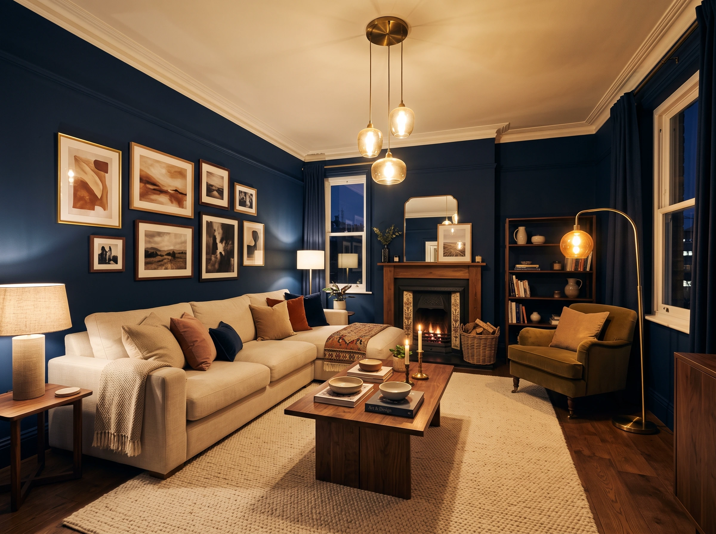
Dark Blue Living Room Ideas That Know Exactly What They Are
Dark blue is not one colour. Navy reads differently from midnight blue, which reads differently from indigo, which reads differently from inky teal, which reads differently from Prussian blue. Each shade has its own character, its own undertone, and its own specific set of furniture, lighting, and material companions that make it work. Choosing the right dark blue and building the room correctly around it is the difference between a room that feels genuinely enveloping and one that just feels dark.
Each of these 26 ideas is built around one specific shade or interpretation of dark blue, showing exactly what that shade does in a room, what it needs around it, and what trips people up when they try it.
1. Navy Blue All Four Walls with Warm Brass and Cream Sofa
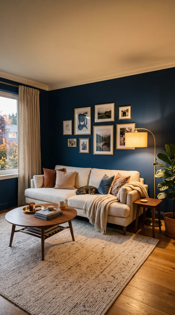
Classic navy, a deep blue with a slight warm or neutral undertone such as Farrow and Ball Hague Blue or Benjamin Moore Van Deusen Blue, on all four walls creates a room that feels enveloping, confident, and genuinely rich when it is balanced correctly. The balance requires a cream or warm ivory sofa, warm brass in lamp bases, pendant lights, and picture frames, a warm wood coffee table, and a cream or oatmeal wool rug. The warm elements absorb the cool tendency of the navy and turn it from a dark room into a cocooning one.
Reality Check: Navy walls on all four sides require a minimum of three warm light sources to read as atmospheric rather than simply dark. A single overhead light in a navy room makes it feel like a cave. Plan for a floor lamp, two table lamps or wall sconces, and warm 2700K bulbs throughout before a single drop of paint goes on the wall.
2. Navy Accent Wall Behind the Sofa with White Walls and Gold Accents

A single navy blue accent wall behind the sofa, with warm white on the remaining three walls, creates a high-contrast focal point that gives the living room depth and drama without the commitment of four dark walls. Gold or brushed brass accessories throughout, a cream sofa, and a geometric rug with navy and cream tones pull the wall colour into the rest of the room so the accent wall reads as part of a scheme rather than a backdrop.
Quick Tip: The navy accent wall should be in a matte or eggshell finish, not flat. Flat paint on a dark accent wall in a living room scuffs easily and marks every handprint. Eggshell reflects just enough light to prevent the wall from feeling cave-like and cleans down with a damp cloth, which matters in a room that gets daily use.
3. Midnight Blue Walls with White Ceiling and Warm Amber Lighting
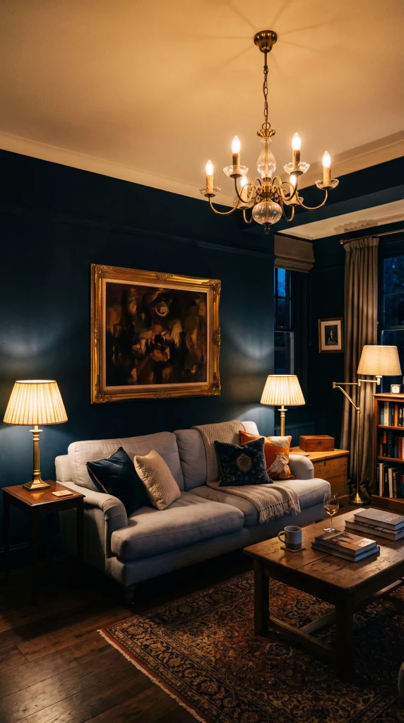
Midnight blue, darker and more mysterious than standard navy with a hint of black in its base, such as Farrow and Ball Stiffkey Blue or Sherwin-Williams Anchors Aweigh, needs warm amber lighting more than any other dark blue shade because its near-black quality absorbs light aggressively. Keeping the ceiling in warm white reflects the lamp light downward and prevents the room from reading as completely enclosed. The result is a room that feels genuinely intimate and cinematic in the evening.
Designer Advice: Midnight blue works best in rooms with at least one large window or glazed door. In a room with very limited natural light, midnight blue on all four walls and the ceiling, even with good artificial lighting, can feel oppressive during daylight hours. Reserve midnight blue for rooms with good daytime light and use it as the evening-hour transformation it is designed to be.
| Dark Blue Shade | Character | Best Supporting Palette | Light Requirement |
| Navy (Hague Blue, Van Deusen) | Rich, confident, classic | Cream, warm brass, walnut | Good natural or 3+ warm lamps |
| Midnight (Stiffkey, Starless Night) | Dramatic, cinematic, near-black | White ceiling, amber lighting | Essential: large window + many lamps |
| Indigo (Pitch Blue, Indigo Batik) | Deep, slightly purple-blue | Blush, warm white, antique gold | Strong natural light or south-facing |
| Prussian Blue (Napoleonic, Drawing Room) | Sharp, historical, architectural | Off-white, dark wood, warm brass | Good light; use satin finish |
| Inky teal (Vardo, Studio Green-adj.) | Moody green-blue, organic | Warm wood, brass, terracotta | Any; warm materials compensate |
| Slate blue (Mole’s Breath-adj., Pigeon) | Sophisticated, almost neutral | Warm grey, cream, natural linen | Any orientation |
4. Indigo Blue Living Room with Blush Accents and Antique Gold
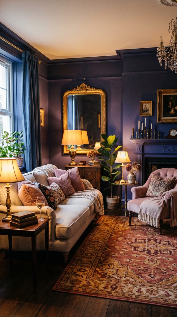
Indigo, which carries a noticeable purple undertone in blue, such as Farrow and Ball Pitch Blue or Little Greene Indigo, creates a living room with a deeper, more romantic and slightly more feminine quality than standard navy. Pairing it with blush pink or dusty rose in cushions and a velvet accent chair, warm antique gold in mirror frames and lamp bases, and a cream or ivory wool rug creates a room that reads as genuinely jewel-like and opulent rather than simply dark.
Heads Up: The purple undertone in indigo becomes much more visible under cool or daylight-balanced light bulbs. Under warm 2700K amber bulbs it reads as a rich deep blue. Under cool white or daylight bulbs it reads as blue-purple or almost violet, which may not be the intended result. Check indigo paint samples under both warm and cool light in your specific room before committing.
5. Prussian Blue Walls in a Traditional or Period Living Room

Prussian blue, a sharp, historical dark blue with a clear cool quality that references Regency and Georgian interior decoration, suits period rooms with architectural details such as cornicing, dado rails, and sash windows. Paired with off-white or warm stone trim, dark mahogany or walnut furniture, warm brass hardware, a Persian or Turkish rug in deep red and gold tones, and leather upholstery in caramel or cream, it creates a room that references the historical tradition of deep-coloured study and drawing room interiors authentically.
Pro Move: Use a satin finish rather than matte on Prussian blue walls in a period room. The slight sheen of satin on a wall with architectural detail catches the light from different angles across the cornicing and dado, making the architectural features read more distinctly and the room feel more refined than flat paint would allow.
6. Inky Teal Blue Living Room with Warm Wood and Terracotta
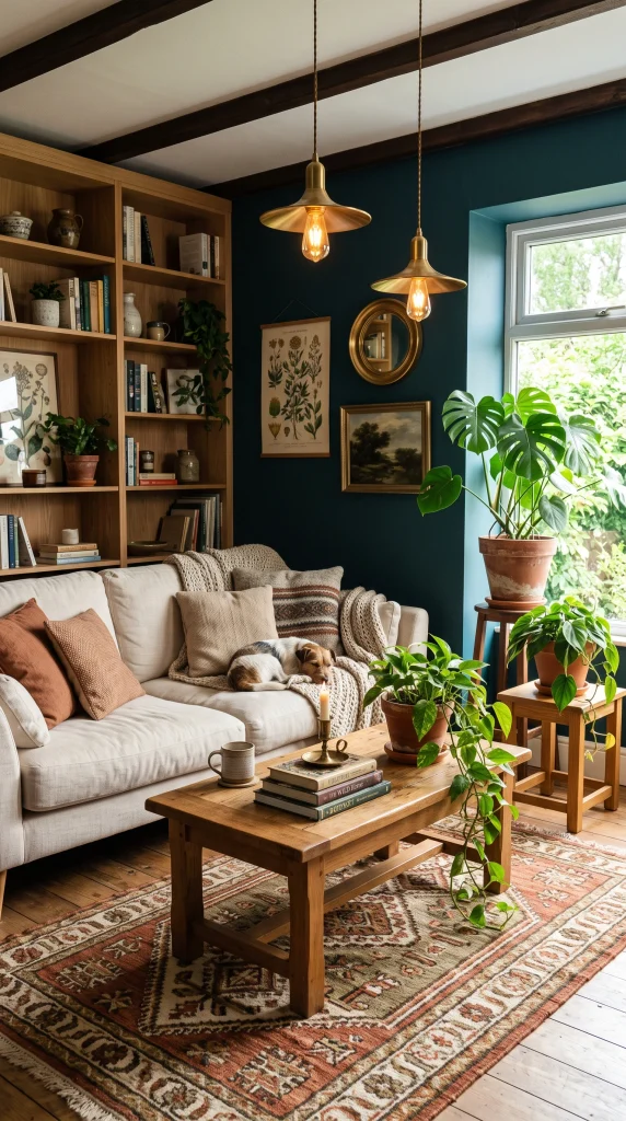
Inky teal, a dark blue with a visible green undertone such as Farrow and Ball Vardo, Claybrook Adriatic, or Benjamin Moore Van Deusen Blue with a green tilt, creates a living room that feels organic and deeply connected to the natural world rather than simply dark and dramatic. The green in the blue responds naturally to warm oak furniture, terracotta plant pots, brass accessories, and hand-woven rugs in earthy tones, making the room feel as if it has grown from the earth rather than been assembled from a colour scheme.
Reality Check: Inky teal on walls behaves like a chameleon under different light conditions. In morning natural light it reads as a clear blue-green. In warm evening lamplight it pulls noticeably warmer and appears almost teal-brown. Both versions are beautiful but they are genuinely different rooms at different times of day. This is not a problem; it is one of the most appealing qualities of the shade.
7. Navy Blue Sofa Against Light Warm Grey Walls
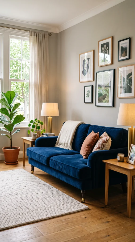
A navy velvet or linen sofa against warm light grey walls, a cream wool rug, natural wood side tables and coffee table, and warm brass lamp bases creates a living room where the navy reads as the room’s strongest design decision and the surrounding palette stays quietly supportive of it. This is the most approachable entry point into a dark blue living room because it introduces all the sophistication of the colour without committing to dark walls.
Designer Advice: A navy velvet sofa looks most intentional when the cushions on it are not also navy. Cream, warm ivory, a soft rust, or a pale mustard cushion on a navy velvet sofa provides the contrast that shows the sofa colour off. A navy sofa with all navy cushions reads as a dark monolith; the same sofa with cream and warm accent cushions reads as a deliberate, considered choice.
8. Dark Navy and White Stripe for a Preppy, Graphic Room
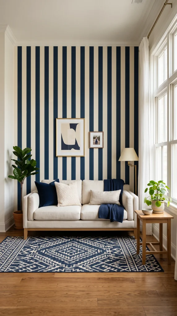
A living room where dark navy is used in bold horizontal or vertical stripes across a feature wall, a striped upholstered sofa, or a navy and cream striped rug paired with white walls, white trim, and natural wood furniture creates a preppy, graphic living room that feels deliberately tailored and confident. The stripe introduces the dark blue in a pattern context rather than a solid wall, which gives the colour a different, more energetic character than an unbroken painted surface.
Quick Tip: Navy stripes work best when they are clearly wider than the cream or white stripe beside them. A stripe where navy and white are equal width reads as a balanced pattern. A stripe where navy is two or three times the width of the white reads as navy with white as a relief line, which gives the room a stronger dark blue presence and a more deliberate design character.
9. Moody Dark Blue with a Fireplace as the Warm Counterpoint
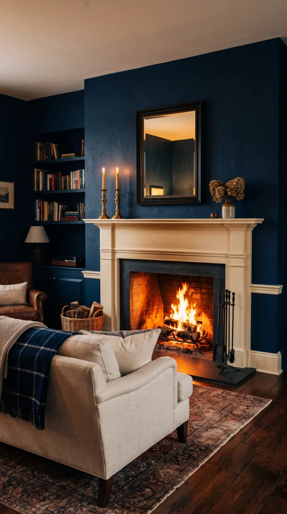
A living room with deep navy or midnight blue on all four walls, centred on a fireplace with a warm stone or white-painted surround, is one of the most classically dramatic combinations in interior design. The warm flickering firelight against the deep blue walls creates an effect that no other colour combination can replicate, and the pale fireplace surround acts as the room’s architectural focal point that gives the eye somewhere to land against the dark field of the walls.
Pro Move: Keep the fireplace surround and mantel in a warm white or natural stone, never in the same dark blue as the walls. The contrast between the pale surround and the dark walls is what makes the fireplace read as the room’s heart. A fireplace surround in the same dark blue as the surrounding walls disappears into the wall and loses all its architectural authority.
10. Dark Navy and Warm Cognac Leather: The Gentleman’s Library Look
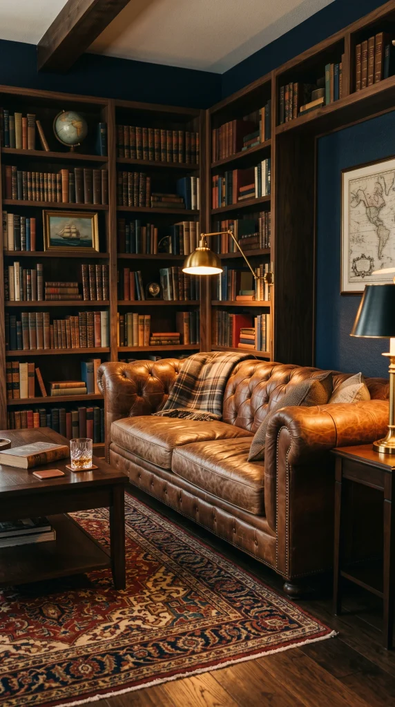
Deep navy walls, a cognac or caramel brown leather sofa, a dark walnut coffee table, warm brass reading lamps, a Persian or kilim rug in deep red and gold tones, bookshelves built into or beside the fireplace wall, and warm amber ceiling lighting creates a living room that references the traditional English gentleman’s library in its most appealing contemporary form. The leather and brass provide the warmth that the navy needs, and the bookshelves give the room depth and personality.
Reality Check: The cognac leather must be genuinely warm in tone, not cold or pale. A cold beige leather sofa against navy walls reads as two separate design decisions that have not found each other. A warm cognac, caramel, or tan leather sofa against navy walls creates immediate tonal harmony because both colours share the same warm-rich quality at different ends of the spectrum.
| Dark Blue Scenario | Best Sofa Choice | Best Rug | Metal Finish |
| Navy all four walls | Cream linen or ivory velvet | Oatmeal wool or jute | Warm brass or antique gold |
| Navy accent wall only | Cream, grey or caramel | Geometric navy and cream | Brushed gold or brass |
| Midnight blue walls | Cream or pale grey | Cream flatweave, pale wool | Warm brass, amber glass lamps |
| Indigo walls | Blush velvet or cream | Deep wool, vintage-style | Antique gold, aged brass |
| Navy velvet sofa, light walls | Navy sofa (the statement) | Cream or warm oatmeal wool | Warm brass throughout |
| Dark blue and leather | Cognac or caramel leather | Persian or kilim, deep tones | Warm brass reading lamps |
11. Dark Blue with Mustard Yellow for a Bold, Confident Room
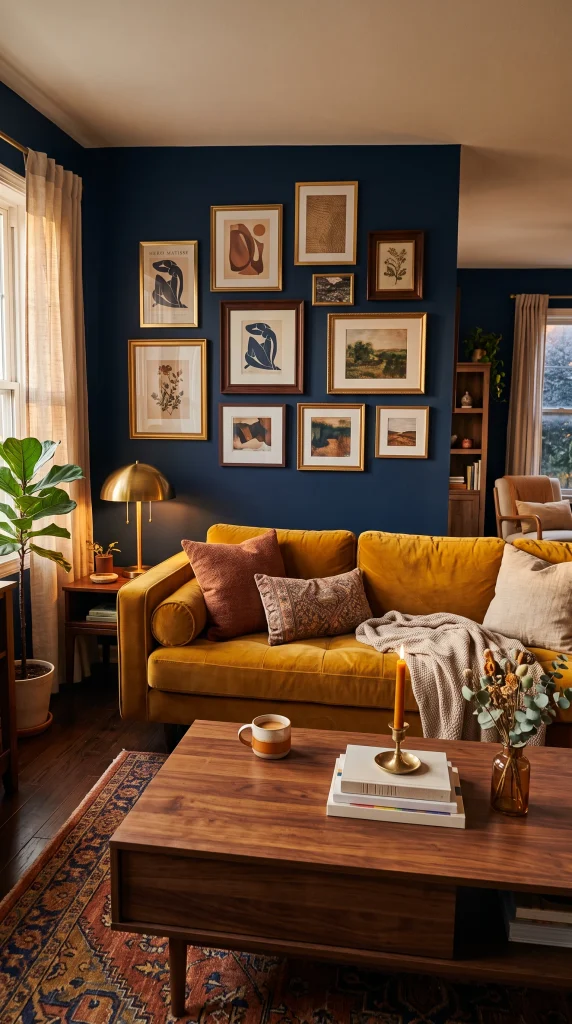
Deep navy or indigo on the walls with a mustard yellow velvet sofa or two large mustard cushions, a warm walnut coffee table, a gallery wall of art in warm tones above the sofa, and brass or warm bronze accessories creates a living room that is bold, expressive, and deliberately confident. Navy and mustard are close enough to complementary on the colour wheel to create a genuine visual pop without the harshness that navy and bright yellow would produce.
Designer Advice: Mustard yellow needs to be the muted, earthy version of the colour to work alongside dark blue. If the yellow reads as bright, clean, or saturated, it will fight the depth of the dark blue and the room will feel restless rather than energetic. Choose mustard with a strong brown or ochre undertone, something that looks slightly dirty or dusty on the chip, and it will work with perfect confidence against deep navy or indigo.
12. Dark Blue and Warm White in a Contemporary Open-Plan Room

In an open-plan living room, painting the living zone walls in deep navy while keeping the kitchen and dining areas in warm white creates a colour-defined zone that gives the seating area its own identity and mood within the larger space. The dark blue walls make the seating area feel gathered and intentional, and the contrast with the white elsewhere in the space prevents any single area from feeling too enclosed or heavy.
Heads Up: Open-plan dark blue zones work best when they have at least one window or glass door within the blue-painted area. A dark blue zone with no direct natural light within it can feel like a dark corner of the larger open-plan space rather than a distinct, enveloping room. The zone should have its own light source, both natural and artificial, to read as a designed room rather than an unlit section.
13. Slate or Denim Blue: The Sophisticated Almost-Neutral Approach

Slate blue or denim blue, a dark blue with strong grey in its base such as Farrow and Ball Pigeon, Elephant’s Breath with blue character, or Benjamin Moore Van Cortlandt Blue, creates a living room that reads as dark and considered without the full drama of navy or midnight. It behaves more like a very dark neutral than a strong colour statement, which makes it one of the most livable dark blue options and one of the most versatile with furniture choices.
Quick Tip: Slate blue is the dark blue that forgives the most mistakes in its supporting palette. Warm wood, cool grey, cream, warm white, warm tan, and even soft blush all sit comfortably alongside it. This versatility is its defining quality. If choosing a dark blue feels risky but the desire is genuinely there, slate or denim blue is the most reliable starting point.
14. Dark Blue Walls with a White Built-In Bookcase as the Room’s Focal Point

Navy or dark blue on the walls surrounding a white painted built-in bookcase that runs from floor to ceiling along one wall creates one of the most dramatic and resolved focal points in a living room. The deep blue makes the white bookcase appear to glow, and the shelves filled with books and objects in warm tones break up the dark walls with depth, texture, and personality that make the room feel genuinely collected and personal.
Pro Move: Style the bookcase shelves in a limited colour palette that relates to the room. In a navy room, books with cream, gold, and warm brown spines sit beautifully on white shelves against the dark walls. Introduce the occasional terracotta ceramic or brass object to echo the warm accessories elsewhere in the room. The shelves should look curated, not random.
15. Dark Blue and Natural Linen for a Relaxed, Unfussy Room
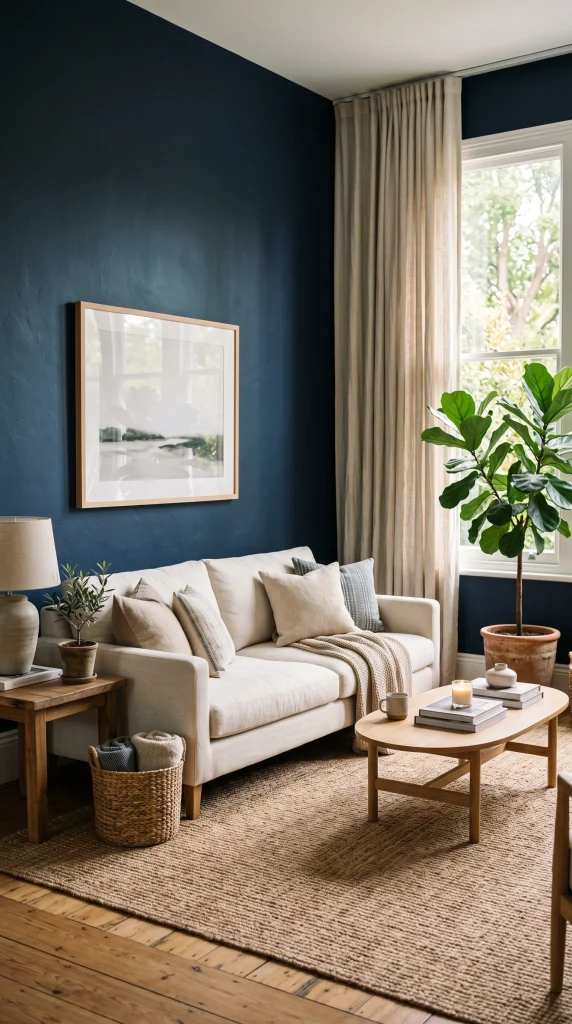
Navy or deep blue on the walls paired with natural undyed linen on the sofa, linen curtains in a slightly warmer tone of the same family, a jute or seagrass rug, and natural wood furniture creates a living room where the dark colour reads as calm and organic rather than dramatic or formal. The rawness of the natural fibre materials softens the authority of the deep blue and makes the room feel genuinely lived-in rather than designed for display.
Designer Advice: Natural linen on a sofa against dark blue walls works because both materials share a genuinely honest, unpolished quality. A synthetic linen-look fabric in the same off-white tone would not achieve the same effect because the slight sheen and evenness of synthetic fabric reads as finished and polished against the dark wall, where natural linen reads as organic and real.
16. Dark Blue Ceiling in a Neutral Living Room
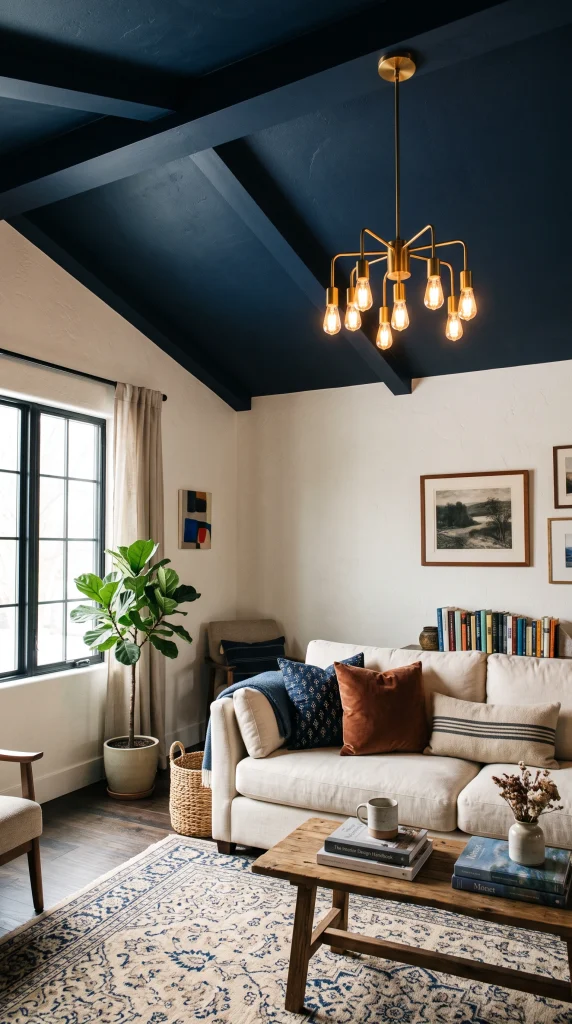
Painting only the ceiling in deep navy or dark blue while keeping the walls in warm white or pale neutral creates an unexpected and genuinely striking effect that most people have not seen executed well in person. The dark ceiling lowers the perceived height of the room and creates a sense of shelter and enclosure from above that warm-coloured walls cannot. In a room with good proportions, a dark blue ceiling can make a standard living room feel as intimate as a study.
Reality Check: A dark blue ceiling works in rooms with ceiling heights of at least 2.5 metres. In rooms with lower ceilings, an already-present sense of confinement is amplified rather than resolved by dark ceiling colour. The overhead application also requires very good lighting because the dark surface absorbs most of the ceiling-reflected light that brighter ceilings use to illuminate the room from above.
17. Dark Navy with Emerald Green for a Jewel-Toned Maximalist Room
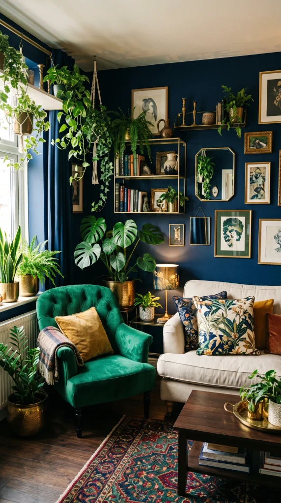
Deep navy on the walls with emerald green in a velvet accent chair, a large botanical or tropical print cushion, and cascading indoor plants in ceramic pots creates a jewel-toned maximalist living room where two of the richest colours in the spectrum coexist by sharing the same depth and saturation level. The key is that both the navy and the emerald must be equally deep; a lighter version of either colour weakens the combination.
Heads Up: Navy and emerald green is a high-commitment combination that requires confidence and completeness. Half measures, such as one small emerald cushion on a navy sofa in an otherwise neutral room, can read as a colour accident rather than a considered choice. The combination works when the emerald is given enough presence in the room to register as a second strong colour alongside the navy, not as an afterthought.
18. Dark Blue Wood Panelling or Wainscoting in a Traditional Living Room

Painting existing or installed wainscoting, panelling, or board-and-batten in deep navy while keeping the upper wall in warm white or off-white creates a two-tone treatment that gives the lower portion of the living room a grounded, architectural weight. The navy panelling reads as furniture-level colour, sitting below the eye line when seated, which gives the room depth and character without the full immersive commitment of four dark-painted walls.
Quick Tip: The dividing line between the navy panelling and the white upper wall should sit at the standard dado or chair rail height of 90 to 100 centimetres from the floor. Lower than that and the navy panelling reads as a painted baseboard. Higher than that and the room loses the two-tone proportional elegance that makes this treatment so effective.
| Dark Blue Application | Room Effect | Best For | Common Mistake |
| All four walls, navy | Enveloping, confident | Rooms with natural light | Too few warm light sources |
| Accent wall only | Focal point, controlled drama | Any room size or orientation | Accent wall behind where you sit (not where you look) |
| Ceiling only | Intimate overhead shelter | Rooms with good ceiling height | Using in rooms under 2.4m ceiling height |
| Wainscoting or panelling | Grounded, architectural weight | Period rooms, traditional rooms | Dividing line too high or too low |
| Sofa only | Colour statement, no wall commitment | Any living room | All-navy cushions on navy sofa |
| Open-plan zone definition | Clear spatial identity | Open-plan rooms | Dark zone with no window within it |
19. Dark Blue and Terracotta: The Earthy Mediterranean Room

Deep navy or inky teal on the walls with terracotta in the rug, plant pots, and a key accessory or two, warm oak furniture, cream linen upholstery, and warm brass hardware creates a room with a distinctly Mediterranean quality that feels genuinely earthy and grounded. Terracotta and dark blue are complementary in the way that all warm earth tones are complementary to cool deep blues, and the combination prevents the room from reading as cold or overly formal.
Designer Advice: Terracotta in a dark blue room works best through ceramics and plant pots rather than textiles. A terracotta rug with a large navy sofa can read as two competing anchor colours. A navy room with terracotta plant pots and ceramics as accessories reads as the blue providing the backdrop and the terracotta providing the warmth. Keep the terracotta in objects rather than large surfaces.
20. Dark Blue with Exposed Brick and Industrial Materials
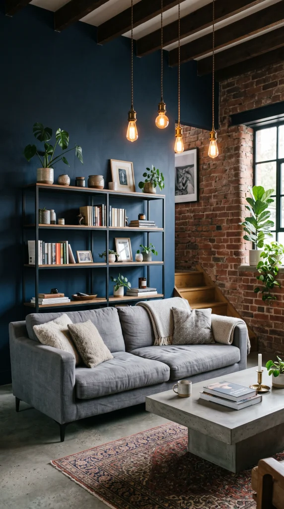
Navy or dark denim blue on the plasterwork walls of a room that also features exposed brick, raw concrete flooring or a concrete-effect coffee table, black steel shelving, and warm Edison bulb lighting creates an industrial living room where the dark blue provides the warmth and refinement that raw industrial materials cannot achieve alone. The combination softens the industrial aesthetic without losing its character.
Reality Check: Navy blue and exposed brick sit in the same warm colour family, with the orange-red of brick sitting opposite blue on the colour wheel. The natural complementary relationship between these two materials is one of the reasons this combination is so successful in loft and converted warehouse living spaces. The dark blue makes the brick look warmer; the brick makes the blue look richer.
21. Colour-Drenched Dark Blue: Walls, Ceiling, and Trim All the Same Shade
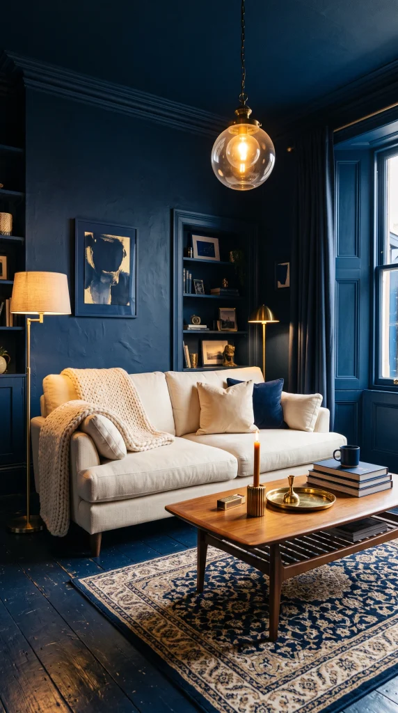
Painting the walls, ceiling, skirting, and all architectural trim in the same deep navy or dark blue creates a fully colour-drenched living room where the colour wraps every surface and the distinctions between ceiling, wall, and floor disappear. The effect is extraordinary: the room feels like the inside of a lacquered box, and the furniture appears to float against the unbroken dark blue field. This is the most committed and most dramatic version of a dark blue living room.
Pro Move: Colour-drenching works only when the furniture in the room is clearly distinct in tone from the walls. A cream sofa, a walnut coffee table, and warm brass accessories against fully drenched dark blue walls create a composition where every object is framed by the dark blue and appears to glow. A grey sofa in a drenched dark blue room disappears into the background because the tonal contrast is insufficient.
22. Dark Blue Living Room with Mirrored Surfaces to Multiply Light
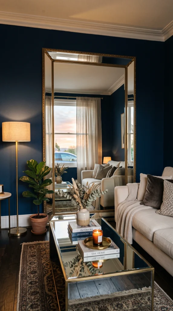
In a dark blue living room where natural light is limited, incorporating mirrored surfaces, a large floor mirror on the wall opposite the window, a mirrored coffee table, or mirrored panels in a sideboard, reflects whatever light exists back across the room and prevents the deep walls from absorbing it entirely. The mirrored surfaces also create the impression of greater room depth and make the dark blue walls appear to recede rather than close in.
Heads Up: Mirrored surfaces in a dark blue room look most intentional when framed in warm brass or antique gold rather than silver or chrome. Cool-framed mirrors in a dark blue room reinforce the coolness of both the metal and the blue and can make the room feel cold rather than dramatic. Warm-framed mirrors add the warmth that dark blue rooms need even when they are reflecting rather than absorbing light.
23. Dark Navy with Soft Blush and Cream for a Romantic Living Room

Deep navy on the walls with a cream sofa, blush velvet cushions and a blush accent chair, warm antique gold picture frames and lamp bases, and a cream and blush patterned rug creates a living room where the depth of the dark blue gives the soft feminine tones of blush and cream a rich, serious backdrop that elevates them from pretty to genuinely sophisticated. The navy provides the gravity that blush and cream alone cannot.
Designer Advice: The blush in this combination must be the muted, grey-dusty version rather than a pink-leaning blush. True dusty blush, which reads as almost grey-pink, has enough cool sophistication to coexist with dark navy without looking like a bedroom colour scheme transplanted into a living room. Bright or coral-toned pink alongside dark navy can read as a child’s nursery interpretation of the palette.
24. Dark Blue in a Small Living Room to Create Intimacy, Not Claustrophobia
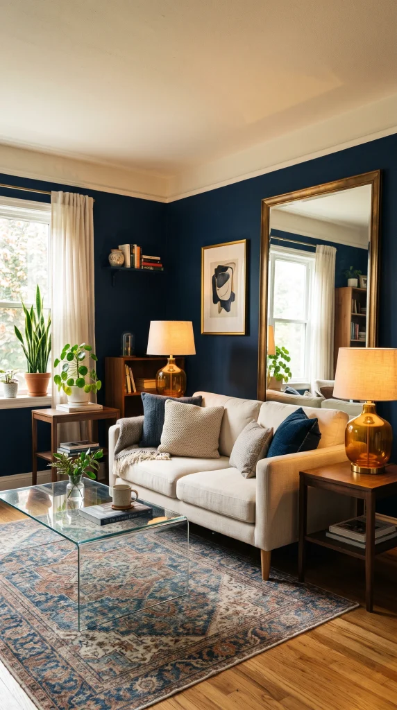
Dark navy or deep blue on all four walls of a small living room, with a large floor mirror opposite the main window, warm white ceiling, carefully planned layered lighting, and light-coloured furniture in cream or warm ivory creates a room that feels intimate and cocooning rather than compressed and dark. Contrary to the instinct to use light colours in small rooms, dark colours in small rooms with good light control and reflective surfaces can make a small room feel like a private, well-considered destination.
Reality Check: The floor mirror is not optional in a small dark blue room; it is the element that prevents the scheme from reading as a small room painted dark. A floor mirror at least 60 inches tall on the wall opposite the primary window doubles the natural light and creates a visual expansion of the room that no other single object achieves. Size matters: a small mirror in a dark room reads as a frame on a dark wall, not as a light-multiplying design element.
25. Dark Blue and Natural Oak in a Contemporary Scandi-Inspired Room
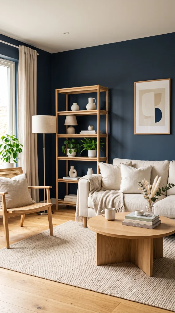
Deep navy or a muted dark blue such as Farrow and Ball Drawing Room Blue paired with natural light oak furniture, a pale natural fibre rug, cream linen cushions, and minimal warm white accessories creates a Scandi-influenced living room where the dark blue provides the depth and contrast that keeps Nordic restraint from reading as sparse. The pale oak furniture is critical: dark walnut or mahogany beside dark navy can feel heavy, while natural oak beside the same dark blue reads as light, clean, and intentionally designed.
Quick Tip: In a Scandi dark blue room, the lamp shades should be white or cream rather than coloured. Scandi interior design uses lighting as a functional design element rather than an accent, and a simple white drum shade on a warm brass base in a dark blue room delivers exactly the right quality of warm diffused light without competing with the colour of the walls for attention.
26. Hague Blue: The Most Referenced Dark Blue Living Room Shade and Why

Farrow and Ball Hague Blue is the most published, most Pinterest-saved, and most professionally recommended dark blue living room colour of the past decade for a specific reason: it has a warm undertone that sits between green and brown within the blue, which means it reads as dark and rich without the cool tendency that makes most dark blues feel cold. Paired with a cream sofa, warm brass, natural wood, and layered warm lighting, Hague Blue creates a room that achieves everything dark blue is supposed to achieve without any of the cold or oppressive qualities that dark blue in the wrong shade can produce.Pro Move: If Farrow and Ball is outside budget, the undertone of Hague Blue, which is its defining quality, can be matched in lower-cost paint ranges by looking specifically for a dark navy that reads blue-green or blue-brown rather than pure blue or blue-purple. Ask for a large sample of any candidate shade and look at it in the room under both natural and artificial light before deciding. The undertone is everything and the only way to check it is in your actual room


