Double Drenching Your Living Room: Color Combinations Worth Committing To
Double drenching takes the all-over color confidence of color drenching and pushes it further: instead of one color across every surface, you use two or more related shades with different undertones to create a room that is layered, immersive, and genuinely unlike anything a neutral palette can achieve. No white ceilings. No white trim. Just color, everywhere, doing all the work.
Forest Green Walls With Dark Green Ceiling
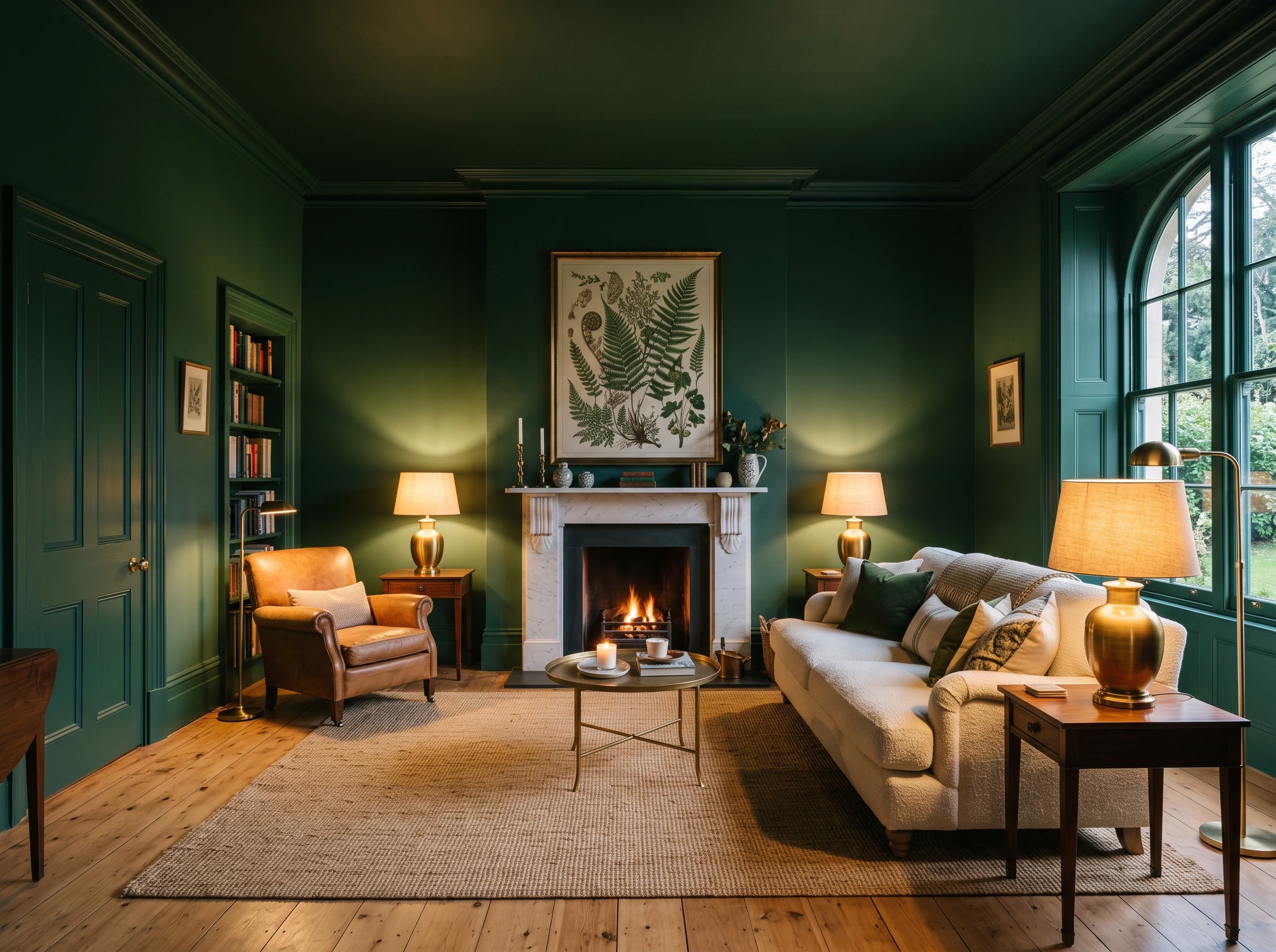
Painting the walls in a rich mid-tone forest green and the ceiling in a deeper, darker green pulls the room inward in the most luxurious way possible, making the ceiling feel like it is pressing down warmly rather than floating above as an afterthought. The variation in depth between the two greens means the eye travels continuously around the room rather than stopping at a paint line, which is the defining quality of a well-executed double drench.
Pro Move: Keep woodwork, skirting, and door frames in the deeper ceiling green rather than the wall color, since painting all architectural details in the darker shade creates a cohesive frame that holds the whole scheme together.

Sage Green Walls With Olive Trim and Skirting
Sage green walls paired with a deeper, more yellow-toned olive on the trim, skirting boards, and window frames is one of the most sophisticated double drenching combinations available because the two greens share the same earthy base but read as distinctly different in direct light. The olive trim draws the eye to the architectural details of the room, particularly cornicing and paneling, making the room feel more characterful and considered than a single-color approach would.
Designer Advice: This combination works best with natural materials in the furniture, such as linen upholstery, raw oak, rattan, and woven textures, which sit comfortably within the earthy green palette without competing with it.

Two Greens With a Citrine Window Frame Accent

Taking a mid-green on the walls, a darker green on the ceiling, and introducing a single pop of yellow-based citrine on the window frames or an interior door is the kind of unexpected design detail that makes a double drenched living room feel genuinely inventive rather than just heavily painted. The citrine operates as a color highlight that sharpens the whole scheme, and because it appears only on the window frames it is always visible when daylight is present.
Quick Tip: Paint only one or two architectural details in the accent color rather than applying it broadly, since the effect depends on the contrast between the accent and the dominant drench colors. The less of it you use, the more impact it has.
| Double Drench Combination | Wall Color | Ceiling or Trim | Accent Detail | Overall Mood |
| Forest green double drench | Mid forest green | Deep dark green | Brass or gold fixtures | Rich, cocooning, dramatic |
| Sage and olive | Dusty sage green | Olive on trim and skirting | Natural wood tones | Earthy, sophisticated, calm |
| Two greens with citrine | Rich mid green | Dark green ceiling | Citrine on window frames | Unexpected, energetic, bold |
| Navy and deep blue | Royal navy | Deeper dock blue on ceiling | Bright cobalt on frames | Dramatic, moody, impressive |
| Warm terracotta and rust | Terracotta | Deeper rust on ceiling | Mustard accent | Warm, earthy, enveloping |
Navy Walls With Deep Blue Ceiling
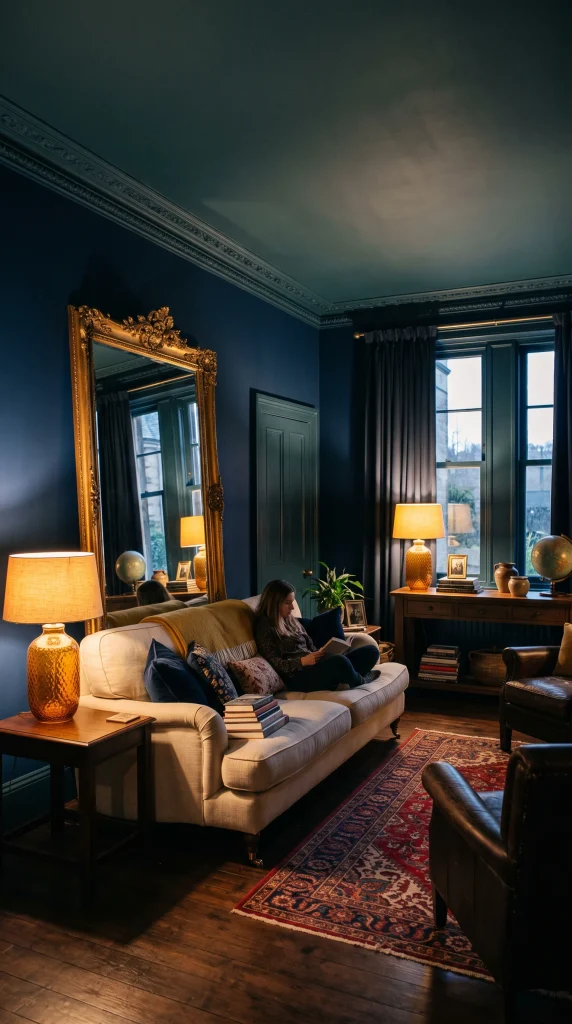
Navy walls with a deeper, slightly greener dock blue on the ceiling create a double drench that is one of the most confidently executed color moves in contemporary living room design, drawing the eye upward into a ceiling that feels like deep water overhead rather than the flat painted surface it is. The shift from the slightly red-undertoned navy on the walls to the greener blue above is subtle enough to read as cohesive but present enough to give the room genuine depth and movement.
Reality Check: Dark double drench schemes like this one require warm artificial lighting to avoid the room feeling cold and cave-like. Warm-toned bulbs at 2700K and layered lamp sources are not optional here, they are what makes the scheme work.
Cobalt Blue Walls With Teal Trim

Cobalt blue walls paired with a teal on the trim and skirting is one of the bolder double drenching pairings and one of the most visually striking, because the two colors sit close on the color wheel but read as distinct and energetic rather than tonal and quiet. This is a living room scheme for people who genuinely want the room to make a statement, and it rewards commitment fully: the bolder and more complete the drench, the better it looks.
Heads Up: In a cobalt and teal double drench, upholstery in a warm neutral, such as cream, oatmeal, or warm white, provides the visual rest the eye needs without breaking the color story with a competing hue.
Pale Blue Walls With a Deeper Azure Ceiling

A lighter double drench using a soft sky blue on the walls and a richer, more saturated azure on the ceiling creates a living room that feels uplifting and airy while still delivering the immersive quality that double drenching is built on. This is one of the most approachable entry points into the technique for anyone who finds darker drenches too committing, since the pale wall color keeps the room feeling bright and open while the azure ceiling adds the depth and color confidence that a plain white ceiling could never provide.
Designer Advice: A pale blue double drench scheme looks particularly beautiful with warm brass light fittings and natural timber floors, since the warmth of both materials prevents the blue from feeling cool or clinical.
Warm Terracotta Walls With a Rust Ceiling

Terracotta walls with a deeper, more saturated rust ceiling is the warmest and most enveloping of all double drenching combinations, creating a living room that feels genuinely sun-baked and warm at any time of year. The two earthy reds share the same warm undertone but the deeper ceiling pulls the room together in a way that makes the whole space feel deliberately enclosed, which is exactly the cocooning quality that double drenching does better than any other decorating technique.
Pro Move: Introduce a single mustard or warm ochre accent on a single door or built-in shelf within the terracotta and rust scheme for a third color note that adds energy without breaking the earthy warmth of the palette.
Dusty Pink Walls With a Blush Ceiling

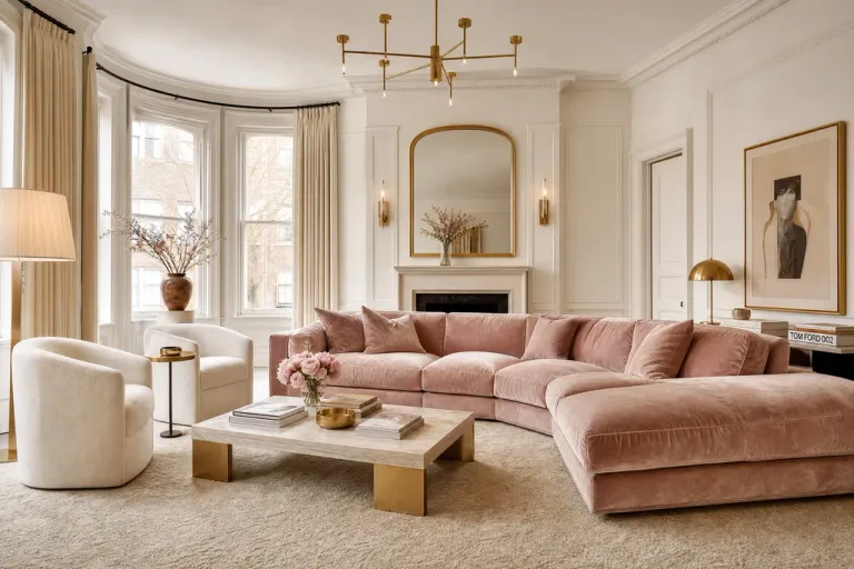
Muted dusty pink on the walls and a softer, lighter blush on the ceiling is the most understated and elegant double drenching combination available in the pink family, creating a living room that feels warm and inviting without ever tipping into overtly feminine or overly sweet. The lightness of the blush ceiling keeps the room feeling airy and bright while the deeper dusty pink on the walls gives the scheme the depth and commitment that separates a proper double drench from a timid decorating decision.
Quick Tip: Avoid combining this pink scheme with cool grey or white accessories since they drain warmth from the palette. Instead lean into warm creams, aged brass, dark wood, and dried botanicals to keep the scheme grounded and rich.
Deep Rose Walls With Mauve Trim

A deeper, more saturated rose on the walls with a more grey-toned mauve on the trim, doors, and skirting is a combination that reads as genuinely sophisticated rather than overtly pink because the grey undertone in the mauve stops the scheme from feeling sugary. This pairing works particularly well in living rooms with period architectural detail, such as paneling, cornicing, or deep skirting boards, because the mauve trim draws attention to every detail in a way that white paint never does.
Reality Check: Deep rose and mauve double drenching can feel heavy without the right lighting, so prioritize warm table and floor lamps at multiple heights rather than relying on a central ceiling fixture that will flatten the tonal variation between the two shades.
| Color Family | Light Version | Dark Version | Best For | Avoid Pairing With |
| Greens | Sage and soft olive | Forest green and dark green | Natural, earthy, Japandi rooms | Cool greys or stark white furniture |
| Blues | Sky blue and azure | Navy and deep dock blue | Coastal, moody, modern classic | Orange or red accents |
| Pinks | Blush ceiling and dusty pink walls | Deep rose and mauve trim | Romantic, refined, warm rooms | Bright white or cool accessories |
| Earthy reds | Terracotta and rust | Bronze red and deep rust | Maximalist, warm, cocooning | Cold blues or stark metallics |
| Yellows | Warm yellow and golden caramel | Mustard and deep ochre | Joyful, energetic, sunny rooms | Purple or stark black |
Warm Yellow Walls With Golden Caramel Ceiling

Warm yellow on the walls with a golden caramel on the ceiling fills a living room with an almost Mediterranean quality, particularly in rooms that receive good natural light, where the two colors interact with sunlight in a way that makes the room feel permanently sun-drenched. This is the double drenching combination most associated with joyful, energetic living rooms where the color scheme does active mood work rather than simply providing a backdrop.
Designer Advice: Yellow double drench schemes are particularly sensitive to paint finish: use eggshell on the walls and a flat or matte on the ceiling so the ceiling absorbs light rather than reflecting it and making the room feel harsher than the color intends.
Mustard Walls With Deep Ochre Trim
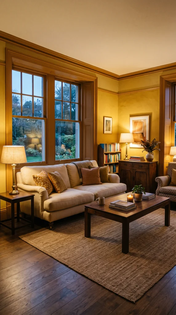
Mustard on the walls with a deeper, more earthy ochre on the trim and skirting is one of the most warming and grounding double drenching combinations available, connecting the living room to the earthy, natural palette that has defined the most admired interiors of the past three years. The ochre trim anchors the mustard walls and stops the scheme from feeling too bright or too energetic by introducing a note of depth and age that the fresher mustard alone could not provide.
Heads Up: Mustard and ochre double drenching works best in rooms with warm-toned timber floors, since cold or grey floors create a jarring contrast that undermines the warmth the color scheme is trying to establish.
Burgundy Walls With Deep Plum Ceiling

Burgundy on the walls with a deep plum on the ceiling is the most dramatic and maximalist of all double drenching combinations, creating a living room that feels closer to a private members’ club or a Victorian jewel box than a conventional domestic space. The shift from the red-based burgundy on the walls to the purple-toned plum above is subtle enough to read as deeply considered rather than two separate color choices that happened to collide.
Pro Move: A burgundy and plum double drench requires artwork in gilded or brass frames, warm lamplight, and upholstery in cream, aged leather, or velvet to complete the scheme. Without those warming elements, the darkness of the two colors reads as oppressive rather than luxurious.
Bronze Red Walls With Arras Deep Red Trim

Two deep reds with slightly different undertones, one more orange-based and one more purple-based, applied to walls and trim respectively is one of the most intriguing and unexpected double drenching approaches because both colors are from the same family but create a friction between them that gives the room energy and visual movement. This is the combination that interior designers point to most often when they want to demonstrate that double drenching is not merely about matching colors.
Quick Tip: Introduce a single accent piece in a completely contrasting color, such as a deep teal armchair or an emerald green cushion, to provide the eye with a resting point within an otherwise entirely red scheme.
Warm Terracotta Walls With Blush Pink Ceiling
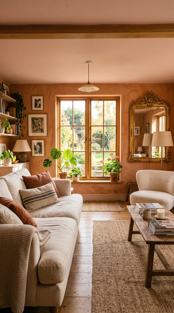
Crossing color families by pairing warm terracotta on the walls with a blush pink on the ceiling is one of the most creatively confident double drenching moves available, because the two colors share an underlying warmth and pinkish quality but read as completely different tones at first glance. The blush ceiling lifts the room and keeps it feeling airy while the terracotta walls do the grounding work, and the combination reads as sophisticated and unexpected rather than matched or obvious.
Designer Advice: Terracotta and blush double drenching is particularly effective in living rooms with south-facing light, where the changing quality of daylight throughout the day shifts the relationship between the two colors in a way that makes the room feel alive.
Sage Green Walls With Dusty Pink Ceiling
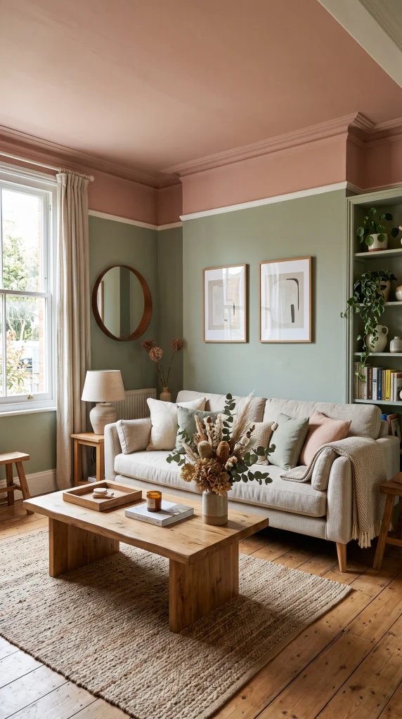
Sage green on the walls with a dusty pink on the ceiling is one of the most beloved cross-family double drenching combinations because the two colors share a muted, earthy quality that makes them feel naturally complementary rather than contrasting, even though they sit opposite each other on the color wheel. This is a living room scheme that photographs beautifully and looks even better in person, since the soft tension between the green and the pink gives the room a quality that is hard to define and impossible to achieve with a single color.
Reality Check: The key to making sage and pink work in a double drench is choosing a sage that leans warm rather than cool and a pink that leans earthy rather than bright. Cool sage with a bright pink reads as a clash rather than a considered pairing.
| Technique Variation | How It Works | Best Color Pairing Example | Impact Level |
| Walls darker, ceiling lighter | Lighter ceiling keeps room feeling open | Deep navy walls, sky blue ceiling | Moderate, approachable |
| Walls lighter, ceiling darker | Darker ceiling creates cocooning effect | Sage walls, deep green ceiling | High, dramatic |
| Walls and ceiling same, trim different | Architectural details become the drench accent | Terracotta walls and ceiling, rust trim | Sophisticated, refined |
| Furniture drenched in accent color | One piece in the third shade ties the room | Green drench with a mustard armchair | Dynamic, editorial |
| Accent wall in darker shade | One wall in deeper tone anchors the room | Blush walls, deep rose feature wall | Balanced, less committing |
Deep Teal Walls With Forest Green Ceiling
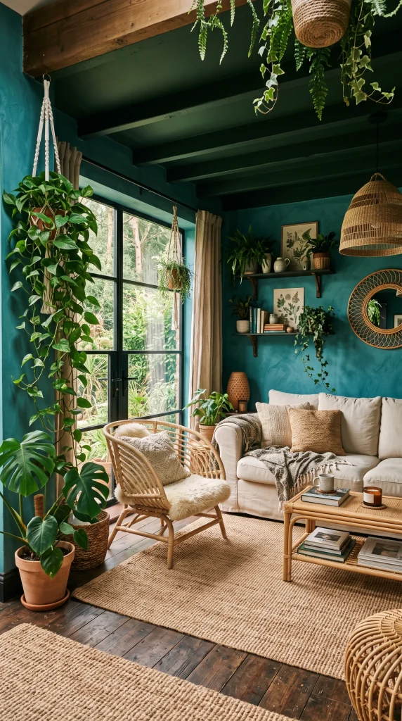
Deep teal on the walls with a forest green on the ceiling creates a living room that feels like the inside of a forest at dusk: rich, layered, and genuinely atmospheric in a way that no single-color room can replicate. The teal reads as blue in some lights and green in others, which means the relationship between the two colors shifts throughout the day and makes the room feel dynamic rather than static.
Pro Move: Introduce natural materials like rattan, linen, and raw timber into a teal and forest green double drench to connect the color scheme to the natural world it is referencing, which deepens the sense of immersion and stops the dark colors from feeling urban and cold.
Warm White Walls With a Soft Stone Ceiling

Double drenching does not have to mean bold and saturated: using a warm white on the walls and a soft stone or barely-there greige on the ceiling is the most subtle entry point into the technique and creates a living room that feels warmer and more considered than a standard all-white room without the full commitment of a deep color scheme. The slight depth of the stone ceiling absorbs light differently from the walls and creates a gentle tonal variation that the room reads as calm and refined rather than undecided.
Heads Up: In a soft double drench like this, the quality of the paint finish matters enormously. Use a matte finish on the ceiling and a very slight sheen on the walls so the two surfaces catch light differently, which is what creates the visual distinction between the two tones.
Inky Black Walls With Charcoal Ceiling

Near-black on the walls with a slightly softer charcoal on the ceiling is the most dramatic and editorial of all double drenching combinations, and one that requires full commitment to work properly, which means trim, skirting, and doors all in the same dark family. The slightly lighter charcoal ceiling prevents the room from feeling totally enclosed, giving just enough tonal variation to make the double drench visible while keeping the overall mood dark, dramatic, and completely intentional.
Designer Advice: An inky black and charcoal double drench living room is completely dependent on its lighting scheme. Warm-toned wall sconces, table lamps with amber shades, and candlelight are what make this scheme feel luxurious. Without them, it just feels dark.
Lavender Walls With a Soft Lilac Ceiling
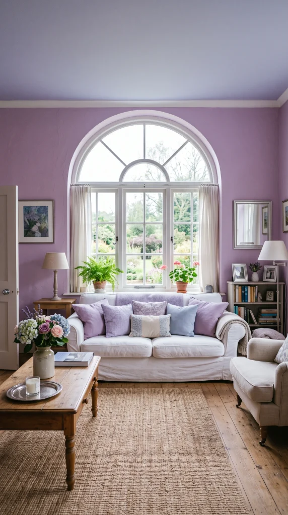
Lavender on the walls with a paler, cooler lilac on the ceiling is a double drenching combination that sits between the blue and pink families and creates a living room with a dreamy, slightly otherworldly quality that neither a blue nor a pink scheme on its own can achieve. The lightness of the lilac ceiling keeps the room feeling bright and fresh while the more saturated lavender on the walls gives the scheme the color confidence it needs to read as a deliberate design choice rather than a timid pastel.
Quick Tip: Lavender and lilac double drenching works best with silver or brushed nickel hardware and cool-toned accessories rather than warm brass, since brass pulls the cool tones of the lavender family into a muddier, less distinctive territory.
Warm Cream Walls With a Soft Peach Ceiling
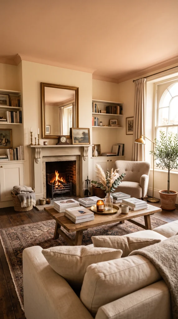
Warm cream on the walls with a soft peachy blush on the ceiling is one of the most liveable and universally flattering double drenching combinations, because both colors share an underlying warmth that makes the room feel gentle and inviting in a way that reads as considered interior design rather than a bold experiment. The peach ceiling is warm enough to be clearly different from the walls in certain lights but close enough to the cream to feel continuous rather than contrasting.
Pro Move: This cream and peach double drench is the combination most likely to make people look good, since both tones reflect a warm, flattering light across skin tones that a white ceiling and white walls never achieve.
Terracotta Walls With a Warm Sandy Ceiling

A softer take on the terracotta double drench uses a warm sandy tone on the ceiling rather than the deeper rust, creating a living room that feels genuinely sun-warmed and unhurried rather than dramatically dark. The sandy ceiling keeps the room feeling bright and airy while the terracotta walls do the color work, and the combination is one of the most popular double drenching choices among interior designers working in period properties where the colors connect to the warmth of traditional plaster and stone.
Designer Advice: Sandy and terracotta double drenching pairs beautifully with natural jute or sisal rugs, linen upholstery, and unlacquered brass hardware, all of which share the same warm earthy tone family and complete the scheme without competing with it.
Emerald Green Walls With Pale Mint Ceiling
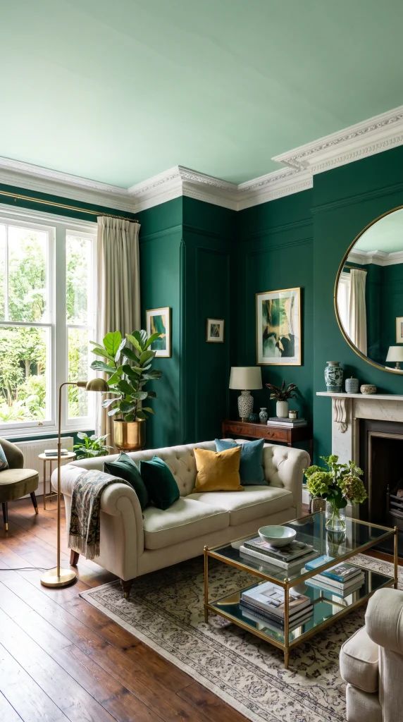
The contrast between a deep, jewel-toned emerald on the walls and a pale, fresh mint on the ceiling is one of the most unexpected and visually exciting double drenching combinations precisely because the two greens are so far apart in depth and character. The mint ceiling acts almost as a light source, bouncing brightness back into the room and preventing the emerald walls from making the space feel dark, while the emerald walls give the mint ceiling a context it could never have on its own.
Heads Up: An emerald and mint double drench requires restraint in the accessories and furniture to avoid the room feeling like a collection of competing greens. Keep upholstery in warm neutrals, cream or oatmeal, and use the emerald and mint purely as the architectural color story.
Deep Ochre Walls With Warm Amber Ceiling

Deep ochre on the walls with a warm amber on the ceiling creates the most naturally warm and candlelit living room atmosphere of any double drenching combination, since both colors share an underlying golden quality that interacts with artificial light in the evening in a way that makes the room glow. This is a combination that looks entirely different in the morning light than it does at night, which is one of the qualities that makes a well-executed double drench genuinely exciting to live with.
Reality Check: Ochre and amber double drenching can feel heavy in a north-facing room that receives limited natural daylight. Add more mirror surfaces and warm lamp sources than you think you need to keep the golden tones reading as rich rather than muddy.
Soft Indigo Walls With Periwinkle Trim
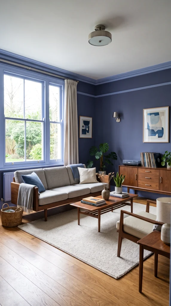
A muted, dusty indigo on the walls with a lighter, more blue-toned periwinkle on the trim and skirting creates a double drench that sits at the meeting point of blue and purple in a way that feels genuinely original and contemporary. The periwinkle trim brings a note of freshness and brightness to the deeper indigo walls, and the combination reads as studied and refined rather than bold and maximalist, making it one of the more accessible double drenching options for rooms where restraint is valued.
Pro Move: Periwinkle and indigo double drenching is one of the combinations most sympathetic to mid-century modern furniture, where the cool-toned blue-purple scheme sets off the warm teak and walnut of MCM pieces particularly beautifully.
Warm Red Walls With Deep Burgundy Ceiling
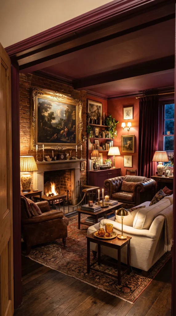
A warm, slightly orange-based red on the walls with a deep burgundy that leans purple on the ceiling is a double drench that delivers an unashamedly theatrical living room, one that makes an immediate and powerful impression and maintains it over time because the depth of both colors is genuinely rich rather than merely bright. This scheme is for people who want their living room to be the room guests remember and talk about, and it achieves that goal comprehensively.
Designer Advice: Warm red and burgundy double drenching requires artwork as a focal point within the scheme, since the color story needs at least one image on the wall to give the eye somewhere specific to look within the all-over drench.
Slate Blue Walls With Soft Grey Ceiling
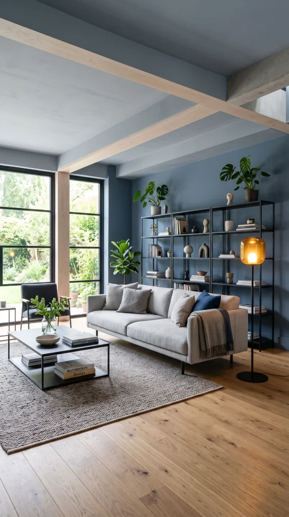
Slate blue on the walls with a soft cool grey on the ceiling is the most understated and architecturally versatile of all blue double drenching combinations, creating a living room that reads as cool and considered rather than dramatic or bold. The grey ceiling is a natural companion to the slate blue because it shares the same cool, slightly muted character, and the combination suits modern and contemporary living rooms where the aesthetic is lean and precise rather than maximalist and layered.
Quick Tip: In a slate blue and grey double drench, introduce at least one warm element in the furniture or accessories, such as a natural timber floor, a warm terracotta cushion, or an amber glass lamp, to prevent the room from feeling cold and corporate.
Limewash in Two Tones for a Textured Double Drench
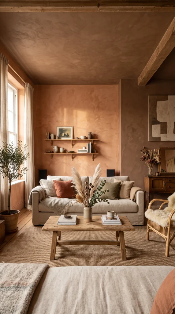
Applying limewash paint in two different tones across the same living room, a lighter version on the walls and a darker version on the ceiling or an accent wall, takes double drenching beyond flat paint and into the territory of texture and material depth. Limewash creates an organic, uneven finish that shifts in different lights and gives the double drench a quality that is more handcrafted and atmospheric than any standard emulsion application.
Pro Move: Two-tone limewash double drenching works best in earthy, warm color families, such as terracotta and clay, sage and olive, or warm white and stone, since the organic finish connects naturally to earthy tones and can look incongruous with cooler or brighter shades.
Furniture Double Drenching: Painting a Piece in the Accent Color
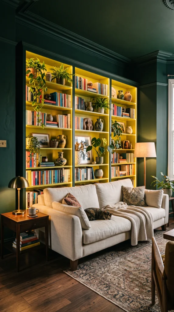
Double drenching does not require repainting every surface in a room: painting a single statement piece of furniture, such as a bookshelf, a console table, or a built-in cabinet, in the accent color of the drench palette is a way of completing the scheme and giving it a three-dimensional quality that paint alone on walls and ceiling cannot deliver. A forest green drench with a citrine-painted bookshelf, or a terracotta drench with a mustard-painted side table, brings the color story into the furniture layer and makes the whole room feel fully committed to the palette.
Designer Advice: The furniture piece painted in the accent color should be the most architecturally prominent piece in the room, such as a floor-to-ceiling bookshelf or a large built-in dresser, so the accent registers as a deliberate design decision rather than a quirky accessory.