Emerald Green and Gold Living Rooms Done Right
Emerald and gold is one of those combinations that looks extraordinary when it is done right and embarrassing when it is not, and the difference almost always comes down to proportion and material quality. Get the balance wrong and you end up with something that reads as a casino lobby. Get it right and you have one of the most sophisticated, genuinely beautiful living rooms that any color palette can produce. Here is how to get every decision right from the ground up.
1. Treat Cream or Warm White as Your Third Essential Color

Emerald and gold is not actually a two-color palette: it is a three-color palette where cream or warm white is the silent essential that prevents the combination from becoming overwhelming. Without a substantial proportion of cream or warm white in the walls, furniture, or both, emerald and gold fight each other for dominance and the room reads as heavy and airless. The warm neutral acts as a visual pause, giving the eye somewhere to rest between the richness of the green and the gleam of the gold.
Pro Move: Apply the 60-30-10 rule: 60 percent cream or warm white across walls and large furniture, 30 percent emerald across upholstery, textiles, and accents, and 10 percent gold across hardware, lighting, and finishing objects. This ratio is the foundation of every well-balanced emerald and gold room.
2. Choose Brushed or Antique Gold Over High-Shine Polish

The gold finish you choose determines whether this palette reads as genuinely luxurious or inadvertently tacky, and the difference is almost entirely about surface quality. High-shine or mirror-polished gold reads as cheap and brash in residential spaces, amplifying every flaw and competing aggressively with the emerald. Brushed gold, aged brass, or antique gold with a matte or satin sheen absorbs and reflects light more subtly, sits beautifully next to deep jewel tones, and reads as expensive and considered at every budget level.
Reality Check: Mix two gold tones deliberately, for example a brushed gold lamp base with an antique brass picture frame, but never mix high-shine gold with matte gold in the same room. The former creates intentional depth; the latter looks like mismatched purchases.
| Gold Finish | How It Reads | Best Used On | Avoid Pairing With |
| Brushed gold | Warm, refined, contemporary | Lamp bases, mirror frames, hardware | High-shine polish in same room |
| Antique brass | Rich, layered, old-world | Picture frames, candlesticks, handles | Very shiny or chrome finishes |
| Matte gold | Sophisticated, understated | Furniture legs, shelf brackets | Bright or polished gold pieces |
| High-shine polish | Bold, decorative, high-risk | Small accent objects only, one piece | Large furniture items |
3. Anchor the Room With an Emerald Velvet Sofa

A large emerald green velvet sofa is the single most impactful and most efficient move in this palette: it delivers the dominant jewel tone at the scale the room needs, in the material that shows emerald at its absolute best. Velvet has a natural light-catching quality where the pile shifts between lighter and deeper shades of emerald depending on the viewing angle and the time of day, which keeps the color alive and dynamic rather than flat. Against cream walls and brushed gold accessories, an emerald velvet sofa reads as deliberately confident and professionally considered.
Heads Up: Velvet attracts pet hair and is harder to clean than performance fabrics. If you have pets or young children, a performance velvet, which uses tightly woven synthetic fiber that mimics the look and feel of real velvet, is nearly identical visually and dramatically more practical.
4. Use an Emerald Accent Wall Behind the Seating Group
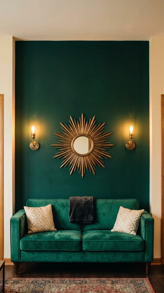
Painting the wall directly behind the sofa in a deep emerald, while keeping the remaining three walls in cream or warm white, creates a backdrop that makes both the sofa and the wall feel intentional without wrapping the entire room in a color that demands constant management. The depth of the emerald wall creates a sense of visual recession that makes the room feel larger, and it provides an ideal backdrop for gold-framed artwork, mirrors, and sconces that would disappear against a white wall.
Designer Advice: Paint the accent wall in a matte or eggshell finish rather than satin or gloss. Matte emerald has a depth and richness that satin cannot replicate and avoids the reflection issues that gloss paint creates on a feature wall behind seating.
5. Hang a Gold-Framed Oversized Mirror as the Wall’s Anchor

A large mirror in a brushed or antique gold frame, 36 inches or wider, hung centered on the emerald accent wall above the sofa or above a console table, does three things simultaneously: it introduces the gold at the dominant scale the palette needs, it bounces light around a room that could otherwise feel too dark, and it creates a focal point that is genuinely architectural rather than merely decorative. Round mirrors in organic or sunburst gold frames are particularly effective against deep emerald because the warm circular form softens the strong rectangle of the wall.
Quick Tip: Size is everything with a mirror in this context. A mirror under 30 inches wide on an emerald accent wall looks like it wandered in from a different room. Go bigger than feels comfortable and the room will reward you for it.
6. Choose a Gold-Legged Coffee Table With a Dark or Glass Top
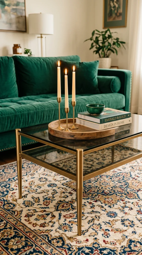
The coffee table in an emerald and gold living room needs to participate in both sides of the palette without duplicating either, and the best solution is a table with brushed gold legs or a gold base and a top in dark marble, smoked glass, or a dark wood stain. The gold base carries the metallic theme at floor level while the dark or transparent top avoids adding another visual mass of color to a palette that is already doing a lot of work.
Pro Move: A coffee table with a glass top and a thin gold frame reflects the emerald and cream tones of the room in its surface, effectively doubling the palette in a small footprint and making the room feel more layered than its actual number of elements would suggest.
7. Layer Cushions in Three Tones: Emerald, Gold, and Cream
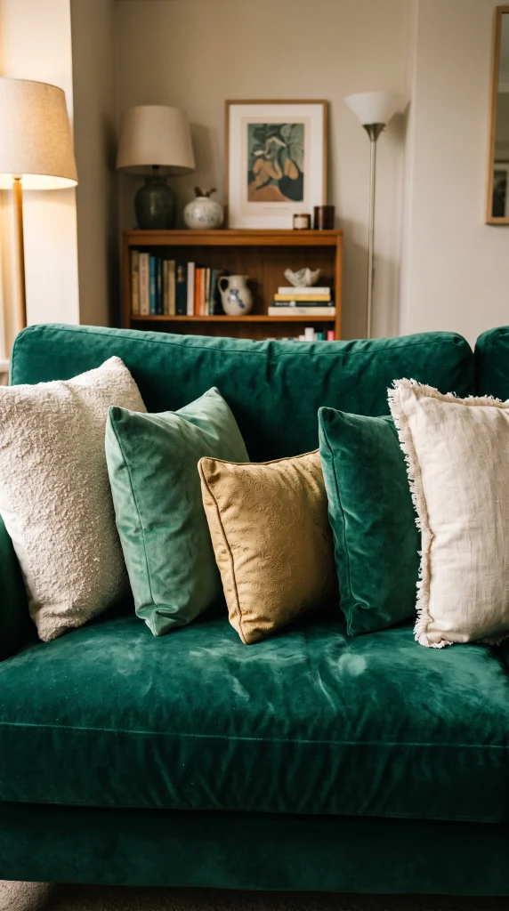
The cushion arrangement on an emerald sofa is where most emerald and gold living rooms either come together or fall apart, because piling on more emerald cushions simply disappears into the sofa and adding too many gold cushions looks like a runway. The correct approach is three distinct tones: emerald velvet cushions in a slightly different shade from the sofa so they read as a separate layer, gold or antique bronze cushions in a rich fabric such as jacquard or brocade, and cream cushions in a textured linen or boucle that introduce the neutral third color directly into the arrangement.
Designer Advice: Use an odd number of cushions total, five or seven, and vary the sizes. Two large cream linen, two mid-size emerald velvet, and one smaller gold jacquard reads as collected and layered where even numbers in equal sizes reads as a shop display.
8. Install Gold Sconces on Either Side of the Accent Wall Feature

Wall sconces in a brushed or antique gold finish flanking a mirror, artwork, or fireplace on the emerald accent wall introduce warm light and architectural symmetry simultaneously, reinforcing the formal structure of the feature wall and adding practical ambient light at eye level that a single overhead fitting cannot provide. In an emerald and gold living room specifically, lit gold sconces against a deep green wall create one of the most naturally dramatic and beautiful lighting effects available without any clever wiring or expensive fixtures.
Reality Check: Plug-in sconces with cord covers are a practical alternative to hardwired sconces and look nearly identical when the cord is painted the same color as the wall. In a dark emerald room, the cord is virtually invisible.
| Feature Element | Gold Accent Placement | Why It Works | Scale Rule |
| Emerald accent wall | Sconces flanking central feature | Warm light on dark wall is dramatic | Sconces at eye height 55-60 inches |
| Emerald velvet sofa | Gold-legged coffee table in front | Ground-level gold balances sofa mass | Table width = at least 2/3 sofa width |
| Cream walls throughout | Gold hardware and lamp bases | Subtle distribution across all surfaces | At least 5-6 gold touch points |
| Emerald area rug | Gold picture frames above it | Vertical gold echoes horizontal green | Frames no smaller than 16×20 inches |
9. Use a Cream or Ivory Armchair as a Tonal Break
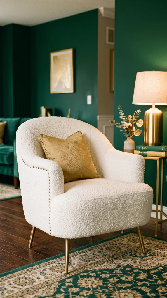
One or two armchairs in cream, warm ivory, or oatmeal linen placed within the main seating group give the eye somewhere to rest in a palette that is otherwise composed entirely of strong colors. The cream chair also provides a practical place to introduce gold through the chair legs or a subtle nail-head trim detail, and it creates the tonal separation that prevents emerald and gold from merging into a single overwhelming visual block when viewed from across the room.
Quick Tip: An ivory or cream boucle fabric on the armchair introduces texture that reads as warm and soft against the richness of the emerald sofa, creating a material contrast that makes both pieces look more expensive than they are individually.
10. Bring In Dark Walnut or Ebonized Wood for Grounding Weight
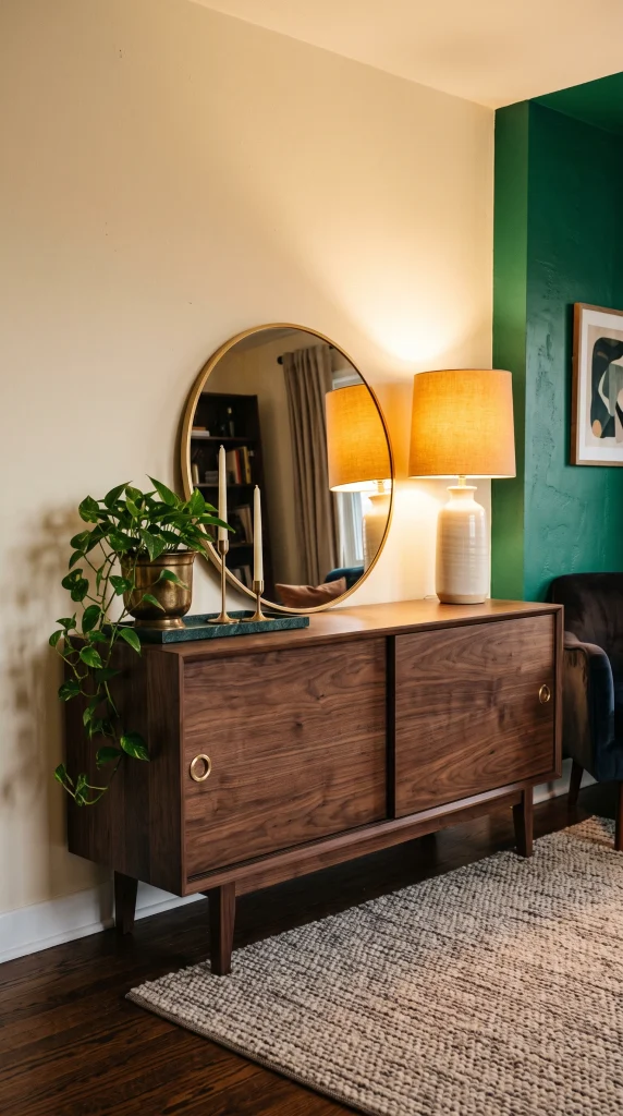
An emerald and gold palette risks feeling ungrounded and floaty without a darker anchoring element, and dark walnut or ebonized oak furniture, a console table, a media unit, or a pair of bookends, provides that grounding without introducing a third competing color. Dark wood sits in the neutral zone between emerald and gold, absorbing the contrast between the two and giving the eye a visual anchor at mid-height that cream and gold alone cannot provide.
Pro Move: A dark walnut sideboard against the cream wall opposite the emerald accent wall creates a balanced composition where each wall has its own dominant material: emerald on one, warm wood on the other, with gold distributed across both.
11. Hang an Art Deco-Inspired Gold Chandelier as the Room’s Crown

The ceiling fixture in an emerald and gold living room is not a functional afterthought: it is the room’s crown, and a chandelier with Art Deco geometric lines in brushed or antique gold elevates the entire palette into a different register of sophistication. The Art Deco movement was built on exactly this color combination, emerald, gold, and cream, which means fixtures from that tradition, or contemporary ones that reference it, have a historical resonance in this palette that other styles simply do not.
Heads Up: Scale is everything with a chandelier. The standard rule is that the diameter of the chandelier in inches should equal the sum of the room’s length and width in feet. A 14 by 16 foot living room needs a chandelier approximately 30 inches in diameter or it will look too small for the ceiling.
12. Add an Emerald Green Area Rug to Ground the Seating Zone
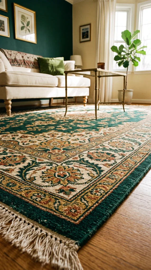
A deep emerald area rug beneath the seating group extends the palette down to floor level and creates the most complete and immersive version of an emerald and gold living room by wrapping the color around the furniture grouping from floor to sofa to wall. A patterned rug that weaves together emerald, gold, and cream, such as a Persian or geometric design, carries all three colors of the palette in a single piece and makes the floor layer feel as considered as every other surface in the room.
Reality Check: A solid emerald rug is powerful but unforgiving; every piece of furniture leg, every fallen object, and every footprint shows against the uniform color. A patterned rug in the same color family is far more practical and visually just as rich.
13. Frame the Windows With Emerald Velvet Curtains

Floor-to-ceiling emerald velvet curtains hung at ceiling height and extending several inches beyond the window frame on each side do two things that no other window treatment can replicate in this palette: they carry the dominant jewel tone vertically from ceiling to floor, making the room feel dramatically taller, and the weight and density of velvet at the window creates a sense of enclosure and luxury that is associated with the great townhouse drawing rooms of the Art Deco era. Even in rooms with average ceiling heights, velvet curtains in deep emerald make the space feel significant.
Designer Advice: Use matte black or antique gold curtain poles and rings rather than chrome or white rods; the hardware is visible and should participate in the palette. A bronze or antique gold pole at ceiling height with heavy emerald velvet panels reads as architecture, not just a window treatment.
14. Display Gold-Framed Botanical or Abstract Art in a Gallery Cluster
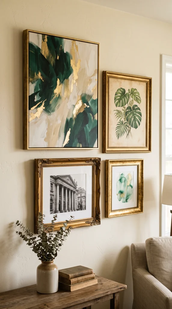
A grouping of two to four framed prints or canvases in matching antique gold or brushed brass frames on the cream wall opposite the sofa creates the gallery-style feature that an emerald and gold living room naturally calls for. Botanical illustrations in warm greens with gold-leaf details, abstract art with emerald and gold as dominant tones, or black-and-white photography in gold frames all work beautifully in this context, each carrying the palette in a different register.
Quick Tip: Matching frame finish across a gallery cluster is more important than matching frame width. Different widths in the same antique gold finish reads as a curated collection; same widths in different finishes reads as a hardware store display.
15. Use Emerald Green Painted Built-In Shelving
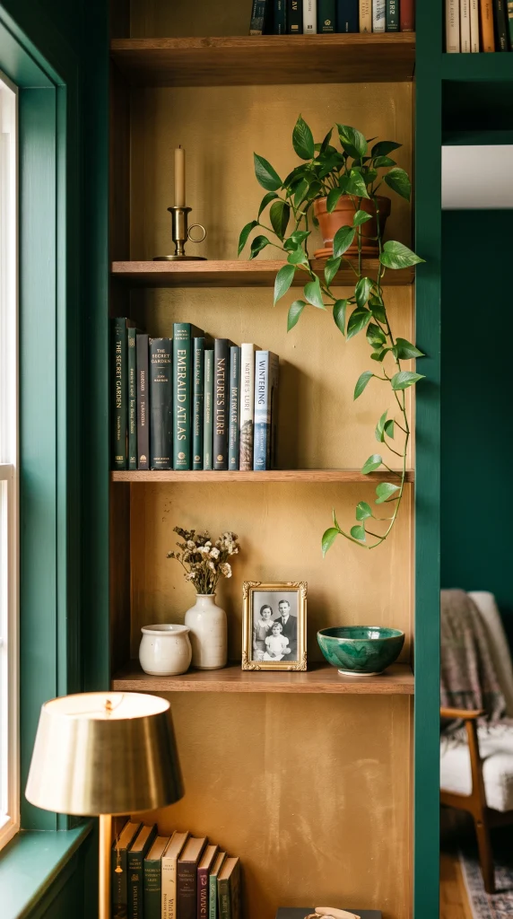
Painting a built-in bookcase or alcove shelving in the same deep emerald as the accent wall, or in a tone one shade lighter for subtle differentiation, creates an architectural moment that reads as considered and deliberate in a way that freestanding furniture cannot. The shelving then becomes the perfect canvas for displaying gold objects, cream ceramics, dark books with warm spines, and small brass-framed photographs in a combination that delivers the full palette at a micro scale within the bookcase itself.
Pro Move: Paint the inside back panel of the shelving in a warm gold or antique brass tone rather than the same emerald. The gold interior glows warmly behind the displayed objects and creates a jewel-box effect inside the bookcase that is particularly dramatic when the room is lit for evening.
16. Introduce Black as a Sharpening Accent
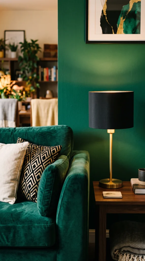
A small and deliberate dose of matte black, in lamp shades, thin picture frame borders, furniture feet, or a single black-and-gold throw pillow, sharpens the emerald and gold palette in a way that neither color can do for itself. Black provides the highest possible contrast against both emerald and gold and prevents the combination from reading as soft or sweet, keeping it firmly in the sophisticated, editorial register that the palette is capable of reaching. This is a technique borrowed from Art Deco interiors and from luxury hotel design, where black is used as a precision sharpener rather than a dominant color.
Reality Check: Keep black to under 5 percent of the room’s visual palette, two or three touch points maximum, or it begins to compete with the emerald and gold rather than sharpening them.
17. Style a Gold Bar Cart or Drinks Trolley as a Decorative Station

A gold bar cart or drinks trolley positioned between two seating zones adds a functional and decorative element that is particularly well-suited to the emerald and gold palette’s associations with entertaining and sophistication. Styled with crystal decanters, emerald-toned glassware, small gold ice buckets, and a single potted plant in a brass vessel, the bar cart concentrates the palette into a freestanding vignette that works from every angle and gives the room a genuinely lived-in and grown-up quality.
Designer Advice: Position the bar cart where it is visible from the main seating area without blocking foot traffic. Against a cream wall or in front of an emerald bookcase, it reads as a deliberate design element rather than functional storage on wheels.
18. Layer a Cream Boucle or Textured Throw Over the Emerald Sofa
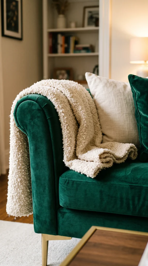
A single cream or warm ivory throw draped casually over one arm of an emerald velvet sofa introduces the third palette color, a tactile material contrast, and a suggestion of everyday comfort all in one move that costs almost nothing relative to the visual impact it creates. Boucle, chunky knit, or a woven cotton throw in cream breaks the uniform surface of the velvet, signals that the sofa is lived in rather than preserved, and softens the formality of a palette that can otherwise feel too polished for daily use.
Quick Tip: Drape the throw so approximately one third hangs over the sofa arm and two thirds pool slightly on the seat cushion. This casual proportion reads as intentional styling rather than a forgotten item left on the sofa.
19. Choose a Geometric Gold Rug or Carpet for a Modern Take

For living rooms that want the emerald and gold combination to read as contemporary rather than traditional or Art Deco, a geometric patterned rug in cream with a gold Moroccan or chevron motif against the emerald sofa and green walls creates the same palette in a visual language that feels current and fresh. The geometric pattern introduces the gold at floor level without the historical associations of a Persian or floral design, and its sharp lines contrast beautifully with the soft texture of velvet upholstery.
Heads Up: In a room with patterned curtains, wallpaper, or heavily patterned cushions, a geometric rug will fight for attention and create visual noise. Reserve the geometric rug for rooms where the other surfaces are solid colors.
20. Position a Tall Indoor Plant in a Brass or Gold Planter
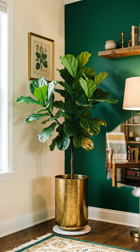
A large indoor plant, a fiddle leaf fig, a snake plant, a monstera, or a potted olive tree, in a tall brushed brass or hammered gold planter reinforces the emerald palette with living green while adding the gold accent at floor level where it provides visual grounding. The organic, living quality of the plant also softens the formality that an all-velvet, all-gold scheme can project, making the room feel inhabited and naturally beautiful rather than showroom-perfect.
Pro Move: A plant in a gold planter in the corner diagonally opposite the sofa both fills the dark corner and distributes the emerald-and-gold palette to the far reach of the room, making the whole space feel cohesive from every angle.
21. Install Emerald Green Grasscloth or Textured Wallpaper
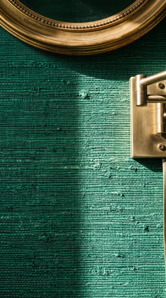
Deep emerald grasscloth wallpaper or a high-quality textured wallpaper in an emerald tone brings a surface quality to the accent wall that paint cannot replicate: the woven or embossed texture catches directional light and creates subtle surface movement that makes the green appear to shift between lighter and darker tones throughout the day. Against this richly textured surface, gold sconces, brass-framed mirrors, and antique picture frames appear to float rather than simply hang on a flat wall.
Designer Advice: Grasscloth wallpaper is not washable and shows scuffs and marks more readily than painted walls. Use it on the accent wall opposite seating where it is not touched rather than on high-traffic walls near doorways.
22. Add a Deep Green Marble or Stone Accent Surface
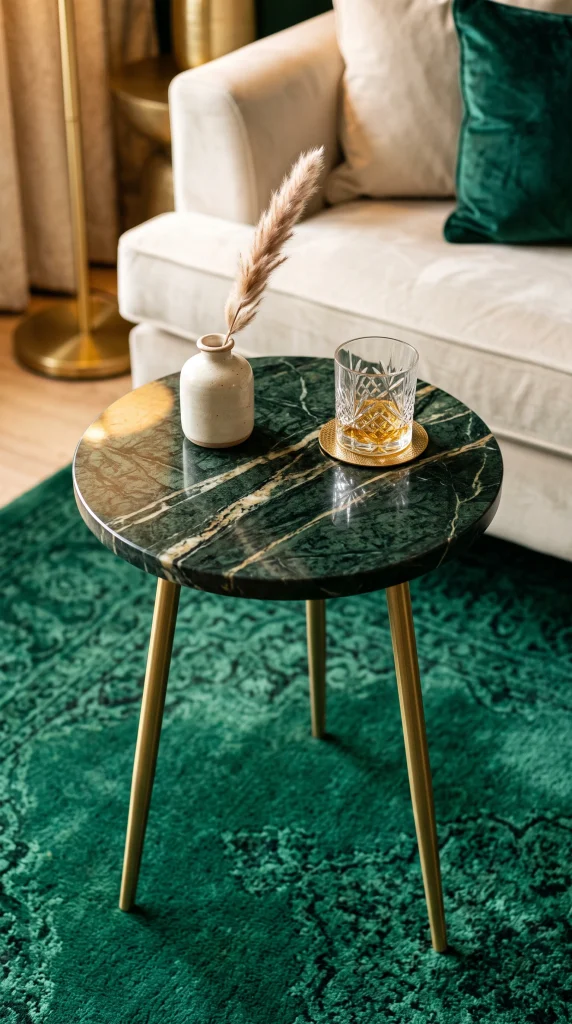
Green marble, verde Guatemala, malachite-pattern ceramics, or a dark forest green stone side table surface introduces a natural material variation to the emerald palette that prevents it from reading as too uniform or purely decorative. Natural stone has an inherent quality and variation that manufactured materials cannot replicate, and the veining in dark green marble naturally incorporates ivory, black, and gold tones that echo every other element in the palette without any additional curation effort.
Quick Tip: A single green marble tray on the coffee table, or a small marble-topped side table, is enough to bring the natural material quality into the room. You do not need an entire marble surface to get the benefit of the material’s visual richness.
23. Use Gold Leaf or Metallic Paint on Ceiling Molding

In a living room with existing crown molding, cornice detail, or ceiling roses, applying a metallic gold or antique brass paint to just the molding profile while keeping the ceiling in warm white creates an architectural detail that costs very little and returns an extraordinary amount of visual richness. This technique has a long history in European interior design and is particularly associated with the Art Deco period, where gilded architectural detail was used to connect the room’s decorative elements to its structural bones.
Reality Check: This technique works best with clean, well-defined molding profiles. On damaged, filled, or lumpy molding, gold paint amplifies imperfections rather than hiding them. Repair the molding properly before painting it in any metallic finish.
24. Choose Cream Linen or Silk Curtains for a Lighter Window Treatment
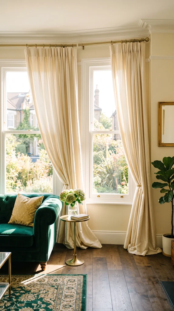
Where emerald velvet curtains create drama and enclosure, cream linen or silk curtains at the windows keep the room feeling airy and light while still participating in the three-color palette. This is the correct choice for rooms that receive good natural light and where you want the jewel tones of the emerald furniture and accents to feel rich rather than heavy. The cream curtains frame the windows without competing with the emerald, and in a sunny room their warm glow adds natural luminosity to the entire palette.
Pro Move: Cream silk curtains in a room with an emerald accent wall and gold accessories will catch and refract light in a way that linen cannot, creating a gentle shimmer at the window that connects visually to the gold elements across the room.
25. Style the Mantelpiece as an Emerald and Gold Vignette
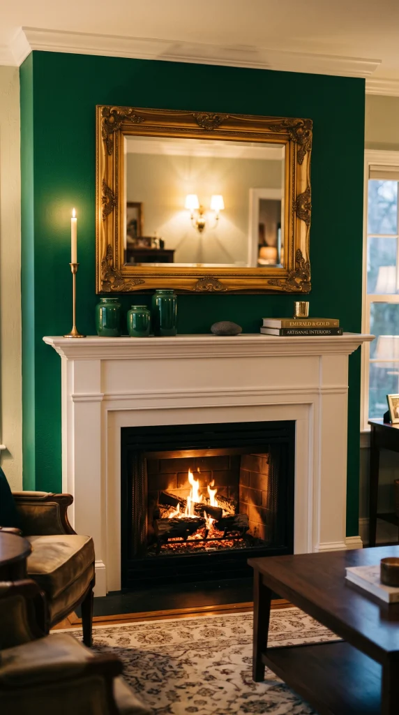
A fireplace mantelpiece in an emerald and gold living room is the natural location for a tightly curated vignette that concentrates the full palette in one high-visibility display. A collection of three to five objects, a tall gold candlestick, a small emerald ceramic vessel, a round antique brass mirror or a framed botanical print above, and one or two natural objects such as a dark stone or dried botanical, arranged with deliberate asymmetry creates a mantel that reads as a composed still life rather than a collection of random objects.
Designer Advice: The vertical element, a mirror, artwork, or tall candlestick group, above the mantel is essential. Without vertical height at the mantelpiece, the arrangement looks flat and disconnected from the wall above it.
26. Introduce Jewel-Tone Companions: Sapphire or Amethyst

Emerald and gold is the foundation of a jewel-tone palette, and adding one additional jewel tone in a small dose, a single sapphire blue velvet cushion, an amethyst purple glass vase, or a deep teal book binding visible on a shelf, adds depth and sophistication that a two-color palette cannot achieve alone. The jewel tones all share a similar level of saturation and darkness, which means they harmonize naturally without any of them dominating, and a small dose of a complementary jewel is often the detail that separates a room that looks like an inspiration board from one that looks designed.
Quick Tip: Keep the additional jewel tone to one or two objects maximum and never introduce more than one companion jewel tone in the same room. One sapphire cushion is a considered accent; sapphire, amethyst, and ruby together in the same room is a circus.
27. Use an Emerald and Gold Botanical or Peacock Print Textile
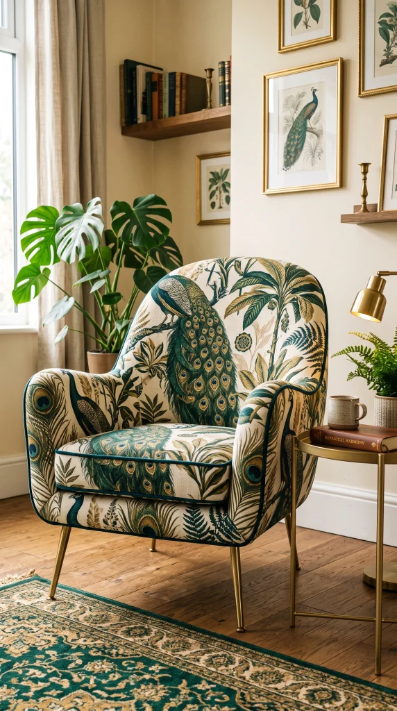
A large-scale botanical or peacock-motif print fabric in emerald, gold, and cream, used on a single armchair, a pair of curtain panels, or a throw pillow grouping, carries the full palette in a single textile and immediately reads as bold, confident, and deliberately styled. Historically, peacock prints have been associated with the aesthetic movement and Art Nouveau, both close cousins of the Art Deco tradition that underpins the emerald and gold palette, giving them a resonance and depth that abstract or geometric patterns in the same colors would not have.
Reality Check: A large-scale botanical or peacock print is a strong pattern and needs room to read. Use it on upholstered pieces in a room with otherwise solid-color surfaces: solid emerald sofa, solid cream walls, solid-colored rug. Pattern on a patterned background creates chaos.
28. Finish With Candles and Amber Light for Evening Atmosphere
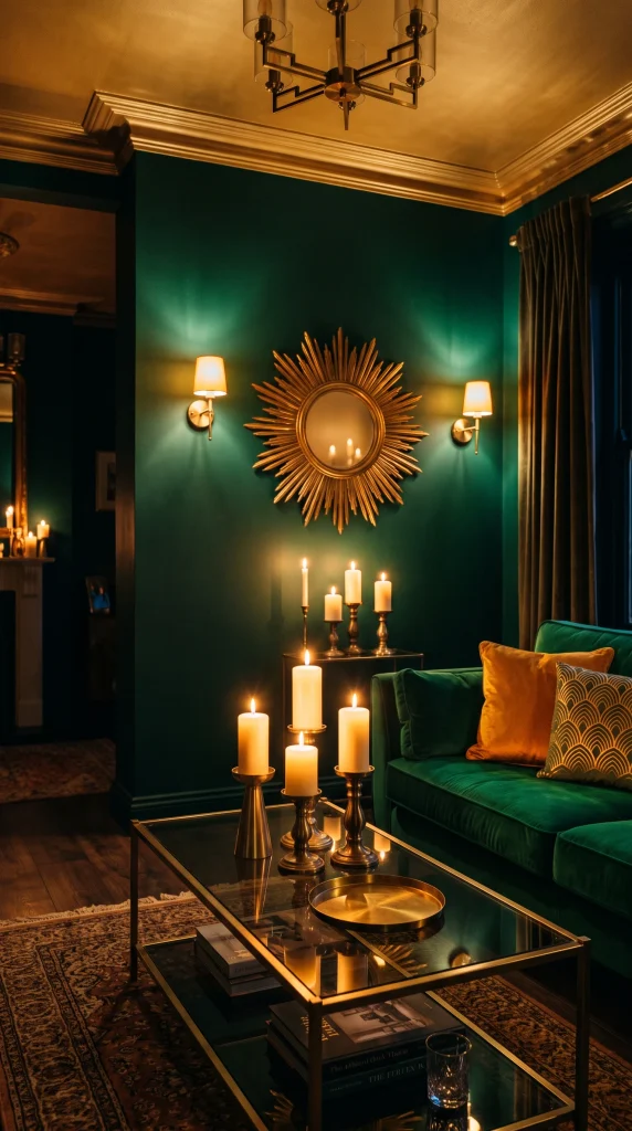
An emerald and gold living room reaches its absolute peak in the evening, when warm candlelight and low amber lamp light bring out the full depth of the emerald and make the gold elements glow from within. A grouping of cream or unscented ivory pillar candles in gold or brass candlestick holders on the coffee table, the mantelpiece, and the console table, combined with all lamps set to their lowest warm setting, transforms the palette from beautiful to extraordinary and is the final layer that makes everything else in the room work harder.
Pro Move: Set every lamp in an emerald and gold living room on a dimmer switch and establish a specific evening setting at 30 to 40 percent brightness. At this level, the emerald walls appear to deepen by two shades and the gold elements develop a warm luminosity that full-brightness lighting completely destroys.