Brilliant Bedroom Bedding Combination Ideas to Try Tonight
Your bed is the undeniable centerpiece of your bedroom, and the way you style it dictates the entire energy of the space. While buying a pre-packaged bed-in-a-bag might seem like the easiest route, it almost always results in a flat, uninspired room that feels like a generic catalog spread. True luxury in bedroom design comes from mixing and matching individual pieces to create a layered, highly textured oasis that invites you to dive in at the end of a long day. I have noticed that many people struggle to break away from perfectly matching sets because mixing patterns and fabrics feels intimidating. However, understanding a few basic rules about color balance, material weights, and proper proportion completely removes the guesswork from the styling process. In my experience, investing time in curating your bedding combinations pays massive dividends in both your daily sleep quality and the overall visual impact of your bedroom.
The secret to a magazine-worthy bed lies entirely in the subtle art of layering. You must consider how different textures interact with your skin and how various colors respond to the natural light in your specific room. Too often, people pile on beautiful but scratchy decorative pillows that just end up tossed on the floor every night, creating unnecessary clutter instead of functional beauty. The twenty-five ideas below are specifically designed to help you rethink how you assemble your sheets, quilts, and duvets to maximize both comfort and style. Whether you prefer a crisp, hotel-like aesthetic or a messy, relaxed bohemian vibe, there is a practical combination here for you. We will look at exactly what works in practice, focusing heavily on actionable tips that you can apply immediately to elevate your sleeping setup.
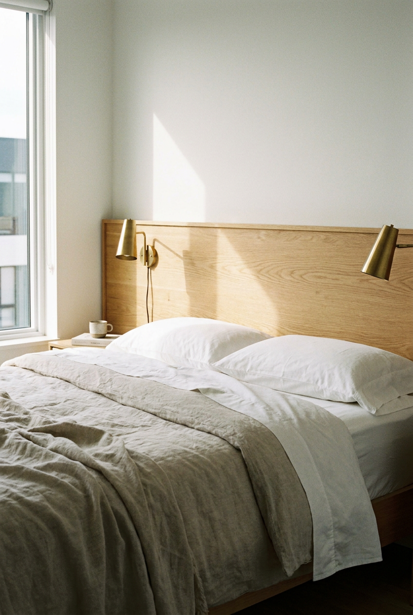
Crisp White and Oatmeal Linen
Starting with a base of crisp white percale sheets and topping them with an oatmeal-colored linen duvet cover creates a highly serene, minimalist aesthetic that works beautifully in brightly lit bedrooms. The smooth, cool touch of the white percale cotton provides ultimate sleeping comfort, while the slightly wrinkled, organic texture of the oatmeal linen adds necessary visual depth to the surface of the bed. You should pair this neutral combination with a natural wood headboard and warm brass reading lamps to keep the room from feeling completely devoid of color. This is an investment-level look because high-quality linen is expensive, but it genuinely breathes better than any synthetic fabric on the market. Keeping the sleeping pillows entirely white while using oatmeal shams for the decorative pillows pulls the entire layered look together perfectly.
Designer Advice: Always wash new linen bedding at least three times before using it to break down the stiff fibers and achieve that highly coveted, ultra-soft drape.
Navy Sateen and Sand Knit
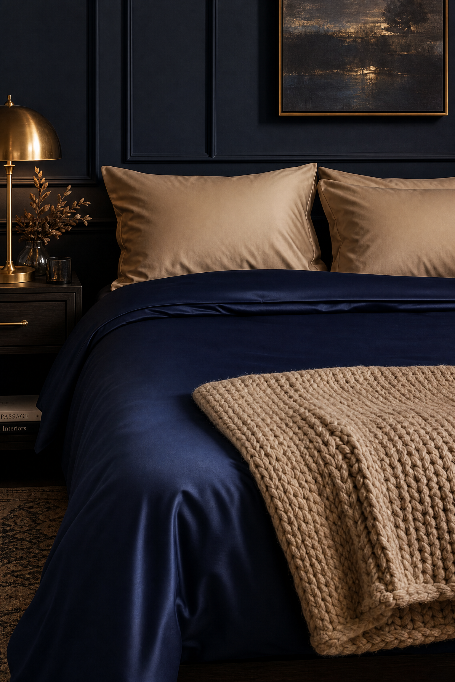
Combining dark navy blue sateen sheets with a chunky, sand-colored knit throw blanket delivers a striking, sophisticated contrast that feels instantly luxurious. In practice, the subtle sheen of the sateen fabric reflects bedside lighting beautifully, making the dark blue color look incredibly rich and expensive rather than heavy and oppressive. You must balance this dark base by using lighter, sand-colored sleeping pillows and a matching light quilt to ensure the bed does not look like a massive dark hole in the center of the room. While sateen sheets fall into a mid-range budget, they require delicate washing to maintain their silky texture over time. This moody combination looks absolutely fantastic in bedrooms with dark hardwood floors or dramatic, dark painted walls.
Pro Move: Fold the sand-colored quilt entirely in half and lay it sharply across the foot of the bed to cleanly break up the massive expanse of dark navy blue.
Sage Green and Ivory Waffle
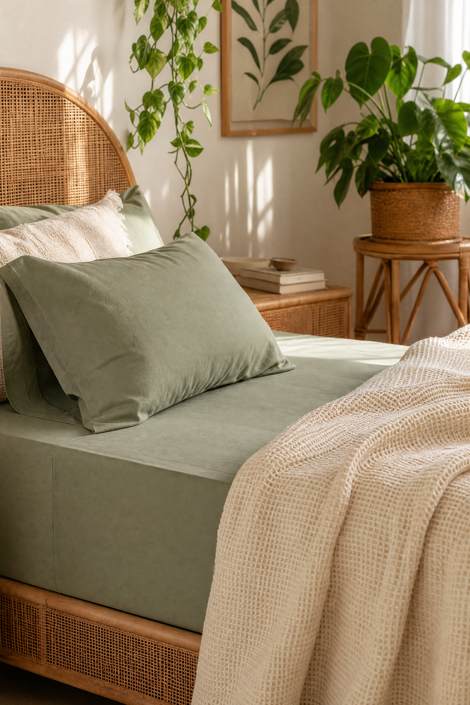
Layering soft sage green cotton sheets underneath an ivory waffle-weave blanket brings a highly calming, nature-inspired energy that works wonders for reducing stress before sleep. The tiny, grid-like texture of the waffle blanket provides an excellent tactile contrast against the perfectly smooth green sheets, creating a bed that looks interesting even when it is slightly unmade. I find this specific color pairing works exceptionally well with rattan furniture and plenty of trailing house plants to complete an earthy, organic aesthetic. You can easily achieve this look on a very tight budget since waffle-weave cotton blankets are widely available and highly affordable. Tucking the green sheets tightly with military corners ensures the bed retains a tailored look beneath the relaxed ivory blanket.
Reality Check: Waffle weave blankets are notorious for shrinking dramatically in the dryer, so you must always wash them in cold water and strictly air dry them.
Terracotta and Blush Silk
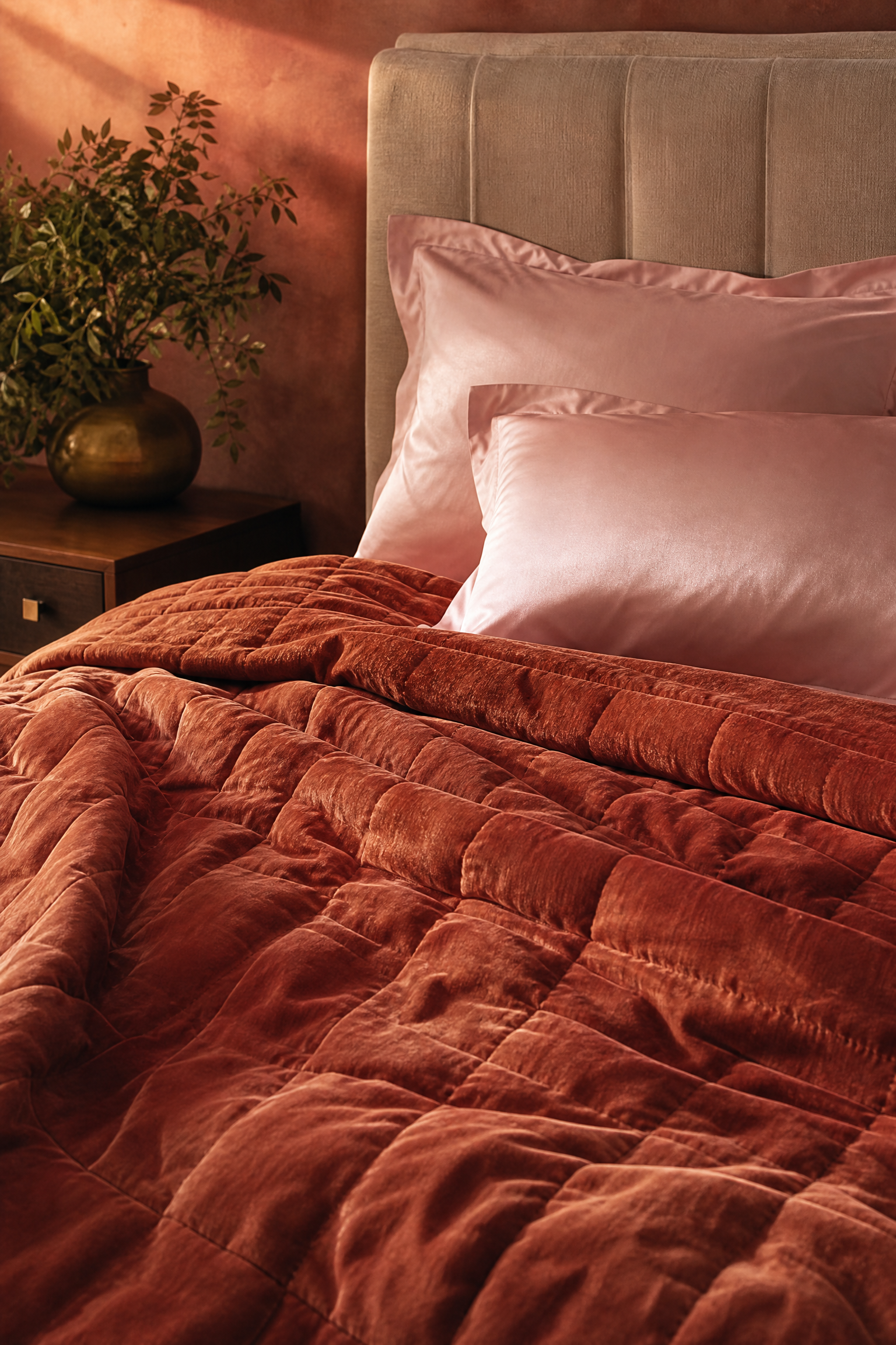
Pairing a heavy terracotta velvet quilt with delicate blush pink silk pillowcases creates a highly romantic, tonal bedroom setup that feels incredibly warm and inviting. When testing this combination, the heavy weight of the velvet provides massive comfort during cold winter months, while the silk pillowcases prevent hair breakage and keep your face cool throughout the night. You should pair this warm, sunset-inspired palette with a simple upholstered headboard to let the rich colors remain the undisputed focal point of the room. This sits squarely in the high-budget category due to the cost of authentic silk, but the benefits to your skin and hair make it a highly functional investment. Keeping the fitted sheet a neutral, warm white ensures the pink and terracotta tones do not completely overwhelm the eye.
Quick Tip: Use a specialized silk-safe liquid detergent and a mesh laundry bag to prevent your expensive blush pillowcases from snagging in the washing machine.
Charcoal Flannel and Crisp White
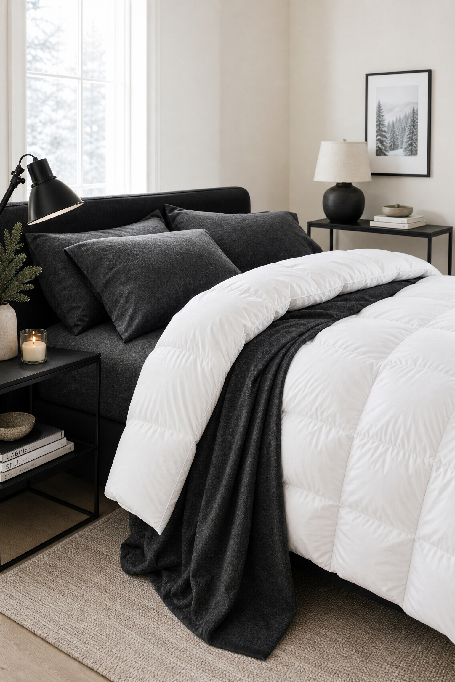
Mixing heavy charcoal grey flannel sheets with a bright, crisp white down comforter offers the ultimate cozy winter bed setup without sacrificing a clean, modern aesthetic. The dark, fuzzy texture of the flannel traps body heat perfectly, while the bright white comforter on top prevents the bed from looking heavy or visually shrinking the bedroom. I always suggest pairing this high-contrast combination with sleek black metal nightstands and minimalist artwork to keep the space feeling tailored and intentional. Flannel sheets are highly affordable, making this an easy seasonal swap that drastically improves your sleeping experience during freezing weather. Folding the white comforter down slightly at the top to expose the dark charcoal sheets creates a highly inviting, hotel-like presentation.
Heads Up: Flannel sheds a massive amount of lint during the first few wash cycles, so you must clean your dryer trap halfway through the drying process.
Mustard Yellow and Navy Check
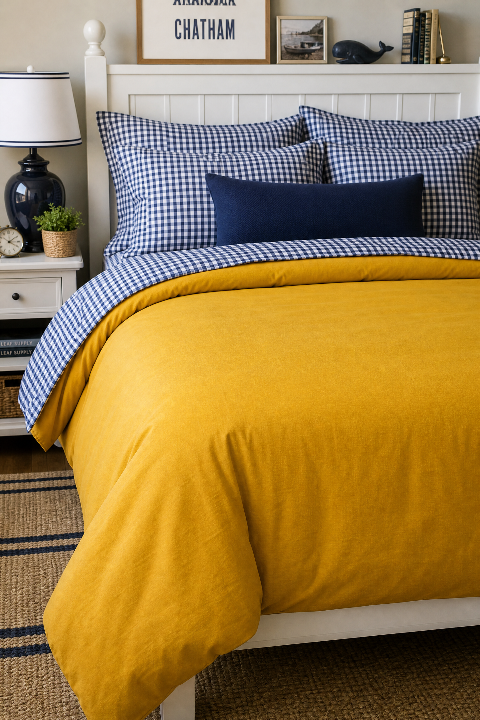
Using a solid mustard yellow duvet cover paired with navy blue and white gingham check sheets introduces a playful, slightly preppy pattern mix that immediately energizes a dull room. In my experience, pairing a large block of solid color with a small-scale geometric pattern is the safest, most effective way to mix bedding without creating visual chaos. You can pair this vibrant combination with a simple white wooden bed frame to ensure the bold colors remain the primary focus. This is a very budget-friendly approach that allows you to easily inject massive personality into a basic apartment or guest room. Adding a single solid navy lumbar pillow to the front of the pillow stack perfectly ties the sheet pattern back into the yellow duvet.
Designer Advice: Always ensure the pattern on your sheets is small and tight when pairing it with a bold solid color to maintain proper visual scale and balance.
Olive Green and Rust Velvet
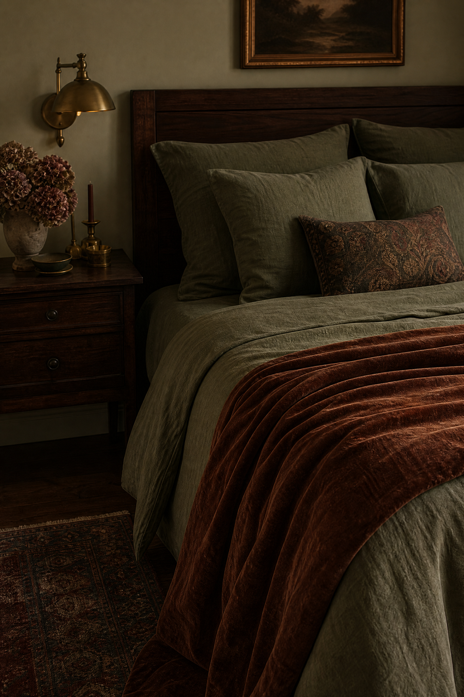
Layering olive green washed cotton sheets beneath a heavy rust-colored velvet throw creates a deeply earthy, vintage-inspired palette that looks incredibly sophisticated. The muted, brownish undertones of the olive green prevent the combination from looking like a holiday decoration, keeping the aesthetic strictly rooted in natural, autumnal warmth. You should pair this moody setup with dark walnut furniture and antique brass lighting to enhance the historic, collected-over-time atmosphere. While washed cotton is quite affordable, a genuine velvet throw is an investment piece that instantly elevates the perceived quality of the entire bed. Keeping the decorative pillows limited to matching olive green ensures the rust velvet throw remains the standout accent piece.
Pro Move: Drape the heavy velvet throw diagonally across the bottom corner of the bed rather than folding it perfectly to create a relaxed, effortless appearance.
Soft Blue and Heather Grey
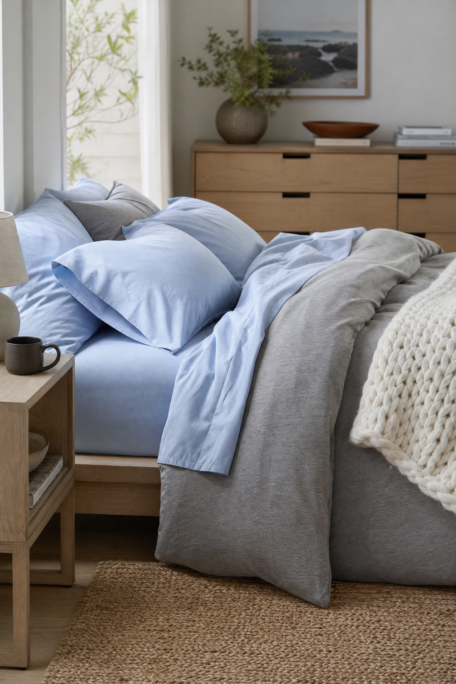
Combining soft powder blue percale sheets with a heather grey jersey knit duvet cover provides a highly casual, ultra-comfortable setup that feels exactly like sleeping in your favorite vintage t-shirt. The extreme softness of the jersey material makes it incredibly inviting, while the cool blue and grey color palette naturally lowers the heart rate and promotes deep sleep. I find this relaxed combination works perfectly in casual, minimalist bedrooms featuring simple platform beds and light ash wood furniture. This is a very affordable bedding option that requires absolutely zero ironing, making it the perfect choice for low-maintenance households. Adding a chunky white knit throw blanket provides a necessary third texture to keep the soft materials from looking entirely flat.
Reality Check: Jersey knit fabric stretches significantly over time, so you must always wash it in cold water to help the fibers snap back into their original shape.
Classic White and Black Pinstripe
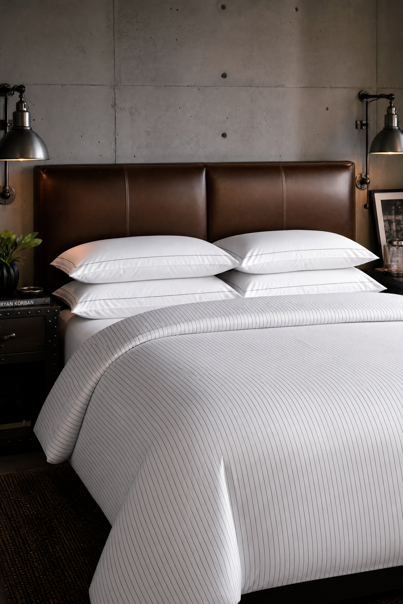
Using pure white sheets alongside a white duvet cover that features a razor-thin black pinstripe offers a highly tailored, menswear-inspired look that feels incredibly chic. The stark white base keeps the bed looking immaculately clean and hotel-like, while the subtle black stripes add just enough graphic interest to prevent the setup from being boring. You can pair this sharp combination with a leather headboard and industrial metal lighting to complete a sophisticated, slightly masculine aesthetic. This sits in the mid-range budget category and works beautifully because high-quality white cotton is easy to bleach and maintain over time. Arranging four standard pillows perfectly flat against the headboard enhances the rigid, organized geometry of the pinstripe pattern.
Quick Tip: Use a handheld fabric steamer directly on the bed after making it to remove wrinkles and achieve a flawlessly crisp, professional presentation.
Plum and Dusty Rose Tonal
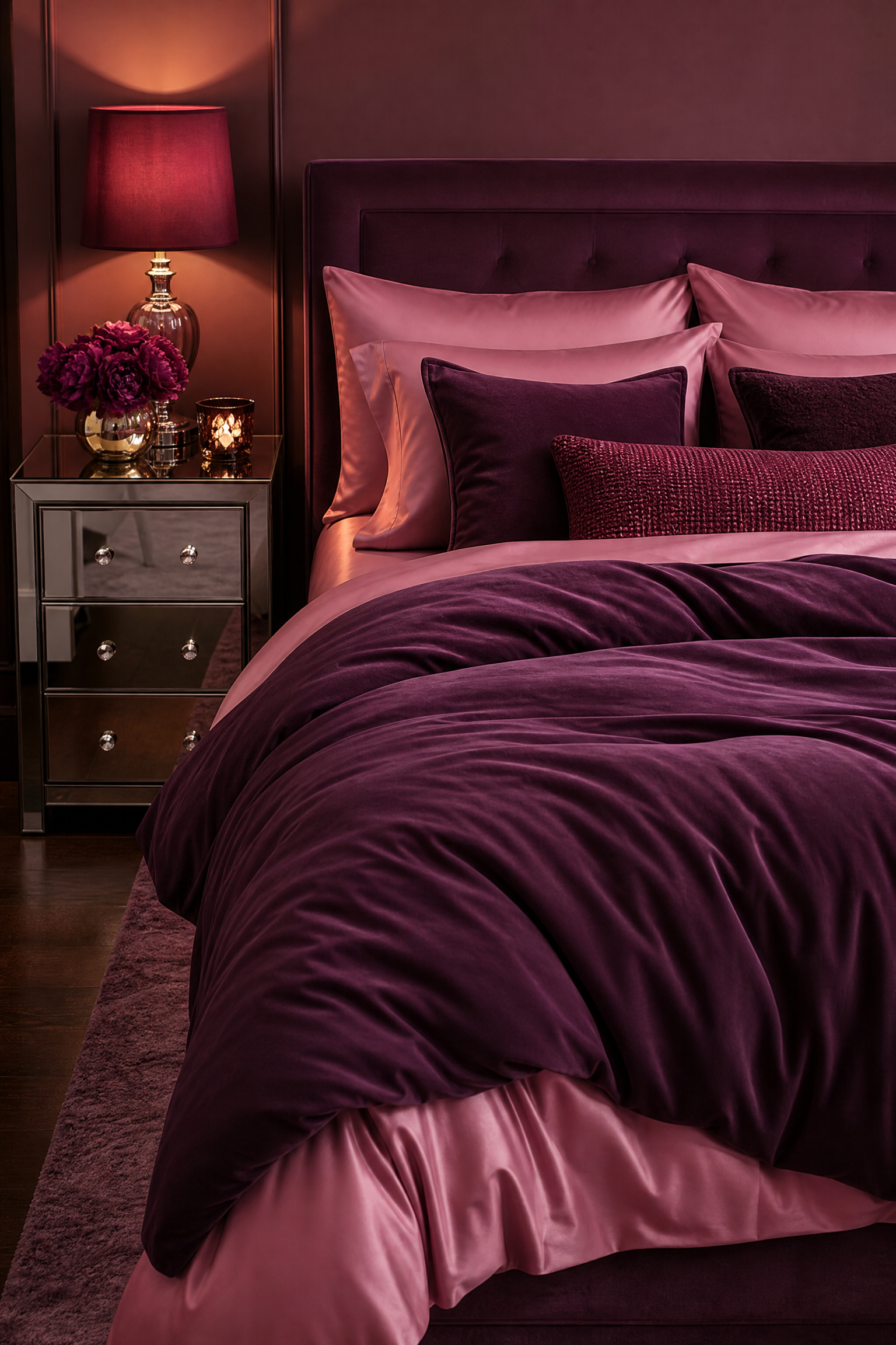
Layering a deep plum purple duvet over dusty rose pink sheets creates a stunning monochromatic, tonal effect that feels incredibly rich and deeply romantic. When working with clients who want color without pattern, using two distinct shades from the exact same color family provides massive visual depth without looking chaotic. You should pair this warm, saturated combination with a simple upholstered bed and mirrored nightstands to reflect the beautiful colors around the room. This approach works well on any budget, provided you carefully match the undertones of the pink and purple fabrics so they genuinely complement each other. Using a shiny sateen finish for the dusty rose sheets adds a luxurious gleam that highlights the darker plum layer beautifully.
Heads Up: Highly saturated dyes like plum bleed heavily in the wash, so you must include a color-catching laundry sheet during the first few cycles.
Chambray Blue and Cream Sherpa
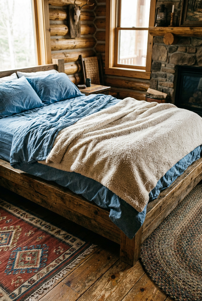
Mixing casual blue chambray sheets with a thick, textured cream sherpa blanket creates a highly inviting, rustic cabin aesthetic that is perfect for casual living. The denim-like appearance of the chambray provides a durable, relaxed base that heavily contrasts with the fluffy, cloud-like texture of the sherpa material. I always suggest pairing this highly tactile combination with a reclaimed wood bed frame and vintage rugs to enhance the cozy, lived-in atmosphere. This is a highly affordable pairing that wears incredibly well, as chambray actually becomes softer and more comfortable with every single wash. Layering the sherpa blanket directly under the top sheet provides ultimate warmth on freezing winter nights.
Designer Advice: Never use fabric softener on sherpa material, as it coats the fuzzy fibers in wax and completely ruins the fluffy texture permanently.
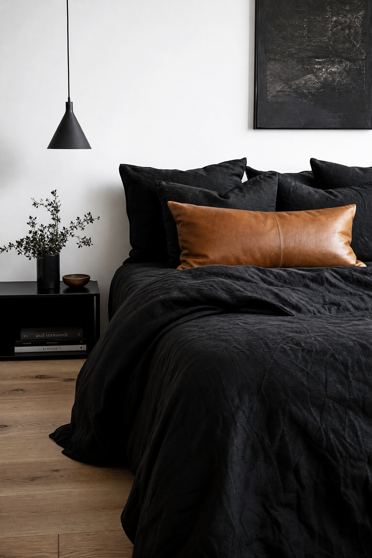
Black Linen and Camel Leather
Combining pure black linen bedding with a large, camel-colored leather lumbar pillow introduces a highly dramatic, edgy aesthetic that looks incredibly modern and bespoke. The matte, slightly wrinkled texture of the black linen absorbs light beautifully, preventing the bed from looking like a shiny black garbage bag. You must pair this extremely dark setup with bright white walls and light oak floors to provide necessary contrast and keep the room from feeling oppressive. While authentic linen and genuine leather are major investments, this striking combination completely eliminates the need for any other decorative pillows. The warm caramel tones of the leather perfectly break up the massive expanse of dark fabric.
Pro Move: Use a completely hidden zipper closure on the black linen duvet cover to maintain a flawlessly clean edge at the bottom of the bed.
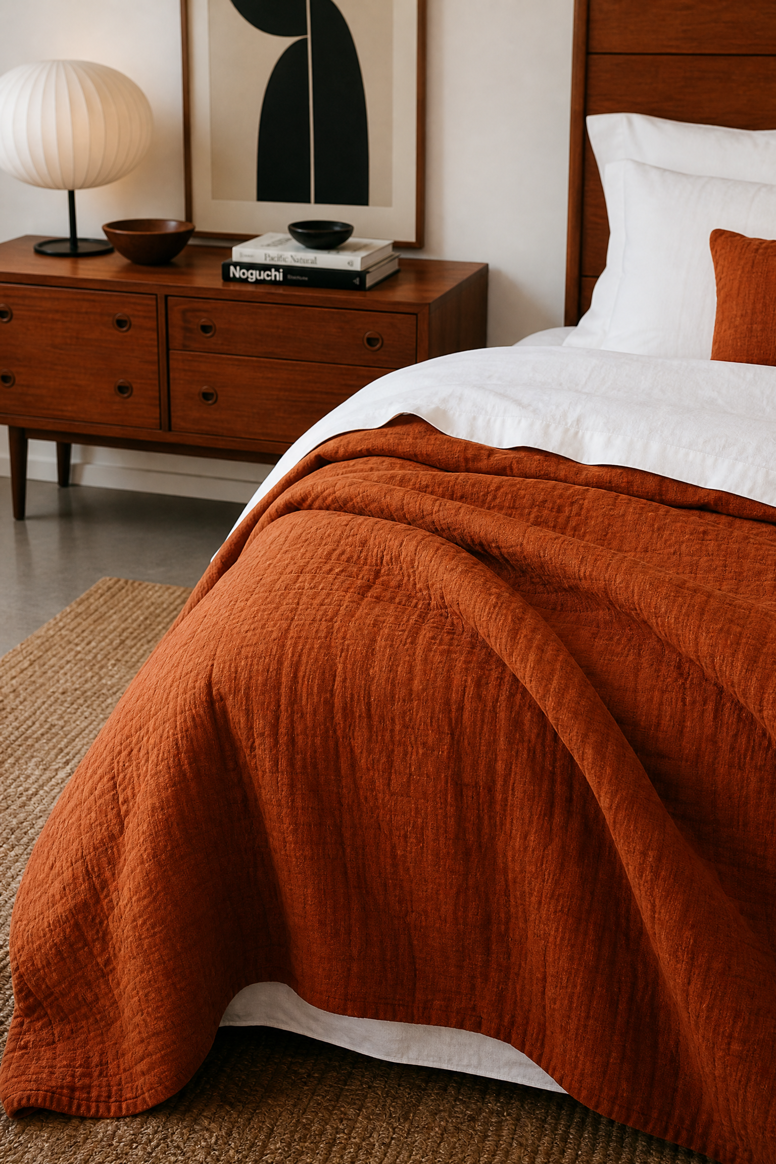
Burnt Orange and Crisp White
Using a burnt orange linen quilt over stark white percale sheets brings a massive punch of energetic warmth to a room while keeping the sleeping surface completely cool and clean. The contrast between the fiery orange layer and the sterile white sheets creates a highly modern, graphic look that feels very intentional and heavily stylized. I find this combination works perfectly with mid-century modern furniture, specifically pairing well with warm teak or walnut wood tones. This is a mid-range budget option that allows you to introduce a trendy, bold color without fully committing to expensive orange sheets or a massive duvet insert. Folding the top white sheet generously over the orange quilt creates a thick, luxurious cuff.
Reality Check: White percale sheets require strict adherence to a weekly bleaching schedule to prevent the cotton from slowly yellowing over time.
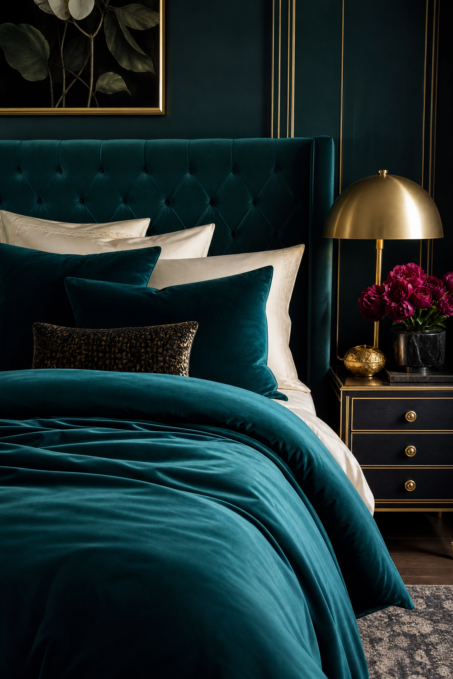
Teal Velvet and Cream Cotton
Layering a heavy teal velvet duvet cover over soft cream-colored cotton sheets creates a highly luxurious, jewel-box aesthetic that feels incredibly opulent and expensive. The deep, rich blue-green tones of the teal shift beautifully depending on the lighting, while the cream sheets provide a warm, soft contrast that is far less harsh than pure white. You should pair this glamorous combination with a tufted velvet headboard and gold or brass accents to fully embrace the high-end, boutique hotel vibe. Authentic velvet bedding is definitely an investment piece, but its massive visual weight makes it the only decorative element your bed will actually need. Keeping the cream sheets simple and unpatterned ensures the crushed texture of the velvet stands out.
Quick Tip: Always brush the velvet duvet cover in one single direction with a soft bristle brush after making the bed to eliminate messy handprints.
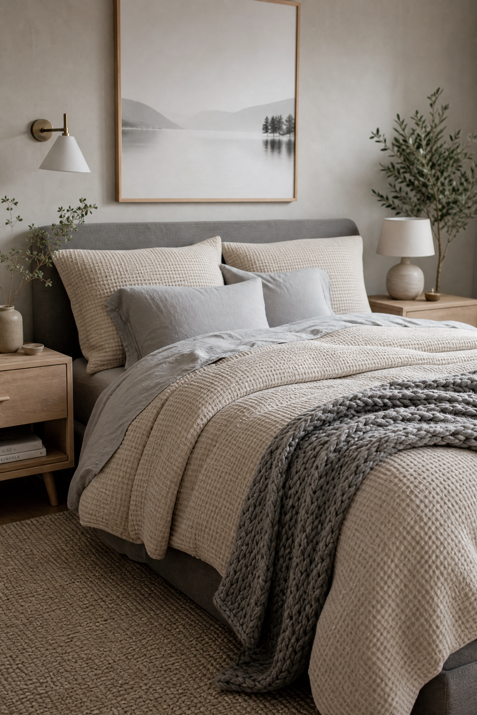
Oatmeal Waffle and Soft Grey
Mixing an oatmeal-colored waffle weave duvet cover with soft dove grey sheets provides a highly soothing, completely neutral palette that relies entirely on texture for visual interest. When testing neutral setups, I discovered that combining warm beige tones with cool grey tones prevents the bed from looking flat and lifeless. You can pair this subtle, highly sophisticated combination with a simple gray upholstered bed and light birch nightstands to maintain the calm, Scandinavian-inspired aesthetic. This sits comfortably in the mid-range budget category and works beautifully for guest rooms where you want a universally appealing, relaxing environment. Tossing a chunky knit grey throw at the foot of the bed adds a third layer of essential texture.
Heads Up: When mixing two different neutrals, you must ensure both fabrics have a distinctly different weave or texture so they do not look like a failed color match.
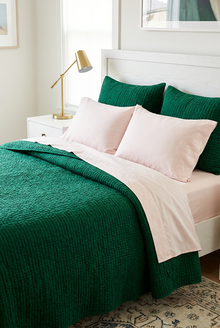
Emerald Green and Pale Pink
Pairing a rich emerald green quilt with pale blush pink sheets creates a stunning, highly trendy contrast that feels both playful and incredibly chic. The deep, saturated green grounds the bed with a serious, moody tone, while the unexpected peek of light pink sheets adds a massive dose of whimsical personality. I always recommend pairing this vibrant combination with modern white furniture and a simple brass reading lamp to keep the focus entirely on the bold bedding colors. This is a highly affordable look to achieve using basic cotton separates, allowing you to easily swap the pink sheets for white if you ever grow tired of the contrast. Using matching green shams pulls the quilt color up to the headboard perfectly.
Designer Advice: Keep the pink shade extremely pale, almost like a tinted white, so it does not aggressively compete with the dark emerald green.
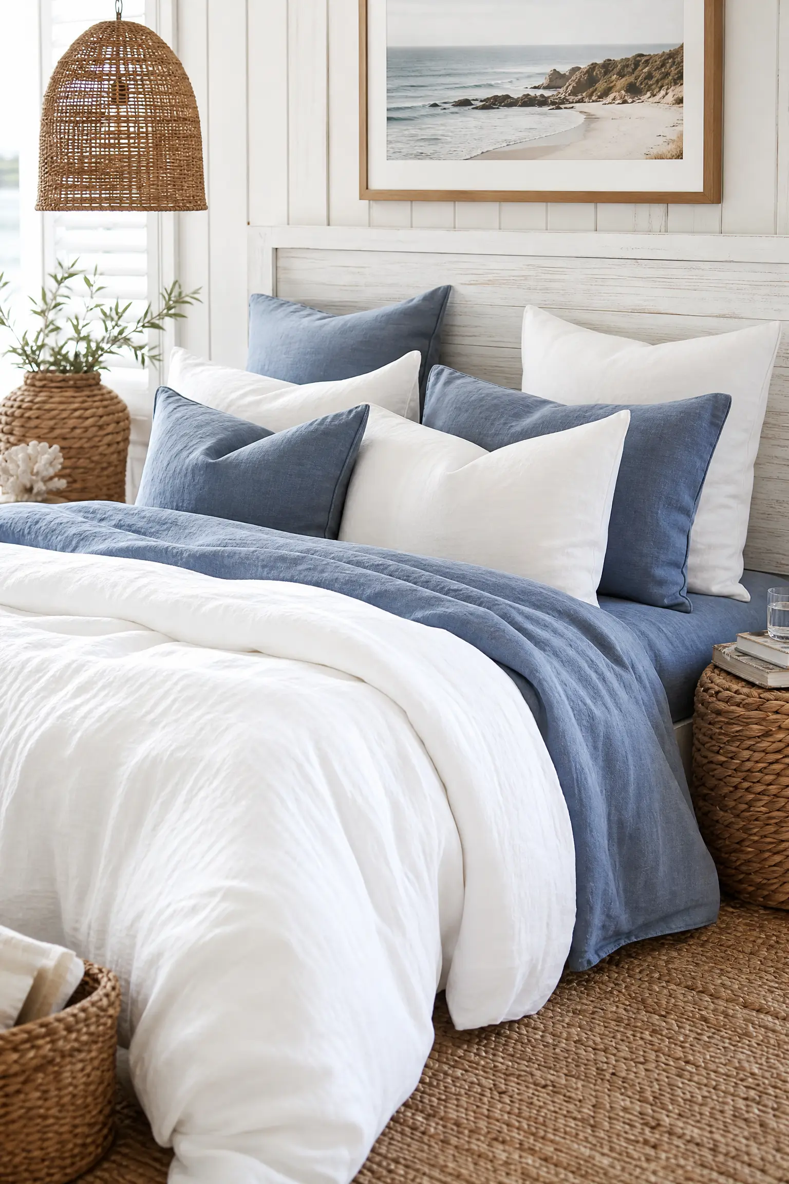
Faded Denim and Crisp White
Using faded denim-blue linen sheets paired with a thick, crisp white duvet cover offers a highly relaxed, coastal aesthetic that feels incredibly welcoming and lived-in. The soft, washed-out blue provides a hint of color that acts almost like a neutral, while the fluffy white duvet makes the bed look like a massive, inviting cloud. You should pair this breezy combination with a whitewashed wood headboard and natural woven rattan accessories to complete the laid-back, beach-house atmosphere. This is a mid-range investment, as high-quality linen is pricey, but the effortless, wrinkled texture means you can skip ironing entirely. Stacking four pillows flat, alternating between the blue linen and white cotton, creates a beautifully layered headboard presentation.
Pro Move: Use an oversized king duvet insert inside a standard queen duvet cover to achieve a highly plush, overstuffed appearance without spending extra money.
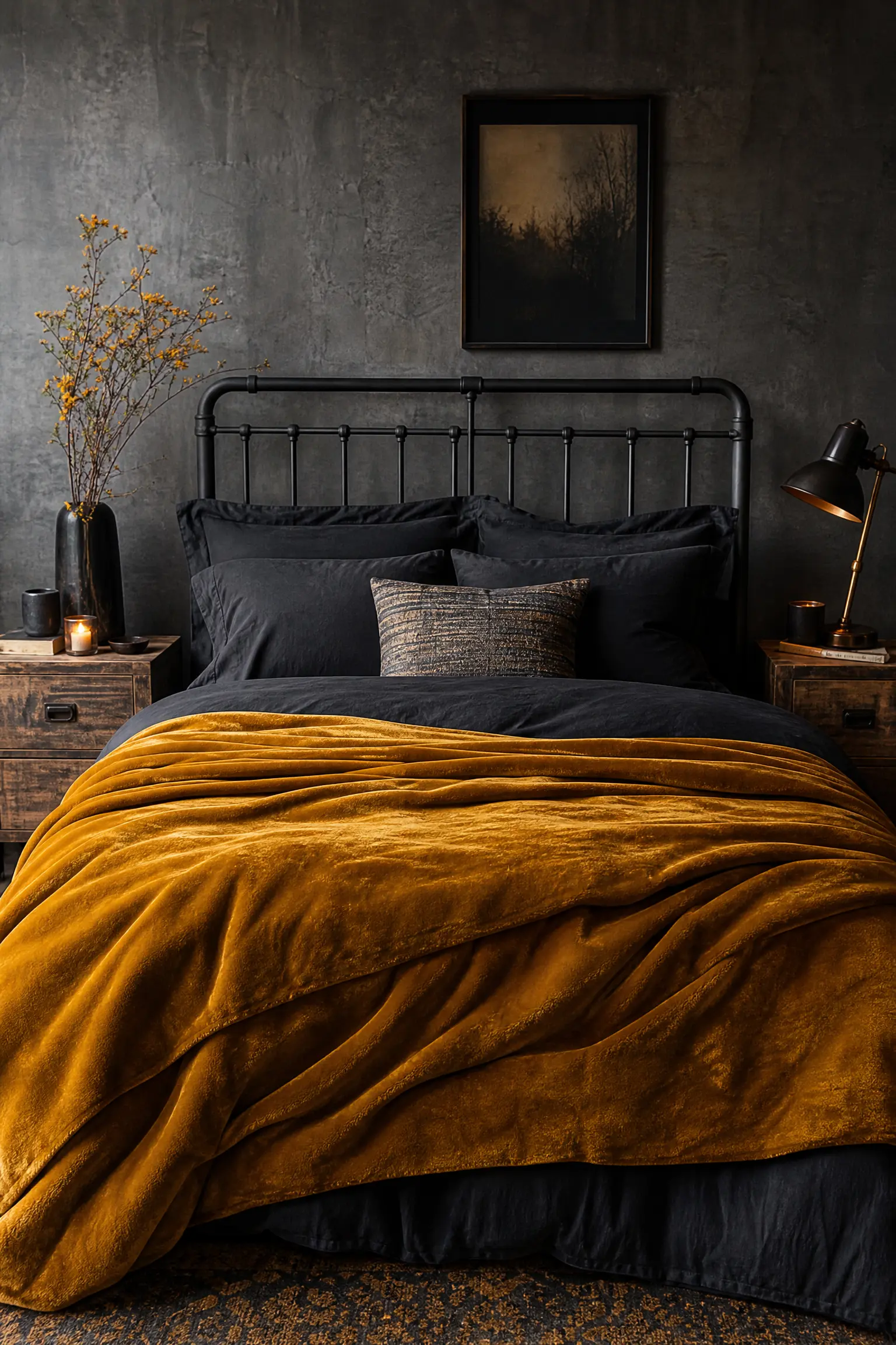
Mustard Velvet and Dark Charcoal
Layering a heavy mustard yellow velvet blanket over dark charcoal grey sheets introduces a fantastic, moody contrast that feels highly autumnal and deeply sophisticated. The bright, golden tones of the mustard instantly pop against the dark, shadowy grey base, creating a bed that commands massive attention the second you walk into the room. In practice, pairing this heavy, textured setup with an industrial metal bed frame and raw wood nightstands grounds the glamorous velvet with necessary masculine elements. This combination requires a slightly higher budget due to the velvet fabric, but it completely transforms a basic bedroom into a highly stylized retreat. Using dark charcoal pillowcases ensures the yellow velvet blanket remains the solitary bright focal point.
Reality Check: Dark grey sheets highlight every single piece of lint and pet hair instantly, so you must keep a sticky lint roller conveniently stored in your nightstand.
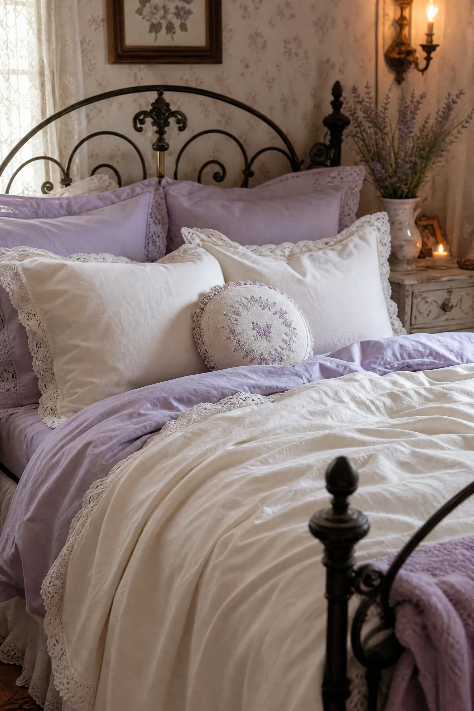
Soft Lavender and Ivory Lace
Mixing soft lavender cotton sheets with an ivory duvet cover that features a delicate lace trim creates a highly feminine, vintage-inspired aesthetic that feels incredibly delicate. The pale purple hue provides a soothing, sleepy atmosphere, while the ivory lace adds an essential layer of historic, cottage-core charm. You can easily pair this soft, romantic combination with an antique wrought iron bed frame and distressed painted furniture to fully embrace the shabby-chic style. This is a very budget-friendly approach, as basic cotton sheets in pastel colors are widely available and highly affordable. Adding a small, round embroidered accent pillow to the very front of your pillow stack completes the highly curated, vintage look.
Quick Tip: Always wash lace-trimmed bedding inside a large mesh laundry bag on the delicate cycle to prevent the intricate threads from tearing or snagging.
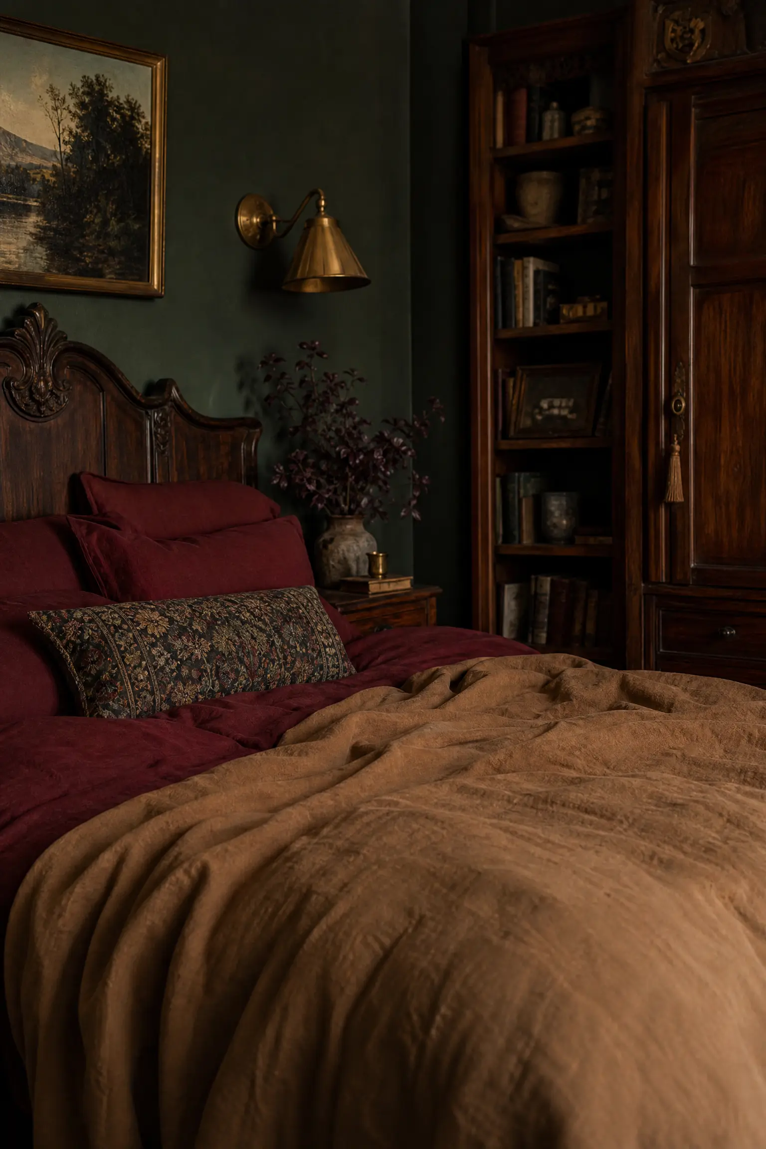
Deep Burgundy and Warm Tan
Combining deeply saturated burgundy sheets with a warm, tan-colored linen duvet cover creates an incredibly rich, earthy palette that feels highly grounded and sophisticated. The wine-colored sheets provide a massive punch of unexpected moody color when you pull back the neutral tan covers, adding a fantastic element of surprise to the styling. I find this specific combination works perfectly in rooms with dark green accent walls or heavy antique wooden furniture, enhancing the historic, library-like atmosphere. This sits in the mid-range budget category and looks best when both fabrics feature a slightly matte, washed finish rather than a shiny sateen. Keeping the bedding completely free of patterns ensures the rich solid colors do not overwhelm the eye.
Heads Up: Warm tan linen can sometimes look slightly yellow under cheap LED lighting, so you must ensure your bedside lamps use high-quality, soft white bulbs.
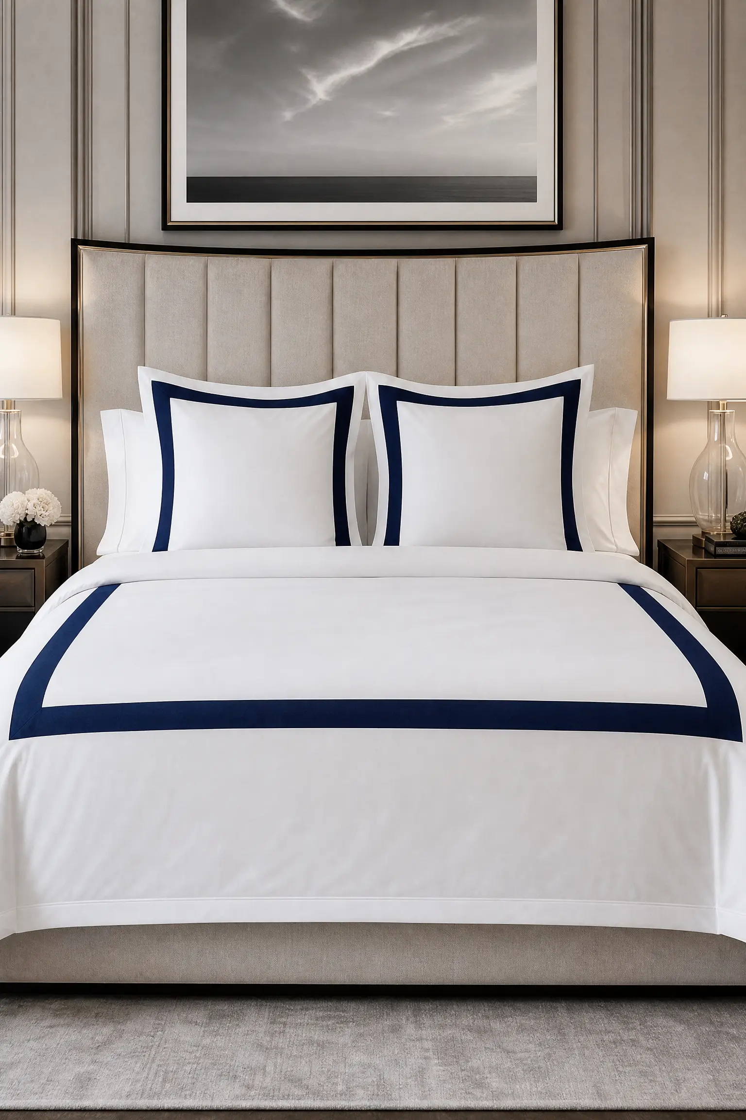
Classic Navy and Crisp White Border
Using crisp white sheets paired with a white duvet cover that features a thick, solid navy blue embroidered border offers the ultimate luxury hotel aesthetic. This highly tailored, classic combination instantly makes any bedroom look incredibly expensive, neat, and professionally styled. You should pair this rigid, organized bedding with a massive upholstered headboard and perfectly symmetrical glass bedside lamps to maintain the formal, high-end atmosphere. This is an investment-level look, as heavily embroidered bedding requires high thread-count cotton to support the stitching properly. Adding three perfectly square Euro shams with the exact same navy border to the back of the bed creates necessary height and structure.
Designer Advice: You must iron the embroidered borders heavily with plenty of starch after every single wash to keep the edges looking razor-sharp and professional.
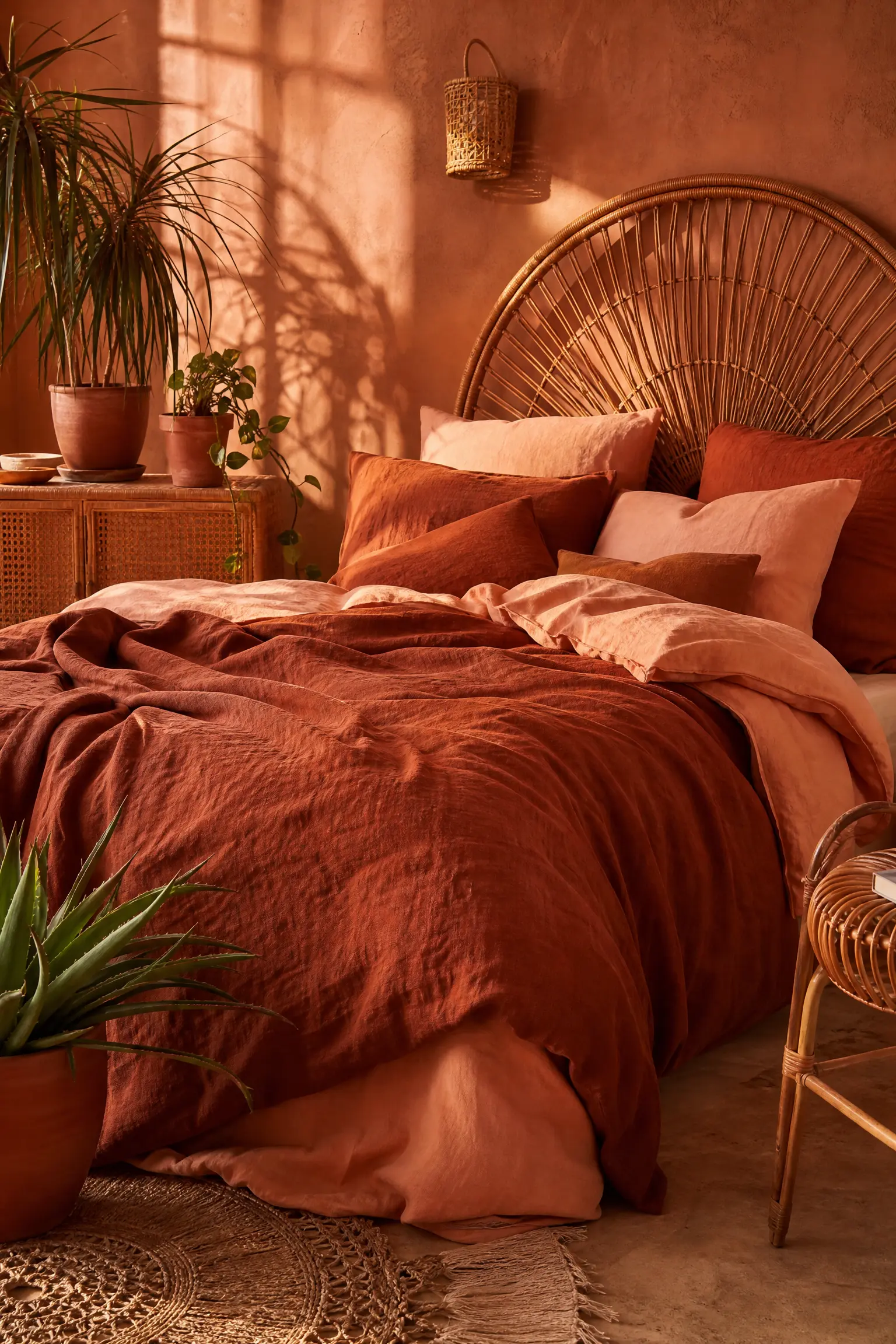
Rust Linen and Faded Peach
Layering a highly textured rust-colored linen duvet over soft, faded peach cotton sheets creates a stunning, monochromatic sunset palette that feels incredibly warm and bohemian. The slight variation between the dark, earthy rust and the pale, washed-out peach provides excellent visual depth without introducing any clashing, contrasting colors. In my experience, pairing this warm, desert-inspired combination with natural rattan furniture and plenty of terracotta potted plants completes a highly relaxing, organic aesthetic. This mid-range option relies heavily on the wrinkled, effortless texture of the linen to keep the solid colors from looking flat or boring. Leaving the bed slightly messy and unmade actually enhances the relaxed, bohemian vibe of these specific colors.
Pro Move: Mix your pillowcases randomly, using two rust linen cases and two peach cotton cases, to effortlessly blend the layers together at the top of the bed.
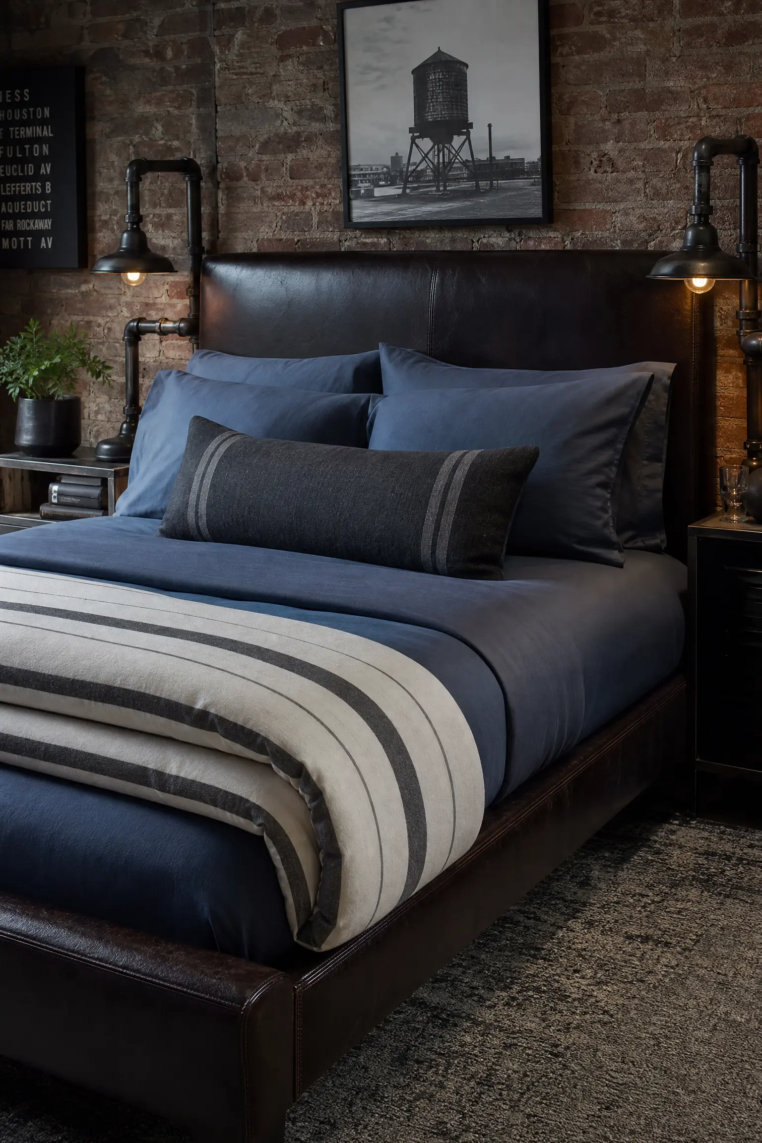
Slate Blue and Charcoal Stripe
Mixing solid slate blue sheets with a duvet cover featuring a thick, charcoal grey ticking stripe introduces a fantastic, subtle pattern mix that feels very tailored and masculine. The muted blue base color acts as a calming neutral, while the dark grey stripes provide necessary graphic structure and visual interest. You can pair this handsome combination with a dark leather headboard and industrial pipe-fitting lamps to complete a highly styled, modern loft aesthetic. This is a highly affordable pairing that works incredibly well for guest rooms, as the dark colors and busy stripes hide minor stains and wrinkles effortlessly. Folding the striped duvet in thirds at the foot of the bed creates a thick, hotel-style presentation.
Reality Check: When buying striped bedding, you must ensure the stripes are woven directly into the fabric rather than simply printed on top for maximum durability.
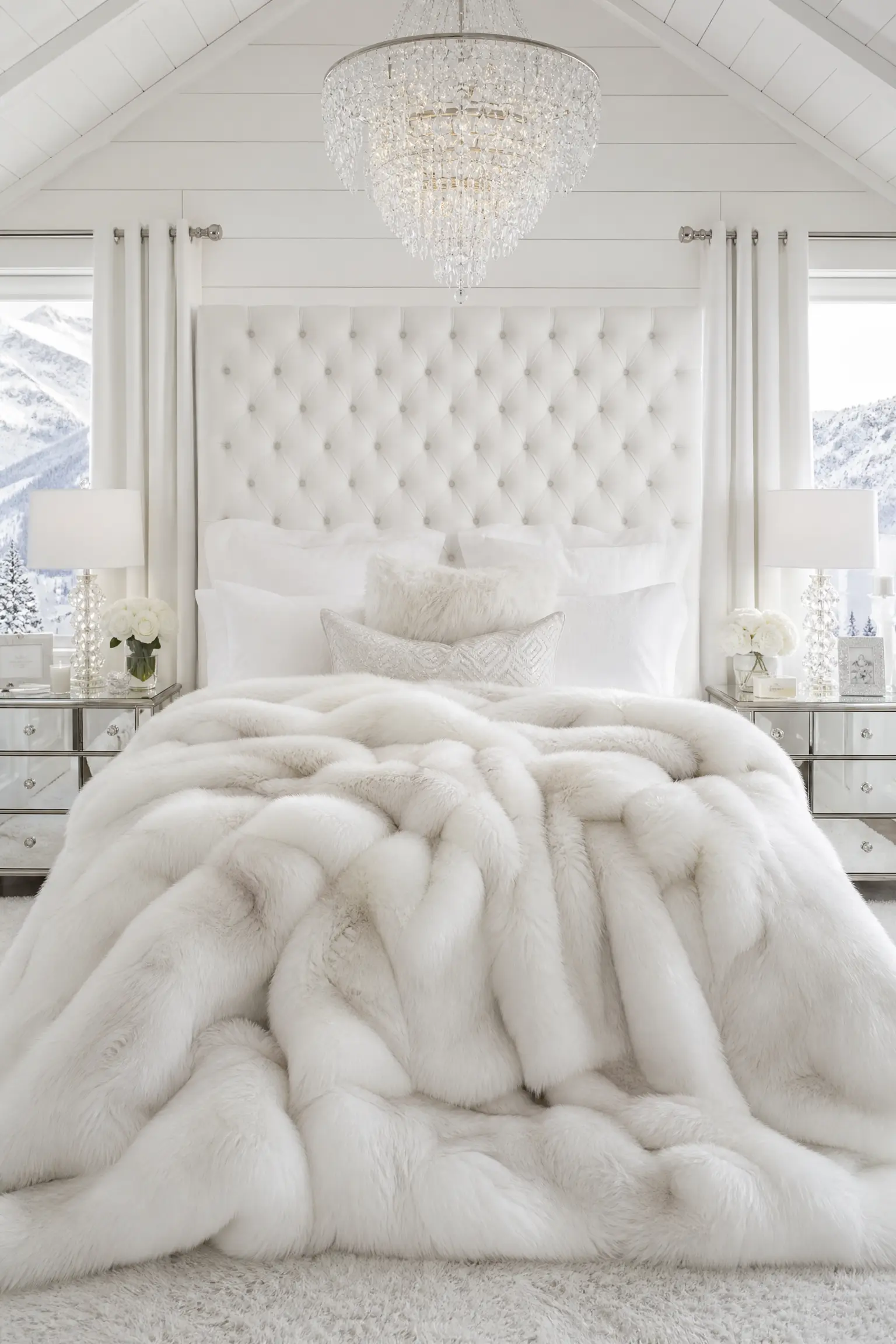
Bright White and Faux Fur
Using an entirely bright white cotton bedding setup layered heavily with a massive, oversized faux fur throw blanket delivers ultimate glamorous winter coziness. The sterile, crisp white sheets provide the perfect blank canvas for the wild, highly tactile texture of the thick faux fur, preventing the bed from looking like a teenager’s room. I always suggest pairing this highly textural combination with mirrored nightstands and a crystal chandelier to fully embrace the luxurious, snow-lodge aesthetic. While affordable faux fur exists, investing in a high-quality, heavy-weight blanket ensures it will not shed constantly or mat up after a single month of use. Keeping all the pillows strictly white ensures the fur blanket remains the solitary statement piece.
Quick Tip: Never wash a faux fur blanket with hot water or put it in the dryer; the heat will instantly melt the synthetic fibers and ruin the texture.
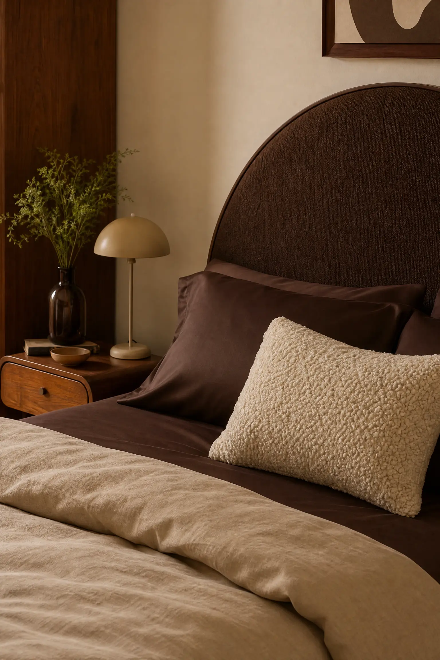
Chocolate Brown and Cream Boucle
Combining deep chocolate brown sateen sheets with a highly textured, cream-colored boucle accent pillow creates a warm, retro-inspired aesthetic heavily rooted in 1970s design trends. The smooth, dark brown fabric provides a rich, grounding base that heavily contrasts with the nubby, sheep-like texture of the cream boucle material. You should pair this trendy combination with a curved, arched headboard and plenty of warm walnut wood tones to maximize the nostalgic, mid-century atmosphere. This sits in the mid-range budget category and instantly updates a boring bedroom with highly relevant, current interior design textures. Keeping the duvet cover a simple, warm beige bridges the gap between the dark brown sheets and the bright cream pillow flawlessly.
Heads Up: Boucle fabric catches on jewelry and pet claws incredibly easily, so you must use it strictly as a decorative accent pillow rather than a sleeping surface.
Conclusion
Curating the perfect bedding combination is the single easiest way to transform the entire mood of your bedroom without picking up a paintbrush or moving heavy furniture. As we have seen, the most successful setups completely ignore the concept of a matching set, favoring instead a highly deliberate mix of contrasting textures, carefully balanced colors, and thoughtful layering techniques. Whether you choose to invest in crisp white hotel borders, moody dark linens, or bright velvet accents, the key is ensuring every layer serves a functional purpose while adding visual depth. Always remember to consider the practical maintenance of your chosen fabrics and how they interact with your existing headboard and lighting. By taking the time to intentionally mix your sheets and blankets, you can build a highly personalized, magazine-worthy bed that you truly look forward to sleeping in every single night.
Frequently Asked Questions
Is it okay to mix different fabrics on a bed?
Yes, mixing fabrics is highly recommended by designers. Combining a smooth cotton percale sheet with a textured linen duvet and a heavy velvet throw creates essential visual depth and makes the bed look incredibly inviting and professionally styled.
How many decorative pillows should a bed actually have?
A practical rule is to use no more than three to five decorative pillows, depending on the bed size. Anything more than that becomes a daily chore to remove and store at night. A simple arrangement of two Euro shams and one long lumbar pillow is usually perfect.
Should your sheets match your duvet cover exactly?
No, matching your sheets exactly to your duvet cover usually results in a flat, uninspired look. Choosing a contrasting sheet color or a subtle pattern adds beautiful layers and dimension when you fold the duvet back.
What is the best bedding material for hot sleepers?
Hot sleepers should strictly use crisp cotton percale, genuine linen, or bamboo sheets. These natural, highly breathable fibers allow body heat to escape efficiently, unlike polyester or microfiber, which trap heat and cause night sweats.
How do you make a bed look fluffy like a hotel?
The secret to a highly fluffy bed is doubling up your duvet inserts. Stuffing two lightweight down inserts into a single duvet cover creates that massive, overstuffed, cloud-like appearance commonly seen in luxury boutique hotels.
Should a throw blanket perfectly match the pillows?
It does not need to match perfectly, but it should coordinate with the overall palette. Using a throw blanket that features a different texture but a similar undertone to the pillows is a great way to add cohesion without looking overly matched.